

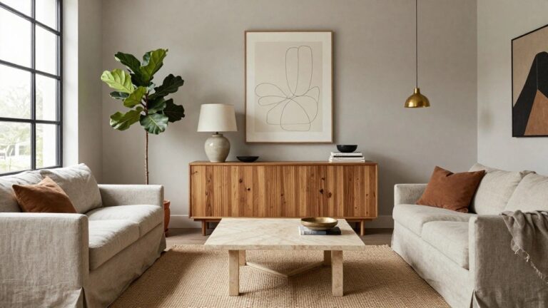
I’ve found that color decisions in a home tend to settle only after you live with them through a few seasons and see how they shift with the light.
When a palette works it usually supports the way a room gets used rather than fighting against the furniture and daily clutter already there.
Some rooms only feel right once the walls stop competing with everything else in them.
I keep coming back to combinations that leave room for the things people actually own instead of demanding a full reset.
Testing one or two of these against an existing space has shown me which ones hold up beyond the first impression.
Warming Neutrals With Terracotta Accents
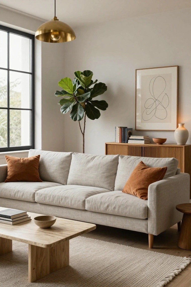
A soft neutral base makes a room feel open and easy to live with over time. Adding just a few terracotta pillows brings enough warmth to keep the space from feeling flat while still letting the overall palette stay calm and simple.
This approach works best in living rooms that get steady daylight. Limit the warm accents to pillows or a single wood tone so the balance stays quiet rather than busy.
Deep Teal Bedding in a Neutral Room
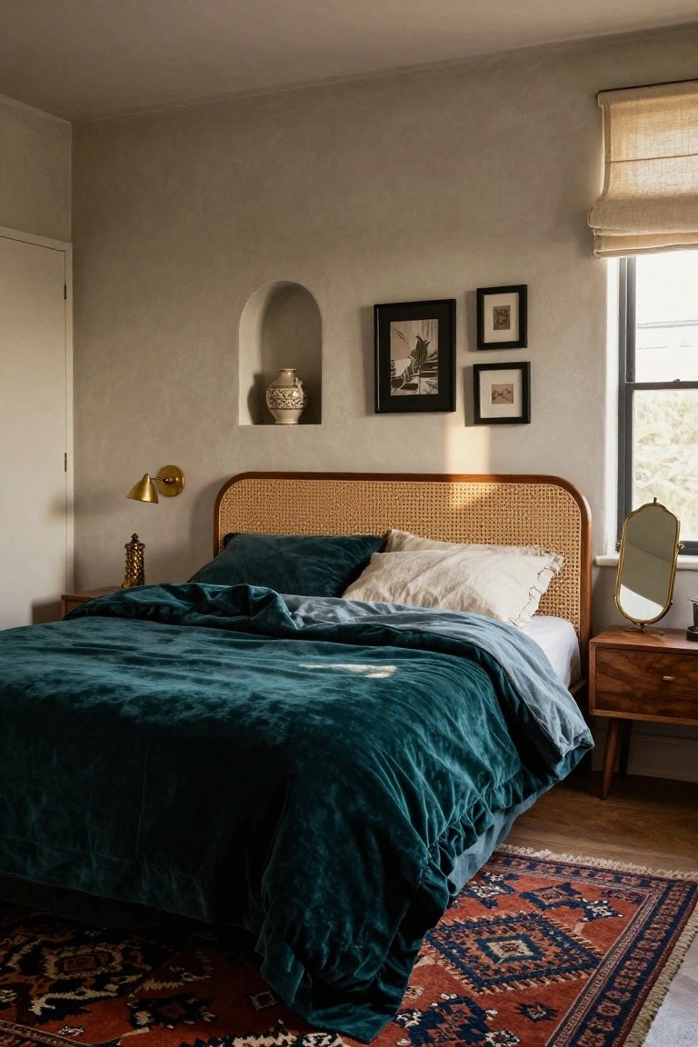
A deep teal works well on bedding when the walls stay light and soft. It gives the room a clear focal point without needing strong patterns or lots of extra color.
This choice suits bedrooms with wood furniture and simple architecture. Keep the surrounding pieces calm so the teal stays balanced and does not take over the space.
Warm Neutrals With Wood Accents
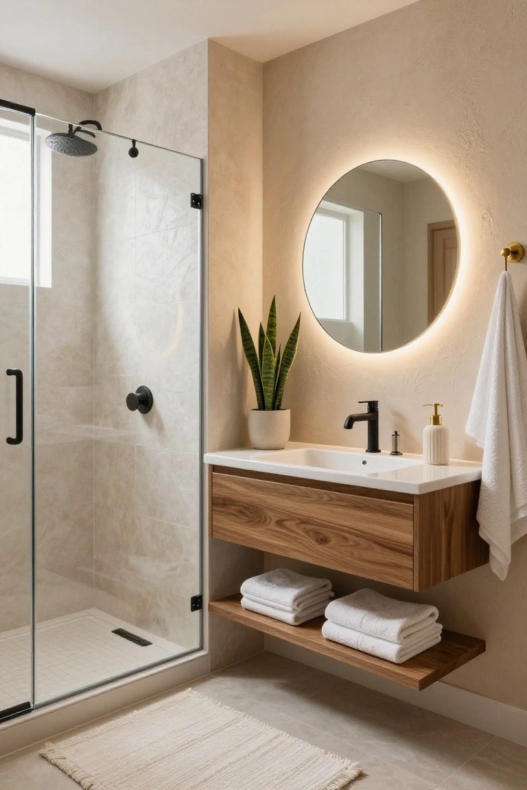
Bathrooms often end up feeling stark when everything leans too cool or too white. A palette built around soft beige walls and natural wood tones gives the space a calmer, more settled look that still reads clean and simple.
This works especially well in smaller bathrooms or homes that want a timeless feel without much pattern or color. Stick with matte black fixtures and a floating wood vanity to keep the room from feeling heavy while the warm neutrals do most of the balancing.
Terracotta Walls With Green Wainscoting
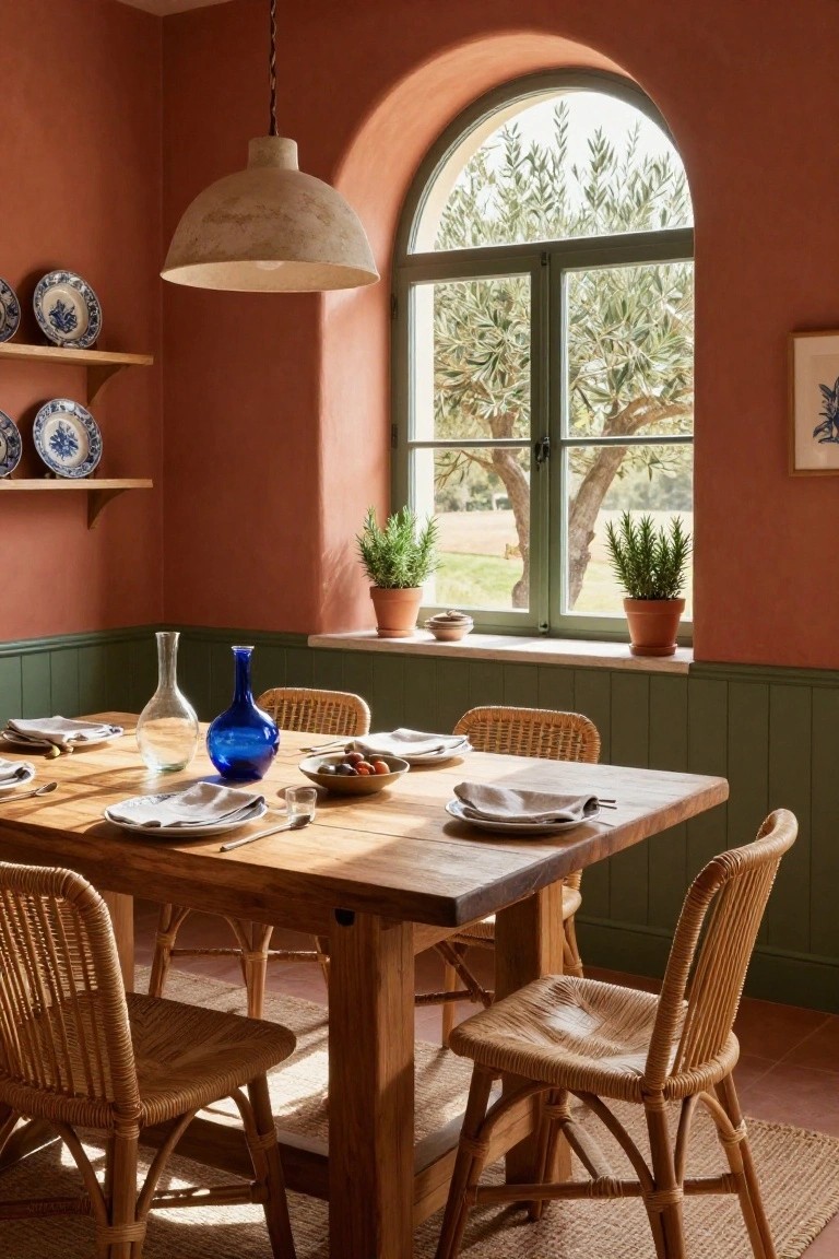
Terracotta paint on the upper walls paired with a deeper green on the lower paneling gives a room a grounded, balanced feel. The warm and cool tones play off each other nicely and keep the space from feeling too heavy or too bright.
This approach works well in dining rooms or kitchens that already have wood furniture and natural light. It suits older homes especially, where the goal is a simple color change that still feels lasting.
Neutral Walls With A Dark Door
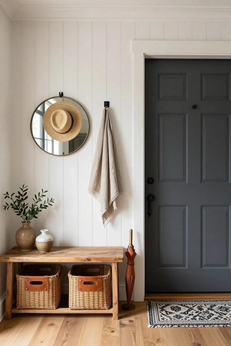
A simple way to get a balanced look is to keep most surfaces light and let one dark element carry the contrast. The white walls and trim create a calm base, while the dark gray door adds weight without needing extra color or pattern.
This works well in entryways or small rooms where you want things to feel steady rather than busy. Stick to natural materials like wood and woven pieces so the palette stays relaxed, and avoid adding too many other dark tones that could compete with the door.
Soft Pink Walls For A Timeless Look
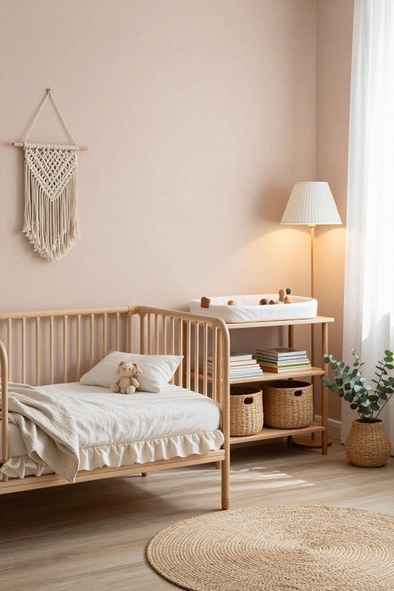
A soft pink wall color can give a room a gentle feel without making it feel too sweet or trendy. It works especially well when paired with light wood furniture and simple textiles, keeping the overall palette calm and easy to live with.
This approach suits bedrooms or nurseries best, where you want something soothing that still feels grown up over time. Stick to warm neutrals for the rest of the room and avoid adding too many competing colors.
Muted Green Built-Ins For A Quiet Workspace
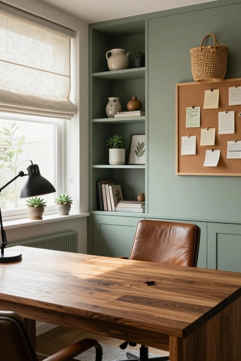
A soft green on built-in cabinetry brings a steady feel to a workspace without making it feel closed in. It pairs naturally with wood tones and keeps the room from looking too stark or overly styled.
This works best in smaller rooms or home offices where you want a bit of color but still need the space to stay practical. Keep the rest of the palette simple with wood, linen, and a few neutral accents so the green stays the main note.
Gray With Warm Wood For Everyday Spaces
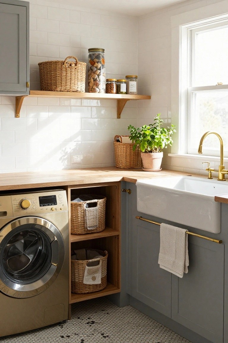
Many homes use soft gray cabinetry with natural wood tones to keep utility spaces feeling calm and settled. The combination avoids looking too cold while still staying practical for daily use.
This palette works especially well in laundry rooms or smaller work areas. Pair it with simple white walls and minimal hardware so the gray and wood stay balanced over time.
Soft Blue And White Cabinets For Balance
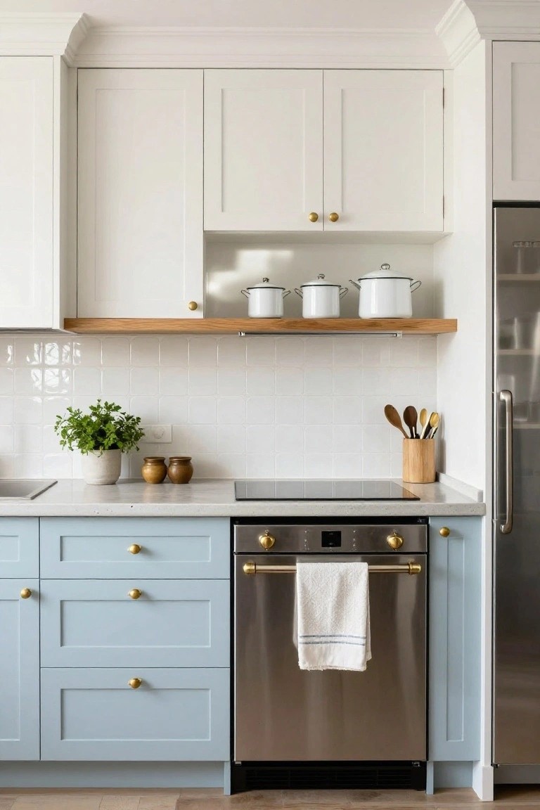
A soft blue on the lower cabinets with white uppers keeps a kitchen feeling light without going completely plain. The contrast adds just enough color to make the space feel calm and put together.
This works best in homes that want a gentle update rather than a bold change. Keep the rest of the room simple so the two tones stay the main focus.
Soft Blue And Neutral Bedroom Palettes
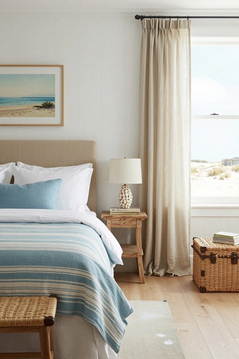
A soft blue and neutral palette works well in bedrooms because it feels calm without looking flat. The blue brings a gentle color note while the beiges and whites keep everything balanced and easy to live with.
This approach suits homes near the coast or any space that needs a relaxed feel. Keep the blue tones light and layer them with linen or cotton in off-white and warm beige so the room stays bright and timeless.
Deep Wall Color For A Calm Bedroom
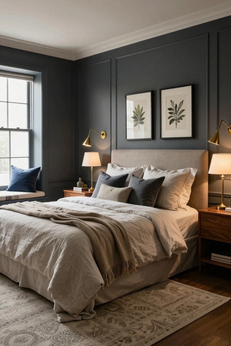
Painting bedroom walls a deep gray gives the space a quiet, settled feel that still reads as timeless. The color adds weight without closing the room in, especially when the rest of the space stays light and simple.
This approach works best in rooms that get decent natural light. Keep bedding and larger textiles in soft neutrals so the dark walls stay the main feature rather than turning the space too heavy.
Deep Wall Colors With Natural Wood
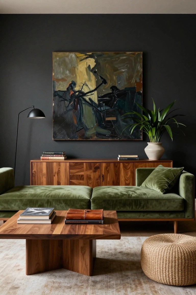
A dark wall color gives wood furniture and softer seating a solid place to settle. It keeps the mix from feeling scattered and helps the room read as calm instead of busy.
This approach works best in living rooms that already have mid-tone wood pieces. Keep the rest of the palette simple so the dark wall and wood can do the main work.
White Cabinets With Wood Islands
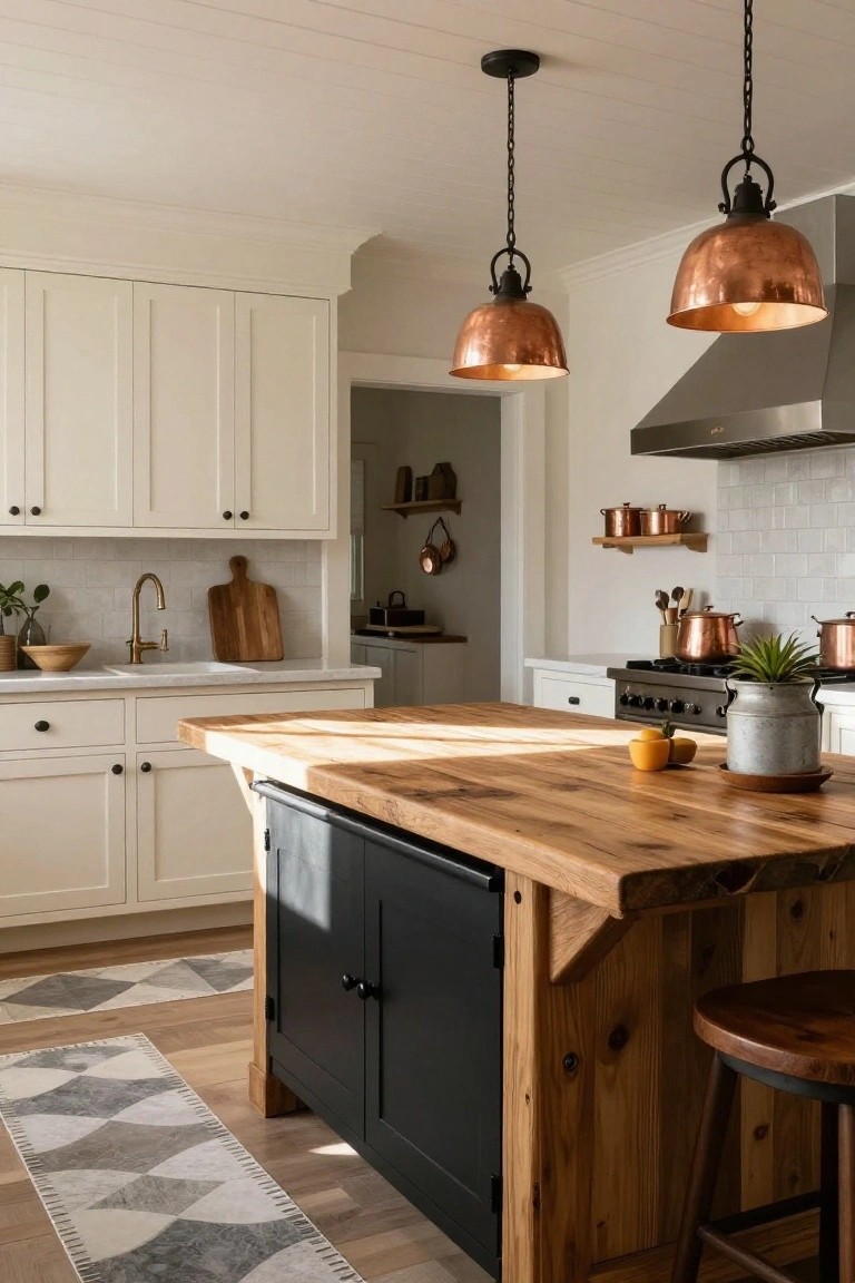
Many kitchens lean on white cabinets for a clean base, but they can start to feel flat without some contrast. A solid wood island brings in natural grain and warmth that keeps the room from looking too stark.
This approach suits homes with a traditional or transitional style. Use a medium wood tone on the island top and pair it with black lower cabinets to hold the palette together without adding extra colors.
Neutral Grays With Warm Wood
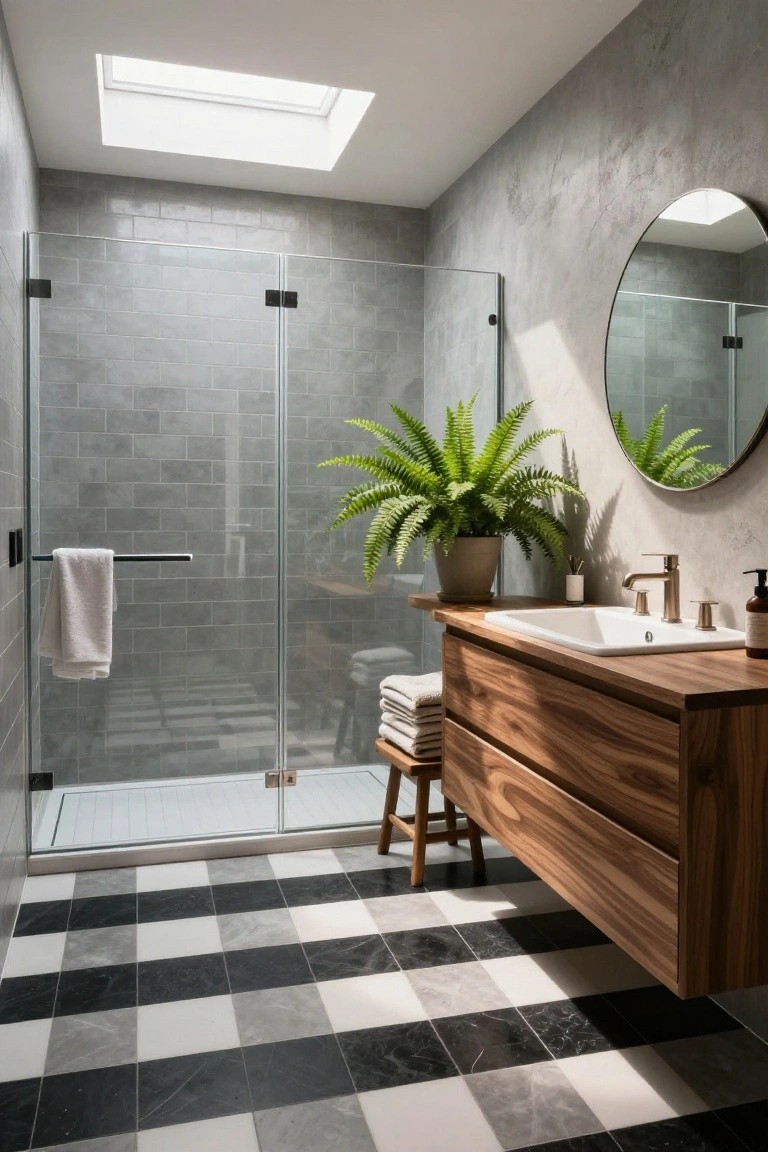
A gray tile palette paired with wood cabinetry creates a bathroom that feels calm and settled without looking plain. The cool wall and floor tones keep the space feeling clean, while the wood adds just enough warmth to stop it from feeling cold or sterile.
This approach works well in smaller bathrooms where you want the room to feel open but still grounded. Stick with two or three gray shades at most, then bring in wood on the vanity or a stool to add contrast. Avoid adding too many other colors or it can start to feel busy.
Deep Green Walls In Dining Rooms
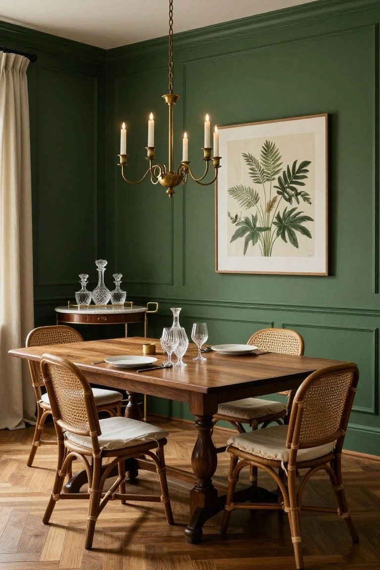
Deep green walls give a dining room a grounded feel that holds up over time. The color works especially well when the room has wood furniture and simple lighting.
It suits homes with classic details or even more modern ones that need a bit of warmth. Keep the trim and ceiling light to avoid making the space feel too closed in.
Soft Pink And Gray For A Calm Bath
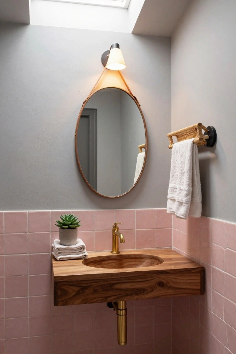
This palette works because the pink stays quiet and the gray holds everything steady. The result feels balanced without trying too hard, and it ages well.
It suits smaller rooms like bathrooms especially well. Keep the wood tones warm and the hardware simple so the colors stay the main focus.
Deep Navy Built-Ins for Entry Storage
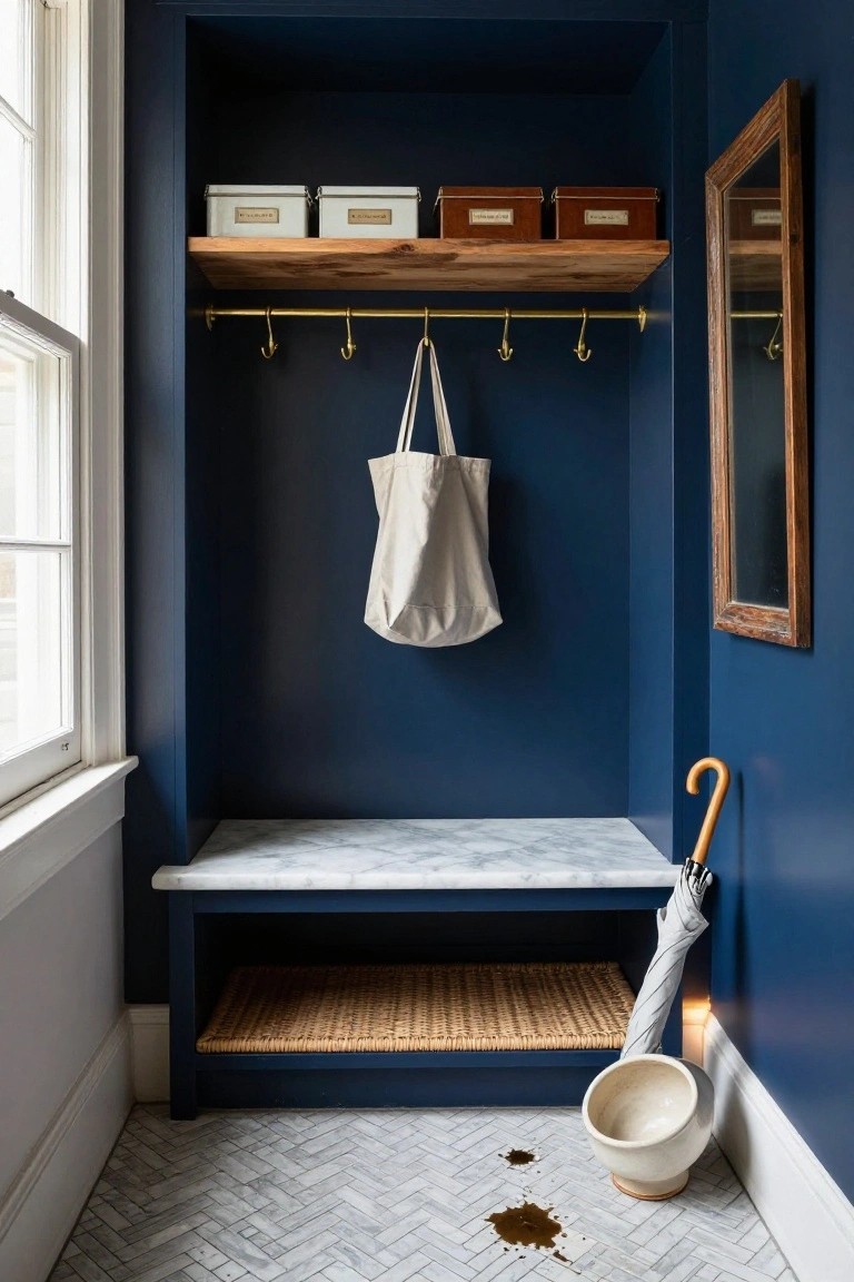
A deep navy works well when you paint both the walls and the built-in cabinetry the same color. It gives the space a quiet, pulled-together feel without needing lots of extra trim or contrast. The color also helps the whole area feel a little more substantial, which suits a spot that sees daily use.
This approach works best in homes with classic or simple architecture where you want the storage to blend in rather than stand out. Keep hardware minimal and choose a matte or eggshell finish so the color stays the main feature. It is easy to live with and does not date quickly.
Light Neutrals For Everyday Storage
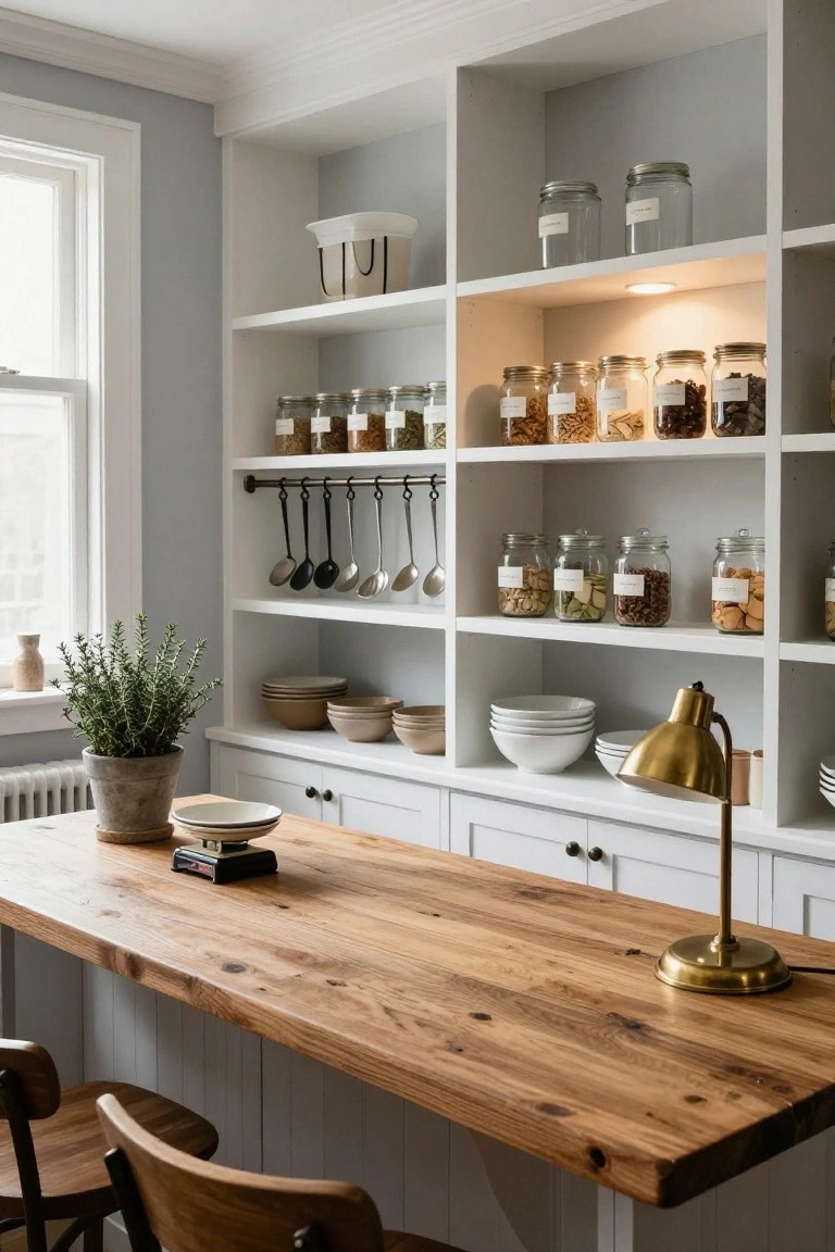
A soft white and pale gray palette keeps built-in shelving from feeling heavy in a kitchen or work area. The colors blend together so the storage looks like part of the room rather than something added on.
This works best in spaces that get steady use, where you want order without a lot of visual noise. Keep the finishes matte and bring in wood tones on counters or stools to stop the room from feeling too plain.
Warm Neutral Wall Colors For Timeless Balance
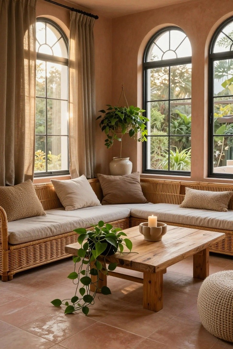
A soft warm tone on the walls can make a room feel settled and easy to live in. It works with natural textures like wood and woven seating, so the space stays comfortable rather than feeling styled for show.
This color choice suits rooms that get steady daylight, where the tone shifts gently from morning to evening. It pairs best with simple furnishings and avoids the need for constant updates when seasons or accessories change.
Leather With Warm Wood For A Balanced Look
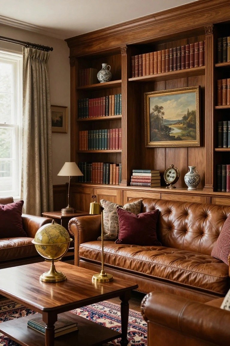
A room like this shows how leather seating and built-in wood shelves can create a steady, comfortable palette that feels settled over time. The deep brown leather picks up the same tones in the shelves and floor, while the burgundy pillows and book spines add just enough contrast without breaking the calm.
This approach works best in living rooms or studies where you want the space to feel both practical and finished. Keep the wood tones consistent, choose leather in a similar depth, and let the books and a few textiles supply the rest of the color. It suits older homes especially well, since the materials age gracefully together.
Frequently Asked Questions
Q: How do I test these palettes in my own space before buying paint?
A: Grab sample pots and brush them onto big pieces of foam board. Move the boards around the room through the day to see how morning light versus afternoon changes the tones. Stick with the combos that still feel steady by night.
Q: My sofa and floors are already in place. How do I build a palette around them?
A: Pull two or three colors from the wood and fabric you have. Use those as your starting point and add softer shades on the walls. This keeps everything grounded without a full overhaul.
Q: What if I want one room to feel a little warmer than the rest of the house?
A: Shift toward the deeper or golden hues in your chosen palette for that space alone. Keep the trim and ceiling light so the change stays subtle. The rest of the home still reads as connected.
Q: How many colors can I actually use without things feeling busy?
A: Limit yourself to three main colors plus one soft accent. Repeat those shades across walls, textiles, and small accessories.
