

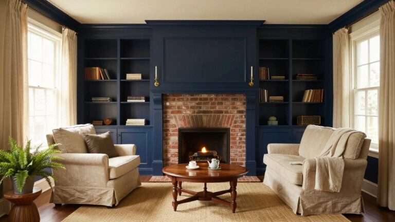
I’ve noticed in our colonial dining room that the walls draw your eye right away, quietly shaping whether the space feels open or closed off. High ceilings and ornate trim thrive when paint enhances their lines instead of overwhelming them with bold contrasts. I once swapped a stark white for a soft linen tone, and it made family gatherings there feel more settled somehow. Colors that play well with natural light keep these rooms functional year-round, without needing constant tweaks. A few here beg for a test strip.
Navy Built-Ins Around the Fireplace
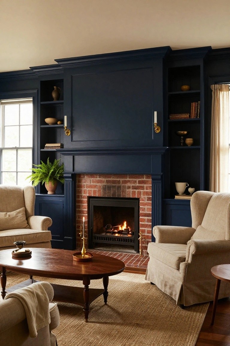
A deep navy paint on tall built-in cabinetry like this makes a brick fireplace the clear star of the living room. The color adds weight and coziness to the wood-trimmed surround without darkening the whole space. It works because the navy echoes colonial roots while contrasting nicely with the red brick and lighter walls.
Paint your own fireplace cabinets or add simple shelving in older homes with exposed brick. Keep furniture neutral, like cream chairs on wood floors, so the navy stays bold but not heavy. Skip it in small rooms unless you have good natural light from nearby windows.
Navy Blue Kitchen Cabinets
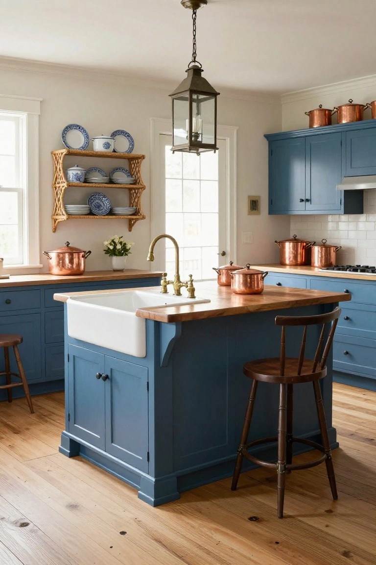
Navy blue paint on kitchen cabinets brings a cozy, old-world feel to colonial homes. You see it here on the island and base cabinets, setting off the white walls and hardwood floors. That deep color feels grounded without being too dark, especially with wood countertops and brass faucet details pulling it together.
Paint your lowers navy and keep uppers light if the room gets decent natural light. It suits farm-style sinks and open shelving with everyday dishes. Skip it in super small spaces, though. The copper pots add a nice shine that keeps things from feeling too heavy.
Red Wainscoting in Hallways
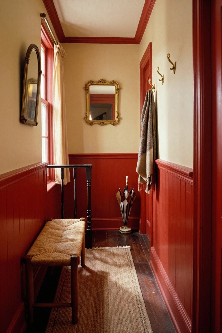
A rich red paint on the lower walls, right up to the chair rail, paired with plain cream above, gives this narrow space a real Colonial kick. The color split makes the hallway feel pulled together without much fuss, and it handles low light well.
Try it in your entry or back hall if you have wood floors and some trim already. Older homes take to it best. Stick to a flat finish on the red so it does not glare, and keep furniture simple like that rush bench nearby.
Sage Green Walls in a Colonial Study
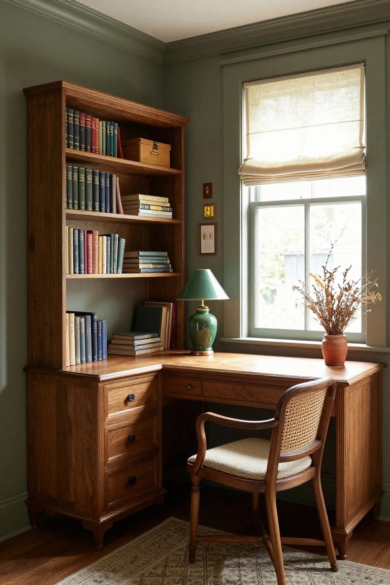
Sage green walls like this one set a quiet, restful tone in a study corner. The muted green tone plays nicely off warm wood furniture, pulling out the honey tones in oak desks and shelves without overpowering them. It feels right for colonial homes, where you want calm focus over bold statements.
Use this color in smaller rooms like home offices or libraries, especially with built-ins or antique pieces. It works best where natural light comes in soft, like through linen shades. Skip it in super sunny spots, though. The green might wash out.
Muted Gray Built-In Cabinets
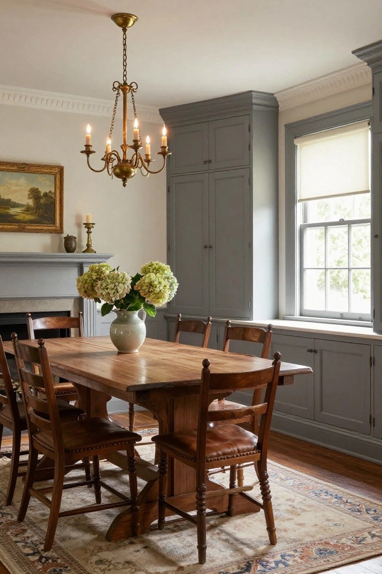
Those tall gray cabinets along the wall catch your eye right away in a colonial dining room. The soft gray paint keeps things calm and pulled together without going too dark. It works against creamy walls and lets the wood table and chairs stay the stars. A touch of green from the hydrangeas on the table keeps it fresh.
Paint built-ins like this in dining areas or small kitchens where you want storage that blends in. It suits older homes with good window light. Stick to matte finishes so it does not show fingerprints. Pair it with wood floors and simple brass lights for that easy colonial feel.
Pale Blue Walls for Colonial Bedrooms
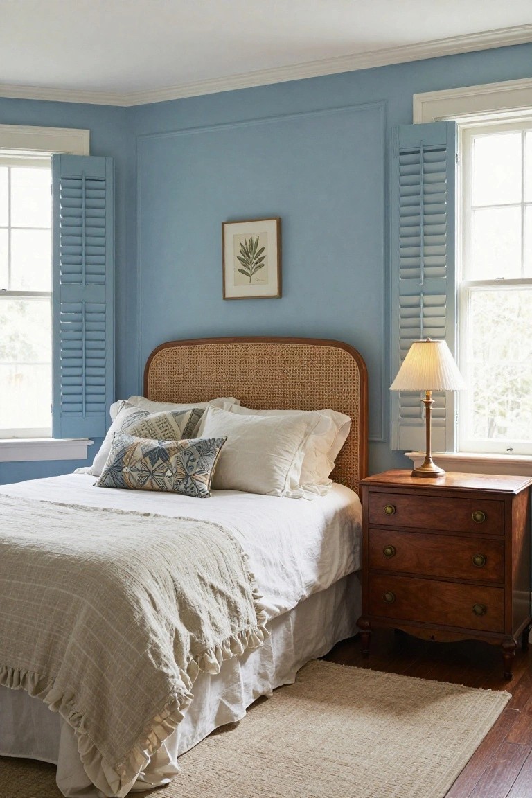
A pale blue paint like this one turns a simple bedroom into a peaceful spot without much effort. It plays nice with white trim and wood pieces, letting natural light bounce around and keeping the room from feeling too closed in. That rattan headboard adds just the right texture against it.
This color works best in spaces with good window light and classic details like shutters or crown molding. Use it in older homes where you want calm over bold. Stick to white or cream bedding to let the walls shine… and avoid darker floors if you can.
Creamy Walls Highlight Colonial Woodwork
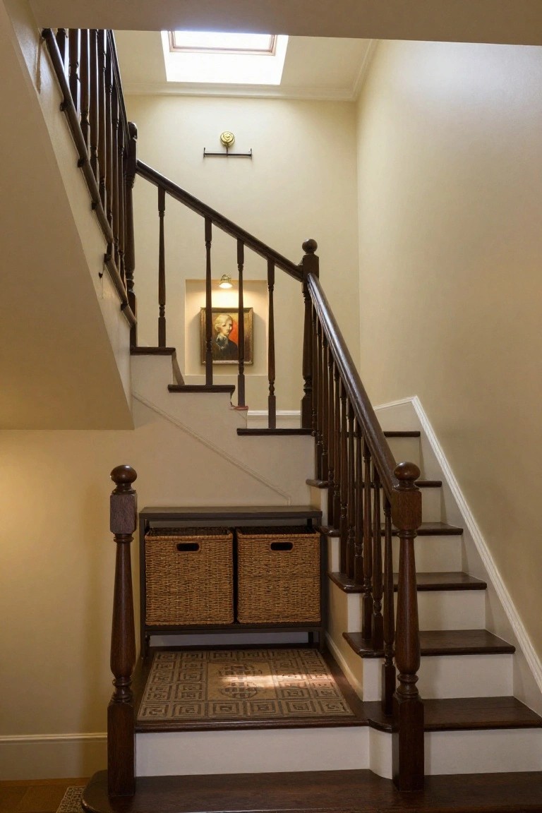
In colonial homes, a soft creamy wall paint like this one keeps staircases feeling open and bright. The light tone makes the dark wood balusters and newel posts stand out without overwhelming the space. It’s a simple choice that nods to traditional style while staying easy on the eyes.
You’ll want this in hallways or entries where wood trim is a big part of the look. It suits older houses best, especially if the floors are wood too. One thing… test the shade in your light first, since it can shift a bit under skylights.
Light Gray Shaker Cabinets
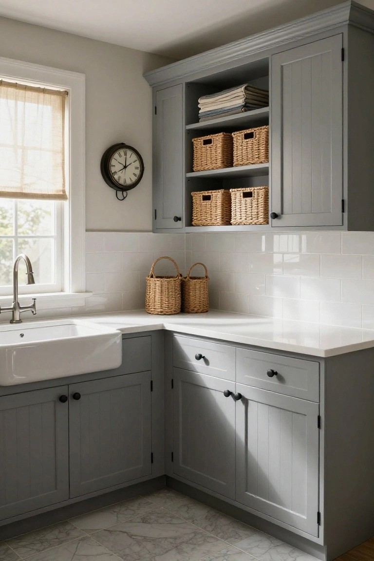
One simple way to bring colonial charm into a workhorse room like the laundry is painting shaker-style cabinets in a soft light gray. It keeps the space feeling fresh and timeless without going too bold. The gray here picks up on the walls just enough to tie everything together, and it lets white counters and subway tile backsplash shine.
This color works best in rooms with good natural light, like near a window. Paint over dated wood cabinets if you have them, or build new ones to match. Just stick to matte finishes to avoid fingerprints showing up too much. It’s practical for everyday use.
Deep Green Bathroom Cabinets
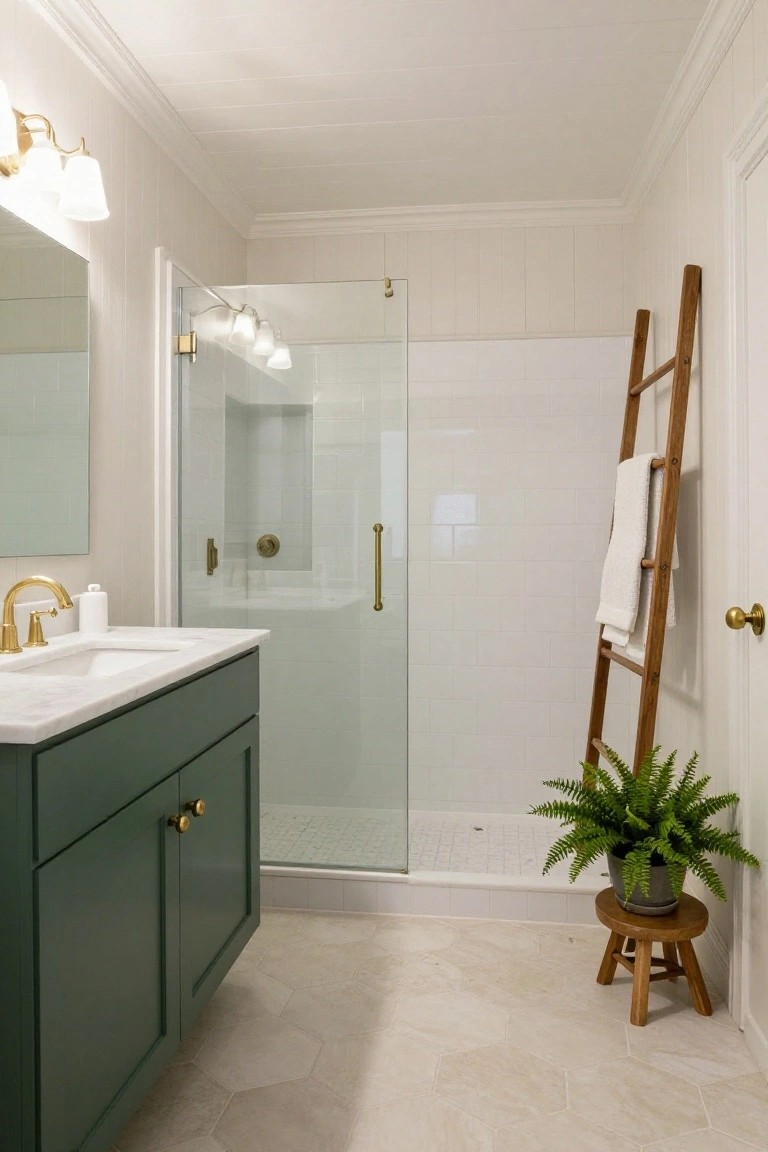
A deep green paint on the vanity cabinets gives this bathroom a fresh take on colonial style. The rich color pops against the white shiplap walls and subway tile shower. Gold hardware on the faucets and pulls keeps everything connected without clashing.
Try this in a small bath with mostly white surfaces. It adds some weight down low so the room doesn’t feel too airy. Just make sure your counter is light like marble to balance it out.
Pale Yellow Walls in a Nursery
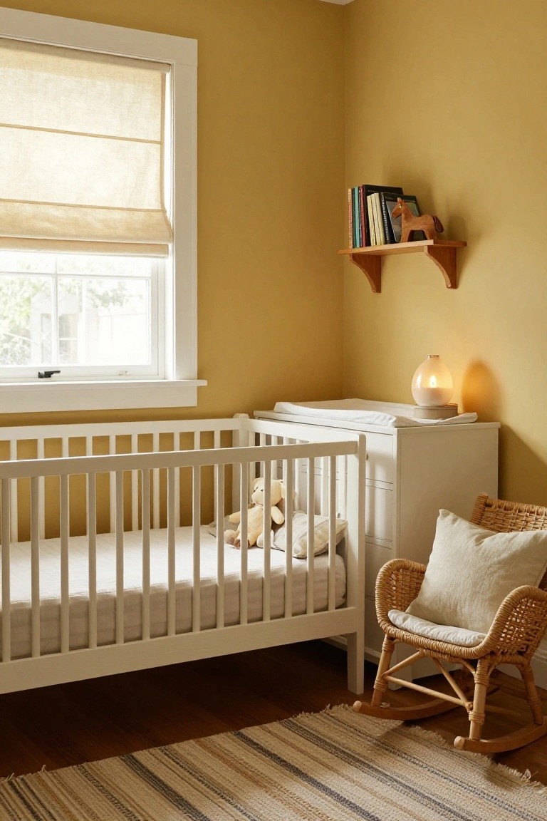
A soft pale yellow like this warms up a nursery without overpowering it. It catches the light from the window just right and pairs easy with white wood furniture. Think crib, changing table. The color feels colonial fresh. Cozy for a kid’s space.
Use it in rooms with wood floors or trim. North-facing spots love the lift. Older homes take to it well. Sample on two walls first. Light shifts the look a bit.
Navy Blue Walls in Colonial Libraries
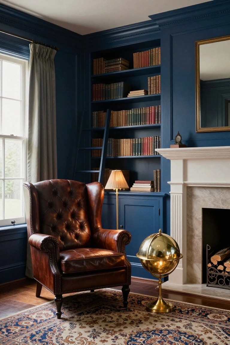
Navy blue walls turn a simple library corner into something special. The deep shade covers the built-in shelves and cabinets here, soaking up light from the window while keeping things calm and bookish. It feels right for colonial style, where you want that old-world coziness without going too dark.
Use navy like this in a study or sitting room with good natural light. It works best in homes with wood floors and some brass touches for shine. Watch the lamp choices though… warm bulbs keep it from feeling cold.
Mudroom Built-Ins in Soft Sage Green
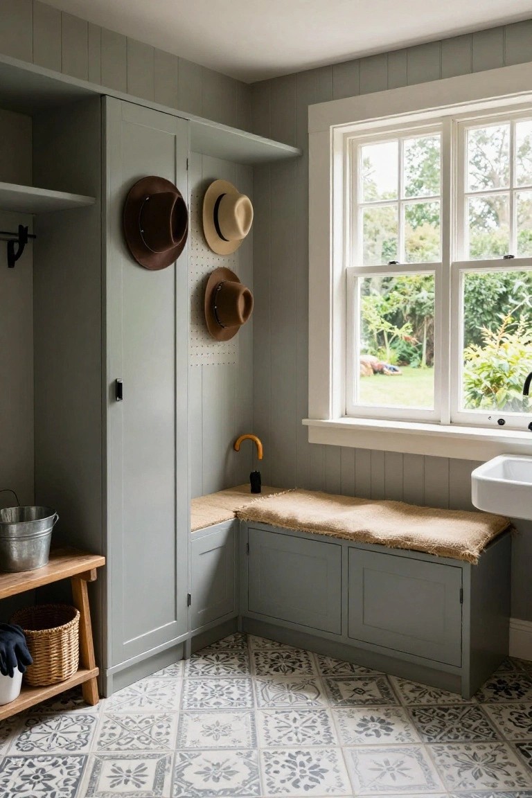
Soft sage green paint on mudroom cabinetry gives a calm, practical feel to busy entry spaces. It works well because the muted tone picks up garden views through the windows without overwhelming the room. Paired with white trim around the tall cupboards and pegboard hooks, it keeps things fresh and colonial-inspired. You get storage for hats and boots right where you need it.
This paint color suits older homes or cottages with paneled walls. Try it on freestanding units too if built-ins aren’t an option. Just stick to matte finishes to avoid fingerprints showing up. It holds up in high-traffic spots like this one near the back door.
Terracotta Walls Warm Colonial Bedrooms
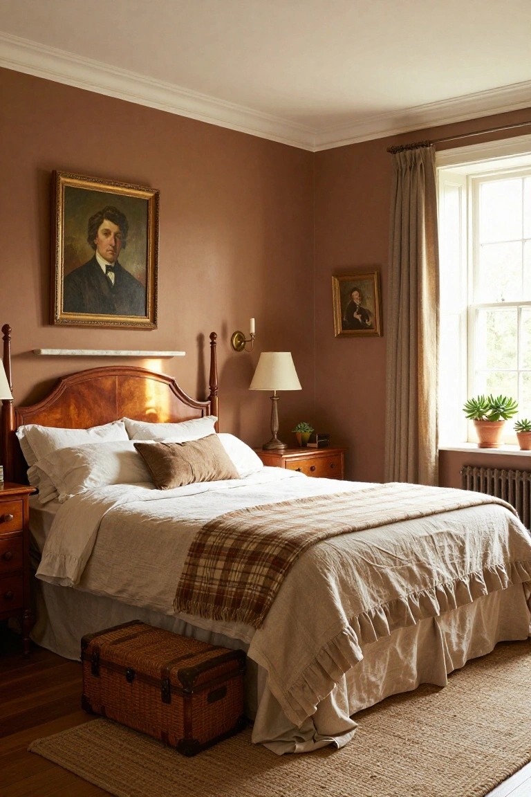
Warm terracotta paint on the walls turns a simple bedroom into something cozy and lived-in. It picks up the wood tones from the bed frame and nightstands without overwhelming the space. Those old portraits hanging there feel right at home against the soft brown shade. It’s a color that nods to colonial roots but stays easy on the eyes.
Try it in a guest room or master with good natural light. It suits older homes with wood floors and trim. Keep bedding in whites and creams so the walls don’t compete. North-facing rooms especially benefit, as the warmth fights any chill. Just test a sample first. Light changes everything.
Pale Blue Walls Lighten Colonial Nooks
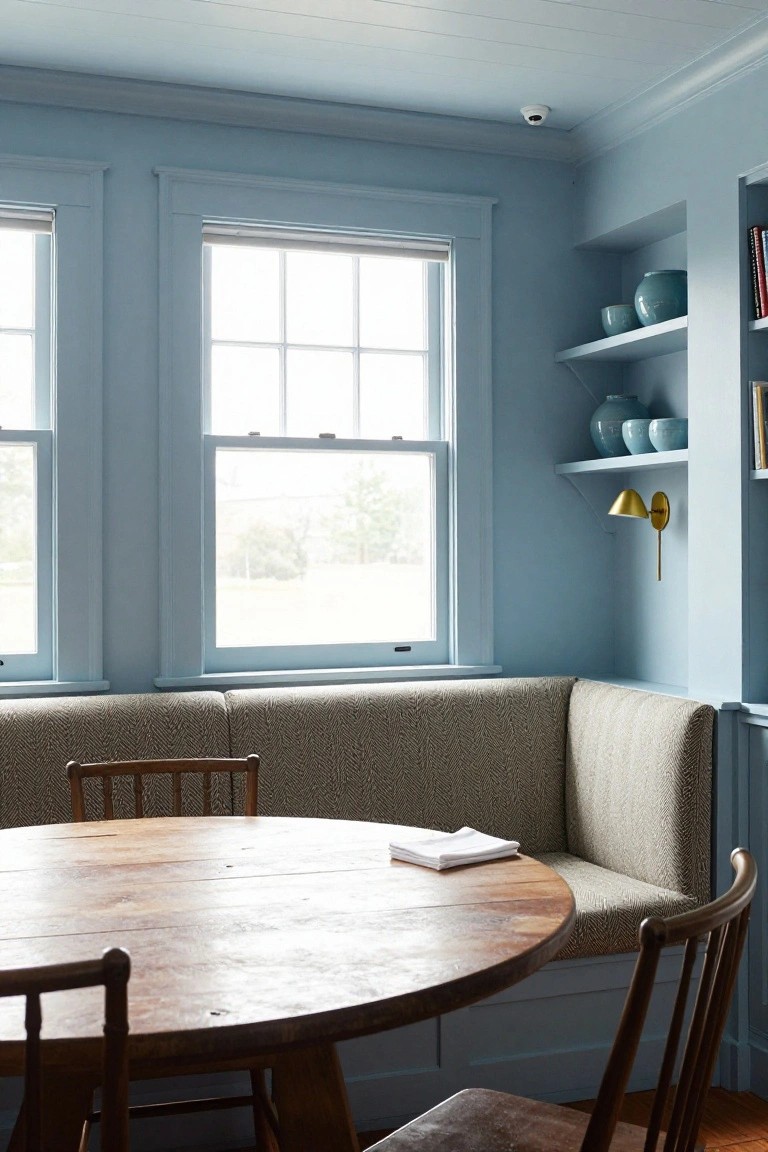
Pale blue walls like these work well in colonial homes because they bounce light around the room. With big windows nearby, the color stays soft and airy all day. It nods to traditional styles but feels fresh, especially against wood trim and simple furniture.
Use this shade in a breakfast nook or small dining area. It suits older houses with lots of natural light. Go easy on darker accents so the blue can shine. Wood chairs and a textured banquette keep things grounded.
Navy Blue Walls with White Wainscoting
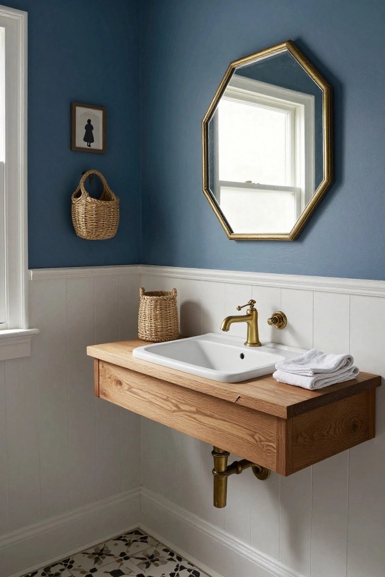
Navy blue on the upper walls over crisp white wainscoting brings a colonial vibe that’s cozy but not dark. The deep color adds some weight to the room without closing it in. That strong line where they meet keeps things tidy and pulls your eye up.
This setup fits powder rooms or small baths best. Pair it with natural wood like the oak vanity to warm it up. Stick to bright white on the lower half so the navy stays punchy. Skip it in big open spaces unless you want bold contrast.
Deep Green Paneled Walls
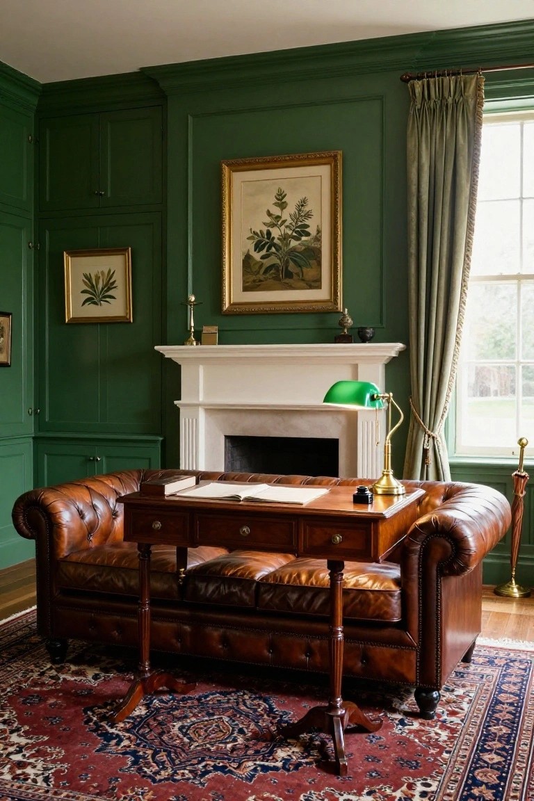
Deep green paint on paneled walls like this turns a simple study into something with real presence. It covers the walls and built-in cabinetry here, giving the whole room a cozy, lived-in feel that fits right into colonial style. The shade is rich but not overpowering. Paired with leather seating and wood tones, it makes everything look pulled together without trying too hard.
You can pull this off in a home office or library where you want warmth without going too dark. Pick a green with some blue undertones to keep it fresh, and test it in your light first… rooms facing north might need a touch more gray. It suits older homes with moldings already in place. Just balance it with lighter floors or rugs so the space stays open.
Soft Blue Kitchen Cabinets
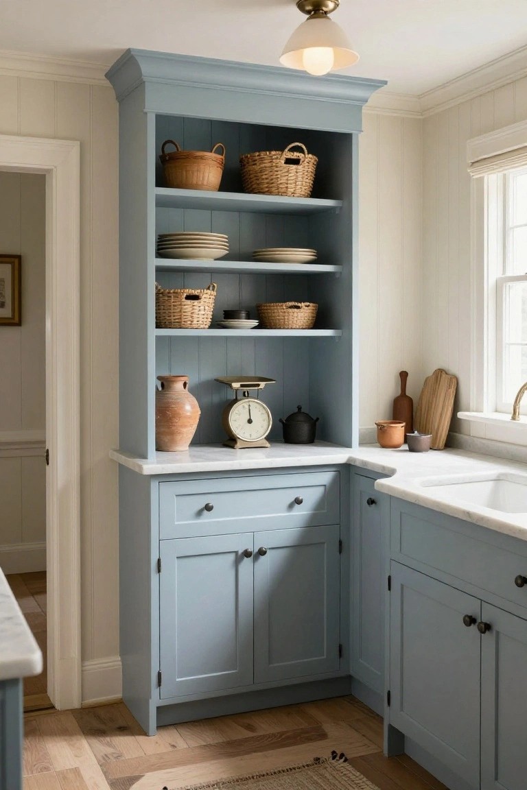
A soft blue paint on these shaker-style cabinets brings a quiet coastal touch to a colonial kitchen. It feels fresh but still nods to tradition, especially with the open shelves stacked with baskets and simple pottery. The color settles nicely against white trim and wood floors without overwhelming the room.
This works best in older homes or spaces with lots of natural light. Pair it with marble counters for contrast, and keep upper shelves light to avoid a heavy look. Go for a muted blue, not too gray or bright, so it stays cozy year-round.
Sage Green Trim in Colonial Entryways
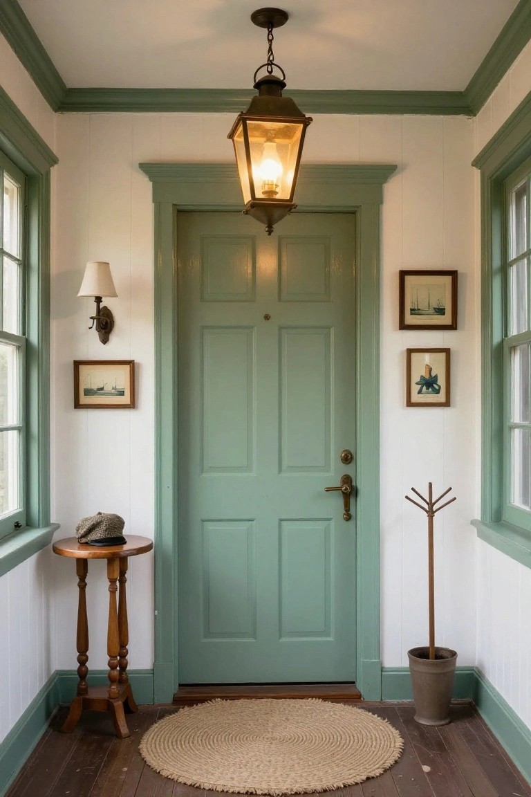
Sage green paint on doors and trim gives colonial interiors a gentle, fresh update. It works so well against white paneled walls, like in this entryway with its simple lantern light overhead. The color feels calm and ties into wood floors without overpowering the space.
Use it for foyers or hallways in older homes. Pick a soft shade that isn’t too yellow or blue. It suits spots with lots of natural light… keeps things welcoming right from the front door.
Deep Blue-Gray Walls Warm Up Colonial Rooms
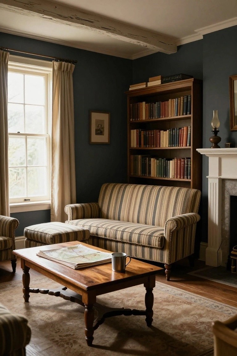
A deep blue-gray paint like this turns a plain colonial sitting room into a spot you actually want to linger in. It soaks up the light from tall windows just right, making the space feel snug without being dark or closed off. Wood bookshelves full of books stand out nicely against it, and that striped sofa adds some pattern without fuss.
Use this color in a den or reading corner where you have good natural light and wood details already. It suits older homes with beams or trim that echo the tone. Pair it with warm metals on lamps and textured rugs to keep the room lively. Skip it in big open areas, though. It shines in compact spots.
Sage Green Vanity Cabinets
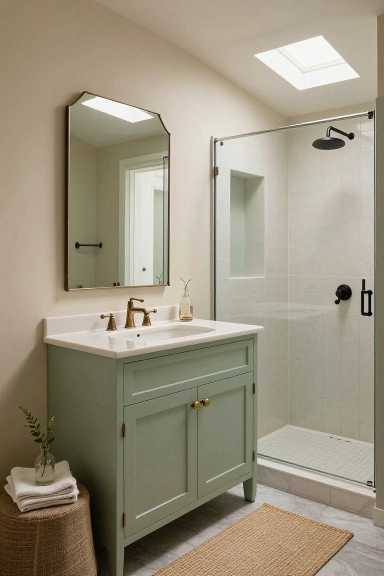
A soft sage green on bathroom vanity cabinets brings a quiet freshness to neutral spaces. Here it stands out nicely against beige walls and white tiles without taking over. That gentle green hue calms things down. It fits right into colonial-style homes that lean on classic whites and soft tones.
Paint your cabinets this color if you have a small bath or powder room. It pairs easy with brass faucets and hardware for a bit of shine. Stick to lighter walls so the green pops just enough. Avoid going too dark… it might shrink the room.
Frequently Asked Questions
Q: How do I test these colonial paint colors before committing to a whole room?
A: Grab large sample cards or pint-sized testers from your paint store. Slap them up on the walls in different spots and check them morning, noon, and night. Live with them for a few days to see how the light changes them.
Q: Will these shades work in a room with lots of natural light?
A: Bright colonial colors like soft blues and warm taupes shine in sunny spaces. They keep the room feeling airy without washing out. Pick one a shade deeper if your windows flood the place with light.
Q: What trim color goes best with these wall ideas?
A: Crisp white trim makes every colonial hue pop clean and classic. Paint it semi-gloss for easy wipe-downs. And test a sample next to your wall color first.
Q: Can I mix these colonial paints with my modern furniture?
A: Pair them with sleek pieces for a fresh twist on tradition. The muted tones ground bold furniture without clashing. Start small, like an accent wall.
