
I’ve noticed over the years that traditional rooms only truly settle when their colors layer quietly, letting natural light reveal the furniture and rugs underneath.
Bold schemes might look sharp in photos, but they wear thin fast in spaces where families actually gather and live.
A good palette hits that balance right away.
Walls and woodwork catch the eye first, so starting there with restrained tones makes the whole room function smoother.
I’ve bookmarked a few of these for my next project, especially ones that adapt well to older homes with uneven light.
Navy Sofa in Neutral Tones
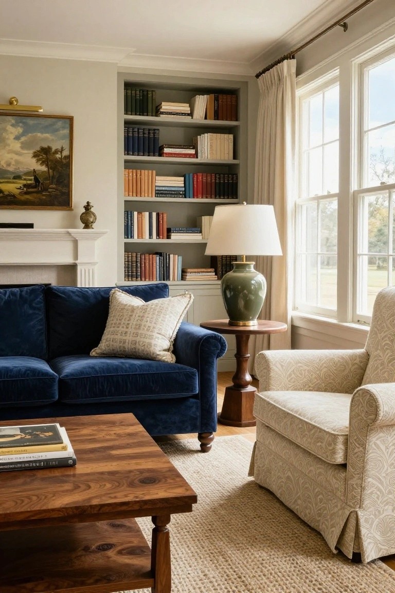
A navy velvet sofa like this one brings a touch of depth to a mostly neutral living room. Pale gray walls and built-in bookshelves stay light, while the deep blue upholstery adds richness without taking over. Wood pieces warm it up, and everything feels settled and traditional.
Try this in a formal sitting area where you want some color but not a lot of fuss. Pair the navy sofa with a cream chair and wood table, and let big windows bring in light. It suits older homes with classic details. Skip busier patterns on other furniture, though… keeps the calm going.
Sage Green Kitchen Cabinets
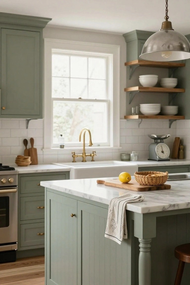
Sage green cabinets give this kitchen a quiet, steady feel. The soft color on both uppers and lowers works against white subway tile and marble counters. Brass faucet and hardware add just enough shine without pushing things too bright. It’s a traditional look that stays easy on the eyes.
Try it in older homes or spaces with good natural light. Paint cabinets in a muted green like this, then keep walls and counters light. Wood shelves or a cutting board bring in warmth naturally. Skip bold colors elsewhere… it keeps the balance right.
Dining Room Neutrals with Navy and Green
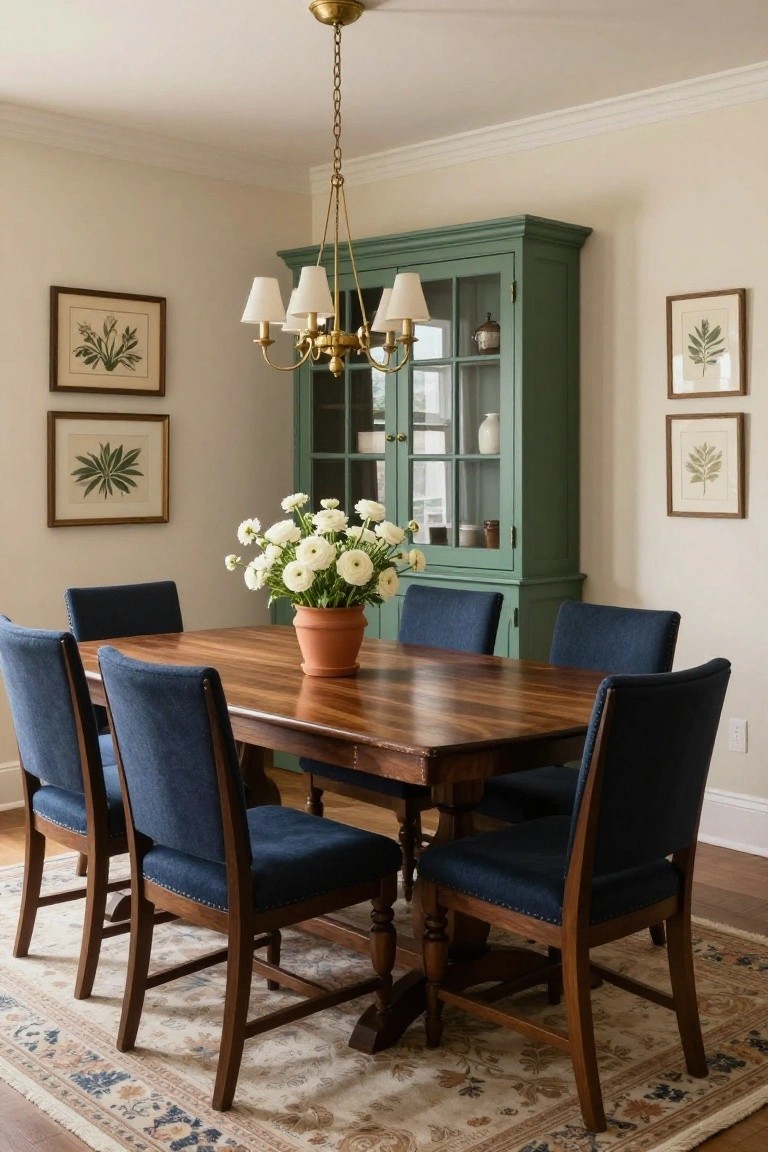
This setup keeps things calm and traditional by starting with soft cream walls that let the wood dining table take center stage. Navy chairs add some weight without overpowering, and that sage green cabinet brings in a bit of color that feels fresh but settled. The white flowers on the table tie it all together nicely, making the room feel put-together for everyday meals or company.
You can pull this off in most dining spaces, especially older homes with some character. Stick to one or two accents like the chairs or cabinet, and keep walls light to avoid a heavy look. It’s forgiving too, since the wood warms everything up… just don’t go darker on the upholstery if your light is low.
Navy Accent Wall in a Neutral Bedroom
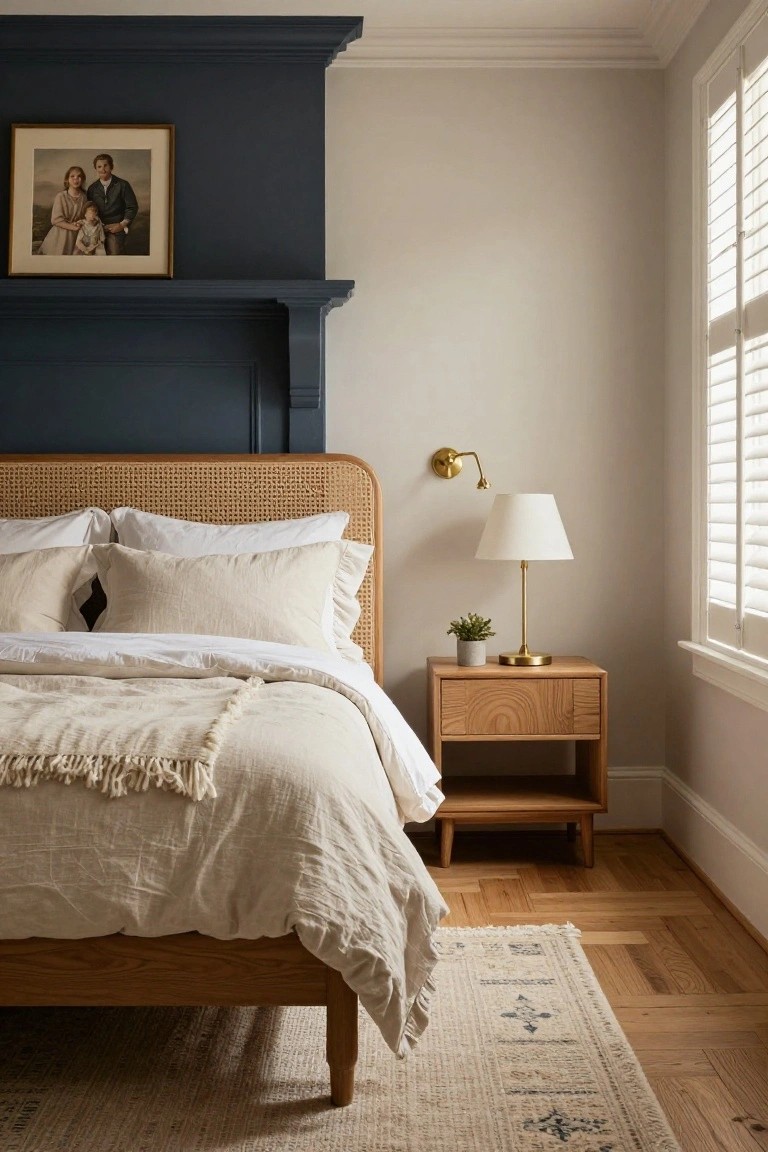
A deep navy wall behind the bed gives this room some color and weight. It stands out against the light beige walls and cream bedding without taking over. The rattan headboard and wood nightstand pull in warm tones that keep everything feeling even and calm. It’s a simple way to add personality to a traditional space.
Try this in a bedroom with good natural light. Paint just the wall at the headboard navy, then layer in linens and wood furniture in soft neutrals. It suits older homes with moldings… avoids feeling too dark if you stick to one wall. Watch the scale on bigger rooms.
Blush Pink Nursery Walls
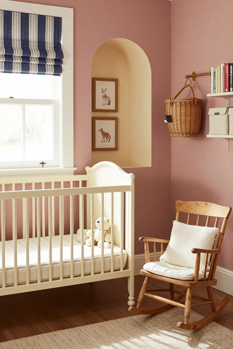
Blush pink walls give this nursery a soft, gentle feel without going overboard. The pale pink keeps things calm and pretty, especially with the white crib and wooden rocking chair pulling in lighter tones. It’s a traditional look that feels fresh and easy on the eyes, perfect for a baby’s room.
Try this in smaller spaces where you want warmth but not too much color. It suits older homes with classic trim. Just stick to creamy whites and natural woods nearby, and skip bold accents to keep the balance right.
Deep Green Walls in a Home Study
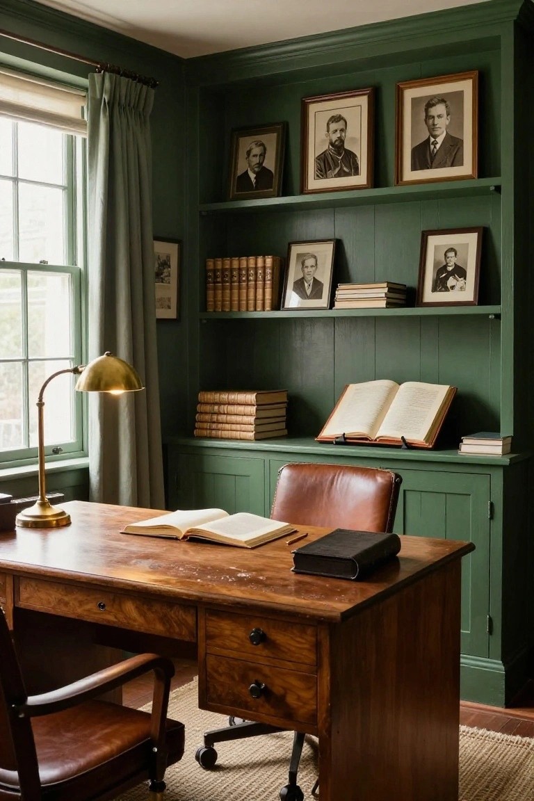
Deep green walls like these make a study feel rich and settled. They wrap the room in a calm color that nods to old libraries, but the mix of warm wood on the desk and built-in shelves keeps it from closing in. A leather chair adds that extra layer of comfort without much fuss.
This setup shines in smaller rooms with windows for light. Paint paneled walls in a deep shade, then bring in antique wood pieces and a few stacks of books. It suits traditional homes, or even a modern one wanting some classic depth… just skip busy patterns elsewhere.
Brick and Cream Mudroom Walls
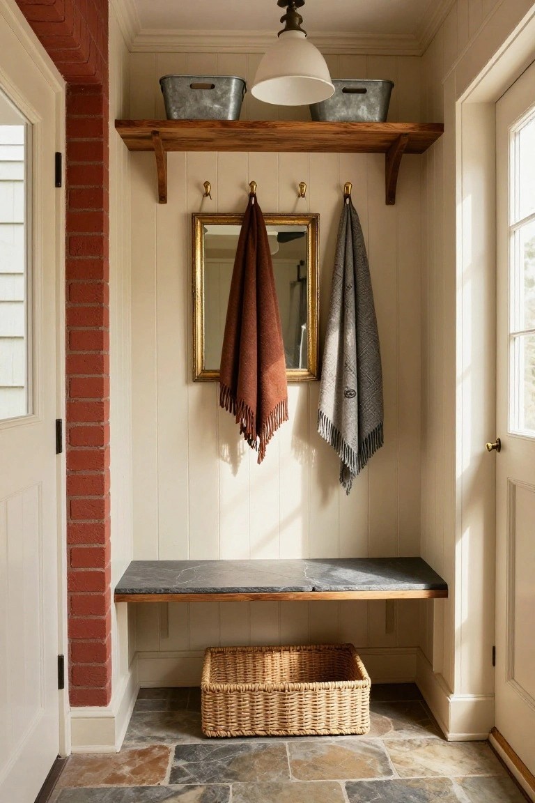
A red brick wall on one side pairs nicely with creamy paneled walls on the other. It keeps things traditional without going overboard. The brick adds just enough warmth to the soft cream, and wood shelves plus a slate bench fit right in. Those rust and gray towels on the hooks pull from the same quiet tones.
This setup works best in entry spaces where you need storage but not clutter. Try it in a mudroom or back hall off the kitchen. Stick to natural materials like the galvanized buckets and wicker basket under the bench. It suits older homes or cottages… keeps mud and coats in check without bright colors taking over.
Entry Console in Warm Wood Tones
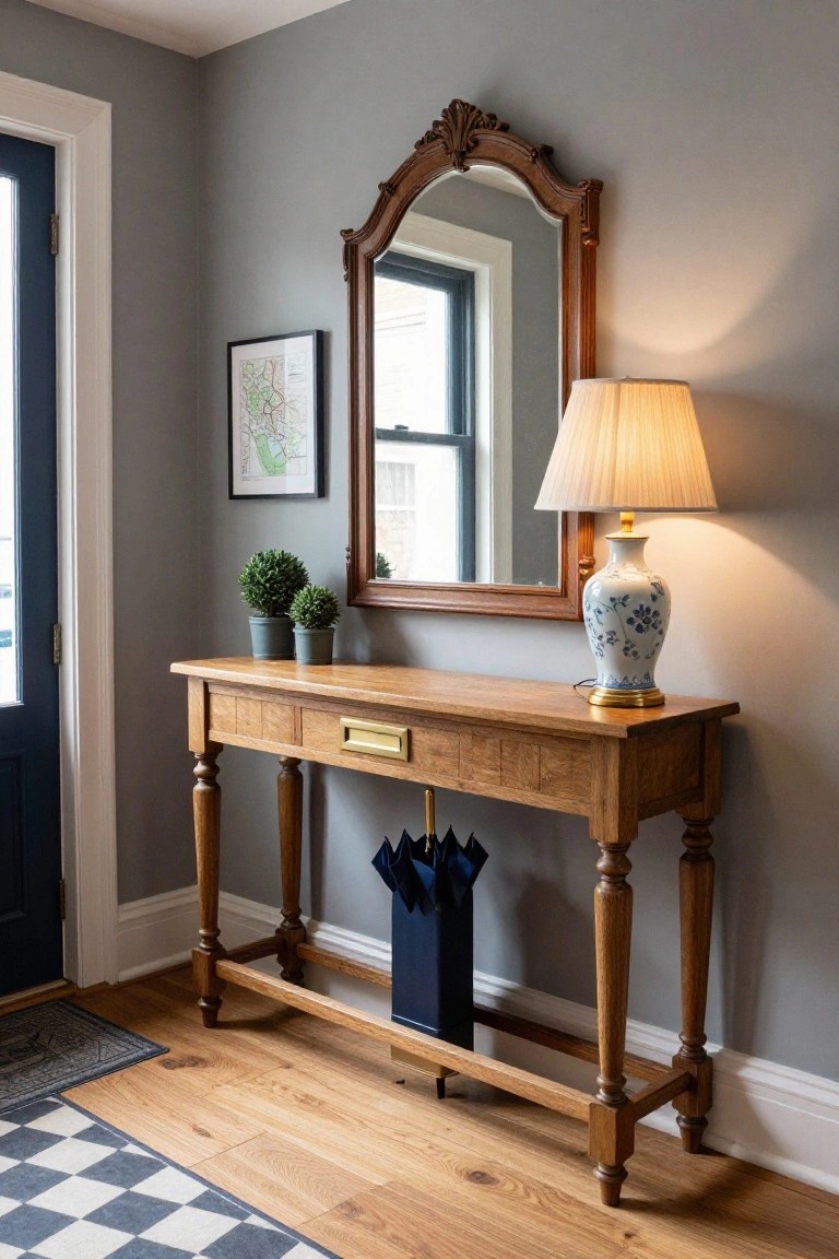
A wooden console table like this one fits right into a gray entry hall. The oak finish warms up the cool walls without clashing. It holds keys in the brass-lined drawer and keeps umbrellas handy below. That mix stays traditional and easy on the eyes.
Try it in a front hall or mudroom where space is tight. Pair with a tall mirror and a lamp for light. Works best in older homes with gray paint already in place. Just keep plants simple so the wood stands out.
Dark Cabinetry Grounds Light Powder Rooms
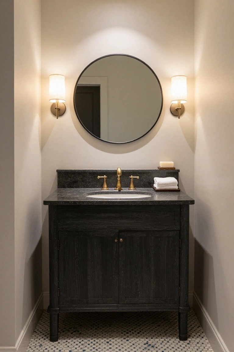
Small powder rooms can feel too stark with all light colors. A dark wood vanity like this brings some weight to the bottom half. Pale beige walls keep things open up top. That simple split creates balance. The black granite top and gold faucet tie it together without overwhelming the space.
Try this in any guest bath or hallway spot. It suits traditional homes best, especially where you want a bit of drama but nothing heavy. Stick to soft walls and maybe a round mirror. Skip dark floors if the room is tiny… keeps it easy.
Navy Walls in a Small Bathroom
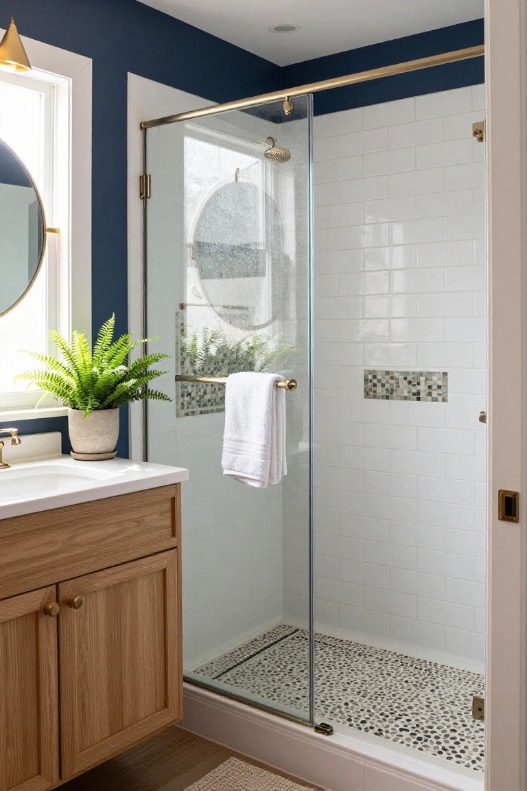
Navy walls on the upper part of this bathroom give it a cozy frame without closing in the space. The deep blue color stands out against the white subway tiles in the shower, keeping everything light and clean. A simple oak vanity below ties in natural warmth that softens the look.
This setup works best in powder rooms or guest baths where you want some personality but not too much drama. Stick to glossy white tiles and wood tones to balance the navy. Gold hardware on the faucet and towel bar adds just enough gleam. It suits older homes with traditional vibes… easy to pull off without repainting everything.
Blue Walls with White Linen Bedding
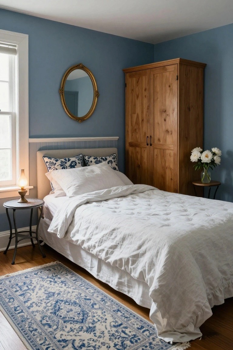
Light blue walls give this bedroom a quiet, restful feel right away. The crisp white duvet and pillows lift everything without adding busyness. A tall wood wardrobe in the corner brings in some natural warmth that fits just right.
This setup works well in older homes or any space that needs to feel bigger and calmer. Use it for a main bedroom or guest room. Stick to simple wood furniture and one or two blue accents elsewhere. Skip heavy patterns on the bedding… keeps the balance easy.
Red Booth Seating in a Neutral Kitchen Nook
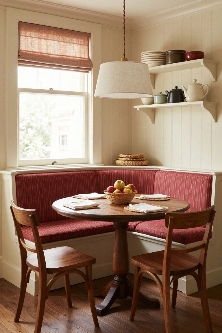
Red shows up a lot in traditional homes. But it can feel heavy if you don’t balance it right. Here a built-in booth in stripes of deep red sits against creamy paneled walls. Warm wood chairs and table keep things grounded. The result is cozy without pushing too hard. Neutrals let that red breathe and warm the space just enough.
Try this in a breakfast corner or small eating area. It works best where you want casual meals to feel special. Pair the red fabric with natural wood tones and soft off-whites. Skip anything too glossy. In older homes with good light it really settles in nice. Just measure your nook first… booths like this hug the walls tight.
Soft Grays for Laundry Rooms
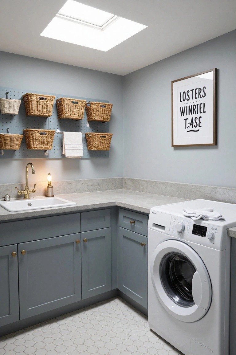
Laundry rooms often end up feeling cold or cluttered. But soft grays on the walls and cabinets change that. They keep things calm and easy on the eyes. Here, wicker baskets hang on a pegboard for storage. That natural texture warms up the gray without much fuss.
Put this palette in tight corner spaces or basements. It suits older homes with traditional vibes. Add a brass faucet for a little shine. Just skip bold colors elsewhere… they can make it busy fast.
Wood-Paneled Home Library
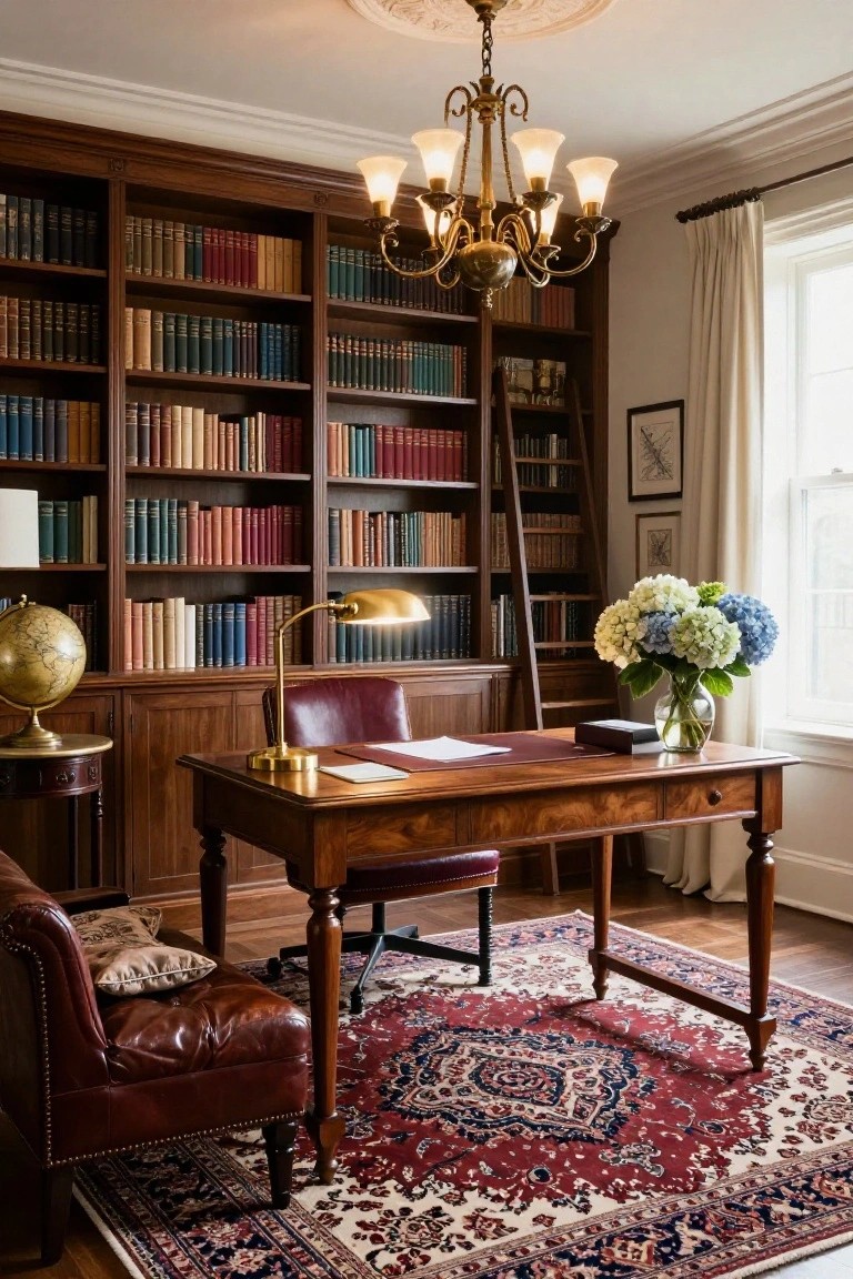
Floor-to-ceiling bookshelves in deep mahogany cover most of the walls here, giving the room its warm, traditional base color. A red Persian rug pulls the tone down to the floor, while cream walls and sheer curtains keep things open. That blue hydrangea vase offers a cool touch without shifting the whole feel.
This palette fits right into a home study or reading nook, especially where you want focus without distraction. Go for walnut or cherry woods on shelves and desk, then echo the red in upholstery or flooring. Natural light from a window helps the most, and it suits older homes or any space aiming for quiet comfort.
Soft Sage Pantry Cabinetry
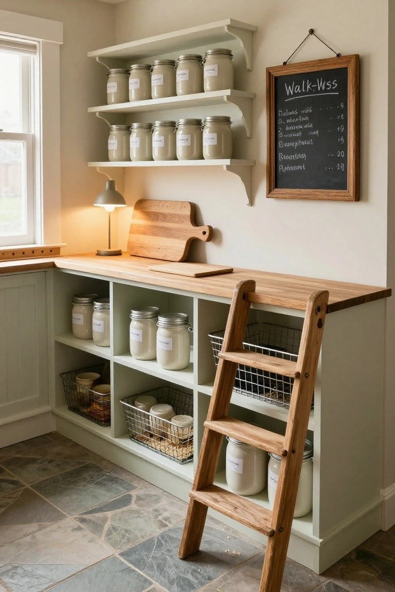
This pantry setup uses soft sage green cabinets that keep things calm and traditional without any bold clashes. The color pairs nicely with wooden countertops and a ladder that slides right into place. White mason jars on open shelves add simple storage that feels organized but not fussy. It’s a good way to handle bulk goods like flour and grains in a small corner spot.
Try this in a kitchen nook or mudroom where you need reachable high storage. The sage works best in rooms with good natural light so it stays fresh, not dingy. Pair it with oak or pine accents to warm it up, and skip glossy finishes that might feel too modern. Watch the scale on bigger walls, though. It can look washed out if the green isn’t quite right for your light.
Fabric Storage on Open Shelves
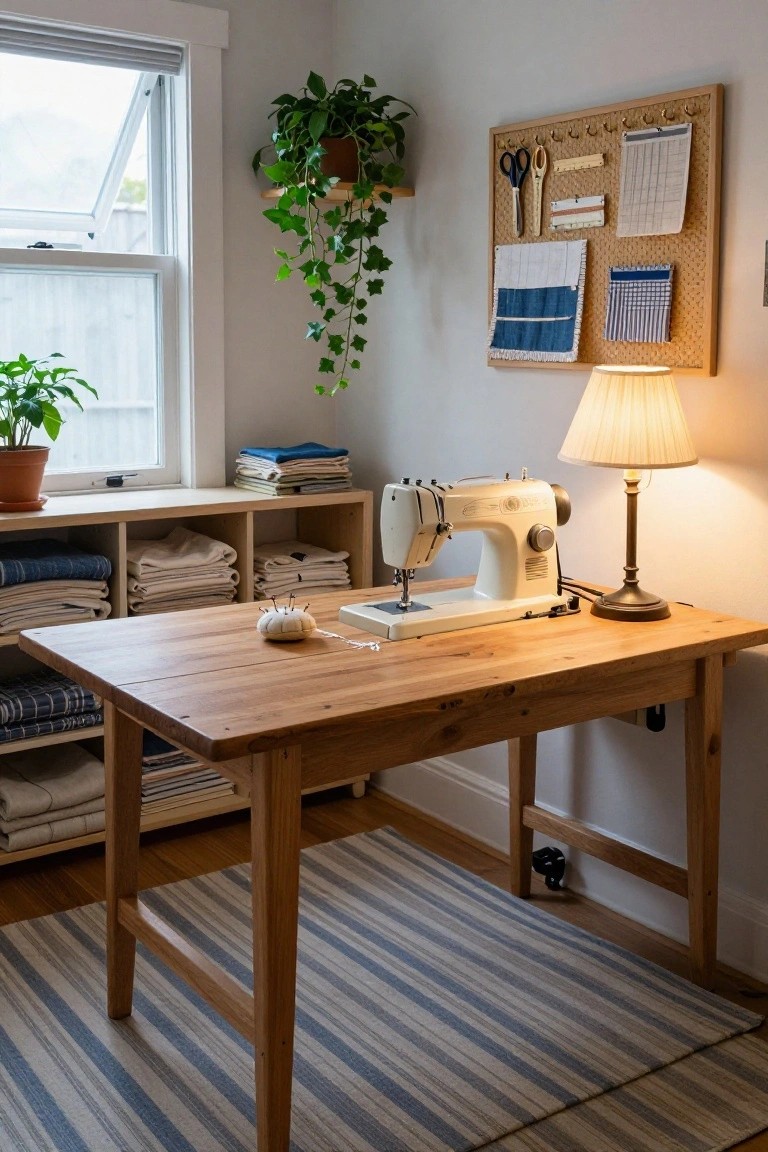
Open shelves stocked with folded linens and fabrics make a sewing room practical and easy to use. Here the stacks in soft whites, pale blues, and naturals line wooden cubbies right next to the workspace. That keeps colors balanced and the room from feeling stuffed. The wood tones pull it together without any bold contrasts.
Try this in a spare corner or small office where you craft or sew. It fits older homes with wood floors or trim. Fold pieces by shade for that calm look, and leave space between stacks so dust doesn’t build up. A few plants nearby help too.
Pale Teal Walls for Quiet Corners
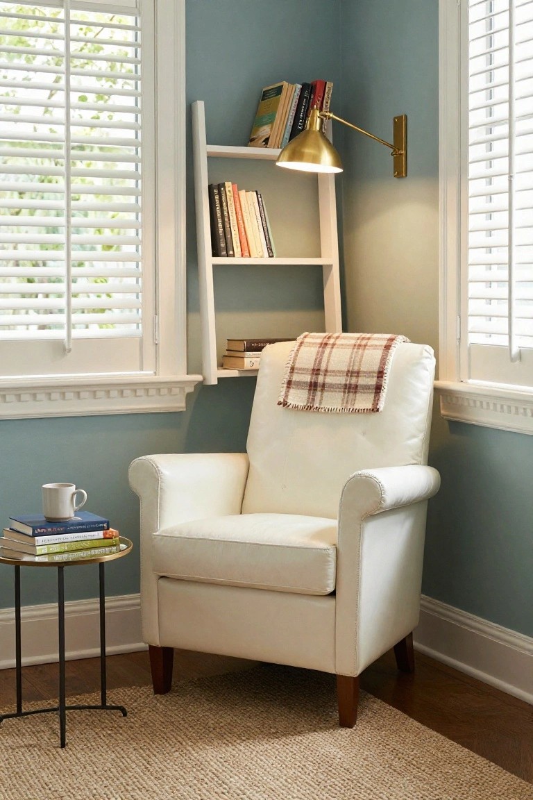
Pale teal walls like these give a room a gentle, traditional feel without pushing too hard. They work well with a white leather chair and wood accents on the furniture legs. That combo keeps the space open and easy on the eyes. A plaid throw adds just enough pattern.
Put this in a living room corner or near a window where you want a spot to read or relax. Layer in books on a simple shelf and a brass lamp for light. It fits older homes best, especially if you like calm over bold colors. Skip busy patterns elsewhere to let the teal shine.
Pale Mint Walls with Oak Wood
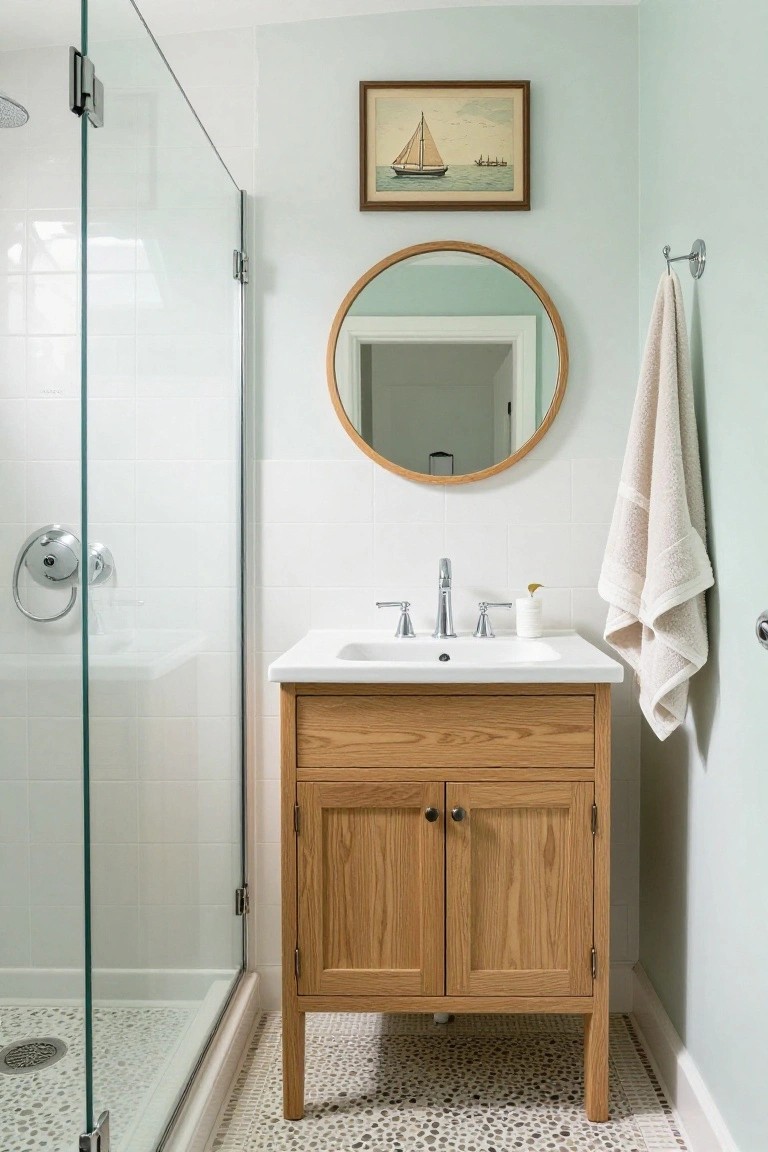
Pale mint green walls bring a soft, restful vibe to this bathroom. They pair nicely with the warm oak vanity, keeping the look balanced and easy on the eyes. White tiles and simple fixtures let the colors do their thing without overwhelming the small space.
Try this in compact bathrooms or powder rooms where you want calm and a touch of tradition. It suits older homes with white tilework, or any spot needing gentle color. Stick to natural wood finishes so it stays cohesive… and avoid busy patterns nearby.
Cream Walls with Wood Stairs
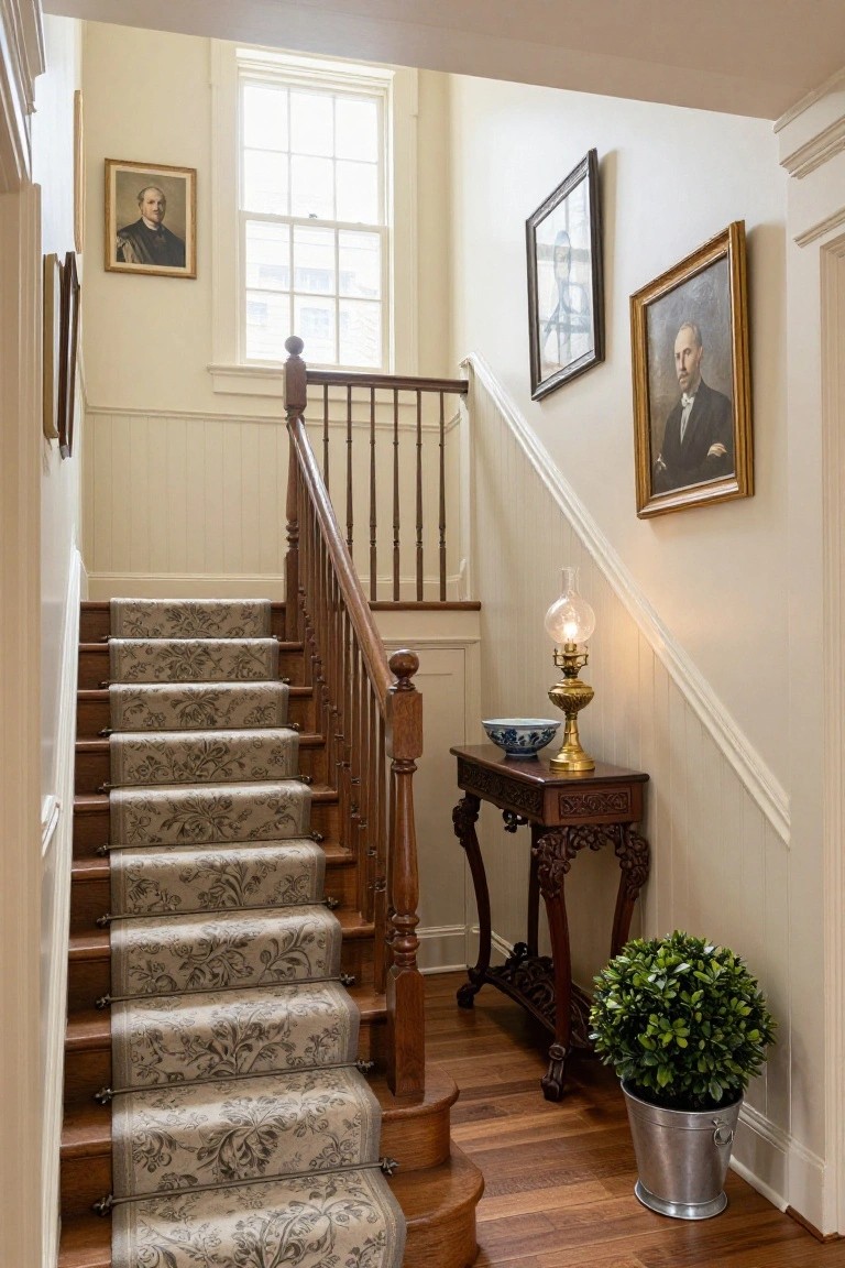
A soft cream on the walls and wainscoting pairs perfectly with natural wood stairs like these. It keeps the space feeling open and traditional without any heavy colors taking over. That light runner on the steps adds a bit of pattern but stays subtle enough not to compete.
This setup works best in older hallways or entry areas where you want calm flow from floor to floor. Use it in homes with some historic charm. Just stick to warm woods and avoid dark paints nearby, or it might feel closed in.
Built-In Corner Bench Storage
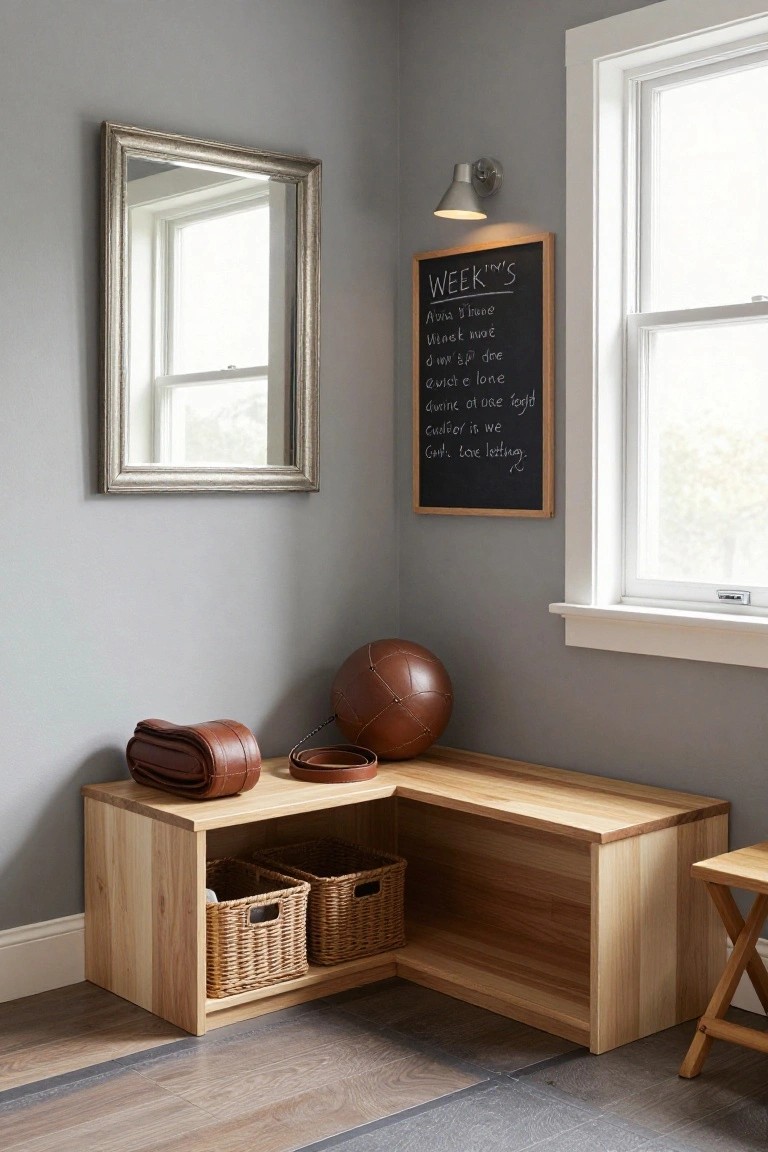
A corner bench with open shelves underneath turns wasted space into smart storage. Light wood keeps it simple and warm against gray walls, while wicker baskets hold everyday items like bags or sports gear right where you need them. It’s practical without feeling crowded.
This setup fits tight entryways or mudrooms best, especially in family homes. Build it to match your flooring, add a cushion if you want seating… and it stays useful for years. Skip fancy finishes to keep costs down.
Soft Blue Walls for Traditional Rooms
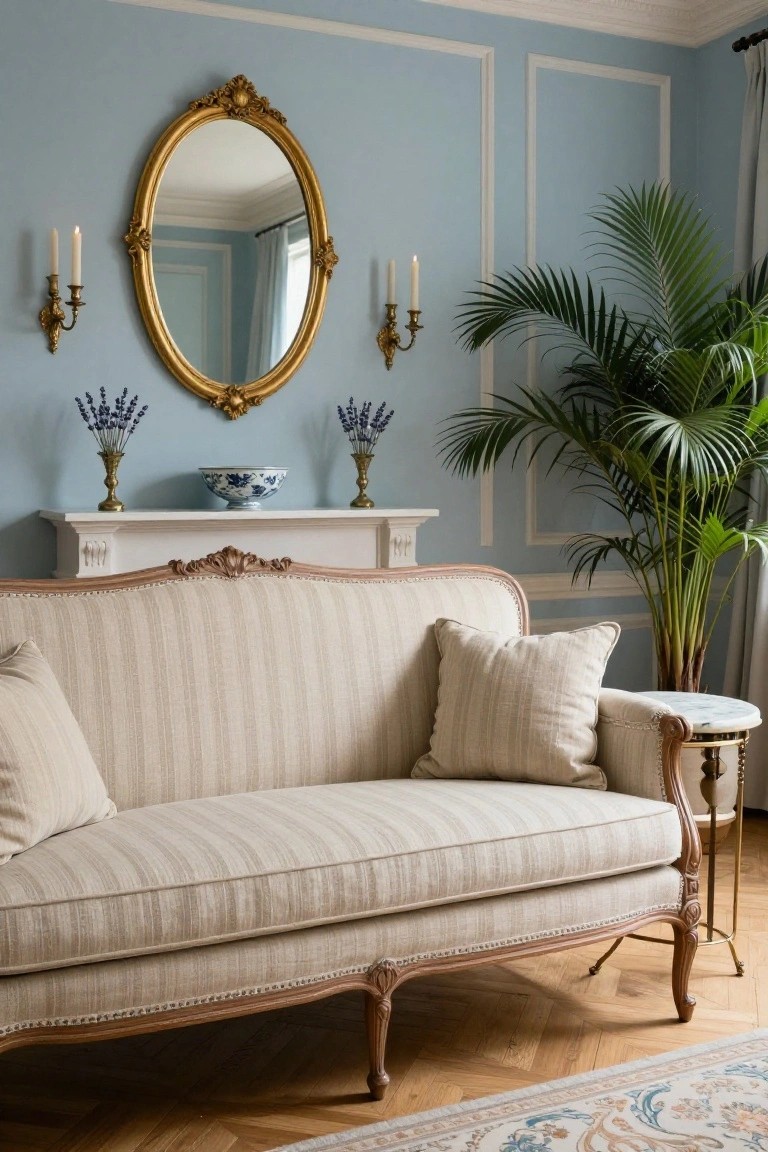
Pale blue walls like these give a traditional living room a calm feel right away. They set off cream-colored furniture without making things too chilly. Gold accents on the mirror and candelabras add just enough warmth, and a few lavender stems keep it fresh.
This works best in spaces with high ceilings or good natural light, like a front parlor. Go for striped cream upholstery on sofas and a tall plant for height. Skip bold colors elsewhere… it stays balanced that way.
Built-In Closet Bench
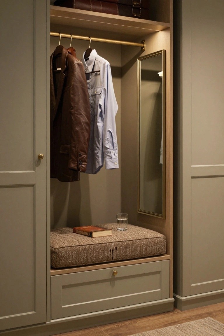
A built-in bench like this one turns a plain wardrobe into something more practical. Tucked right at the bottom with a cushioned top, it gives you a spot to sit while you get dressed or sort shoes. The neutral fabric and simple wood frame keep it from taking over the space. And that little drawer underneath? Perfect for stashing small things.
Put one in a walk-in closet or even a smaller bedroom setup. It suits traditional homes where you want function without fuss. Just match the upholstery to your room’s tones, like a soft beige here, and add a brass pull for a touch of warmth. Skip anything too busy on top… a book or folded scarf works fine.
Sage Green Walls for Calm Bathrooms
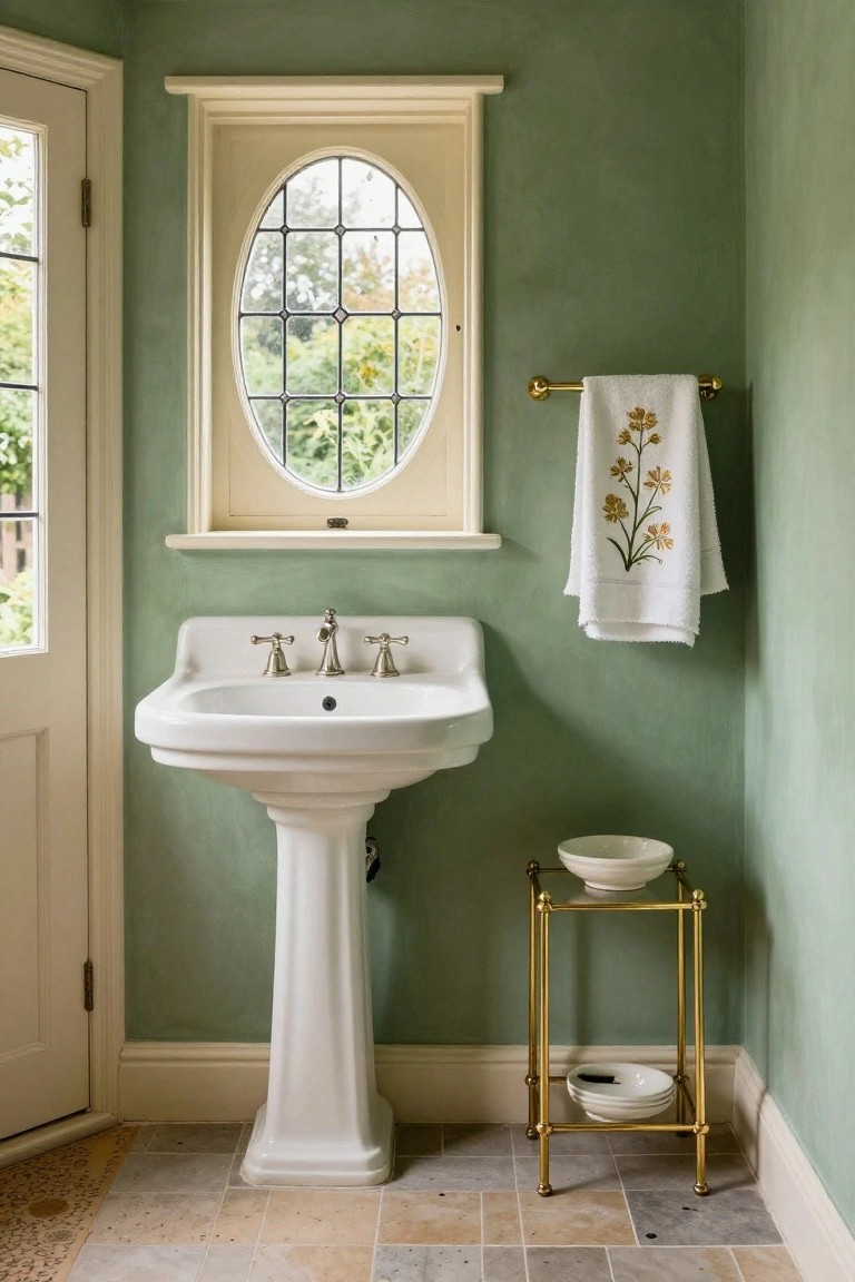
A soft sage green on the walls gives this traditional bathroom a gentle, nature-inspired feel without taking over. The white pedestal sink and gold towel bar keep things crisp and balanced. It’s one of those colors that nods to classic style but stays easy on the eyes, especially with light coming through the oval window.
This palette works best in small powder rooms or guest baths where you want tradition that feels fresh. Pair it with white fixtures and metallic accents like the gold hardware here. Avoid going too dark on the green, or it might close in. Add plants nearby to tie it all together.
Frequently Asked Questions
Q: My living room has oak floors. Which palettes pair best?
A: Go for warm neutrals like soft beiges or muted taupes. They echo the wood’s golden undertones perfectly. Layer in sage or rust accents for depth.
Q: How do I test a palette before committing to paint?
A: Grab sample pots and paint big swatches on poster board. Move them around the room at different times of day. Live with them a week to see how they feel.
Q: Can these palettes freshen up a small bathroom?
A: Pick lighter versions to keep it airy. Paint walls in the palest neutral and add color via towels. Texture on tiles brings interest without crowding.
Q: What if I want a touch more drama… without overwhelming?
A: Deepen one accent shade from the palette. Use it on a single chair or vase. And stop there.