
I’ve noticed that soft Danish pastels really shine in everyday rooms where natural light filters through windows all day. In my own living room, I tested a few of these muted shades on the walls, and they made the space feel wider and more settled, even with kids’ toys scattered around. People usually pick up on the freshness first, the way those colors gently lift the mood without demanding attention from every corner. These setups function best when you balance them with natural wood pieces and airy curtains that let the tones play off each other. A couple ideas here might just work for that awkward nook in your home.
Blush Pink Sofa in a Serene Living Room
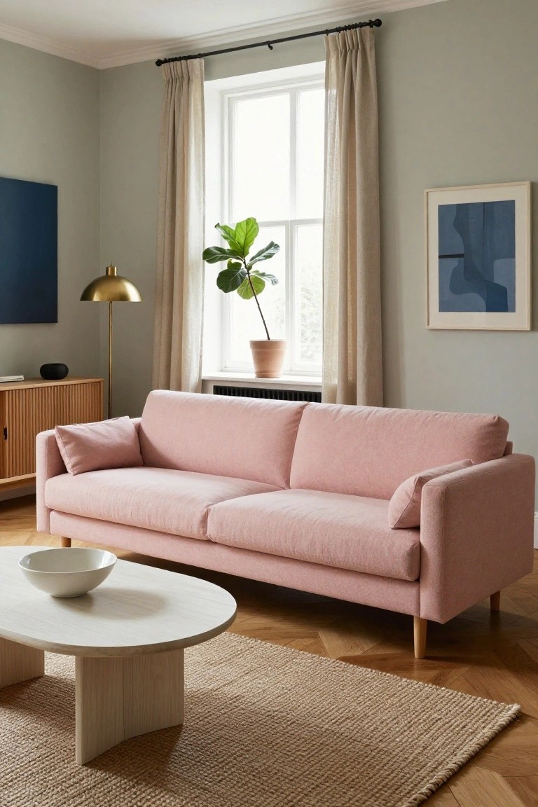
A blush pink sofa like this one sits right in a light room and gives off that fresh, calm Danish feel without trying too hard. The soft color picks up on pastel walls and keeps everything easy on the eyes. Paired with simple wood legs and cushions, it warms up the space just enough. Notice how it works against the pale green walls here.
Put one in your own living room if you want a gentle pop of color that plays nice with neutrals and plants. It suits apartments or cozy homes best, especially near windows for that natural light. Skip bold patterns on it though. Keep pillows plain so the pink stays the star.
Ruffled Pastel Bedding
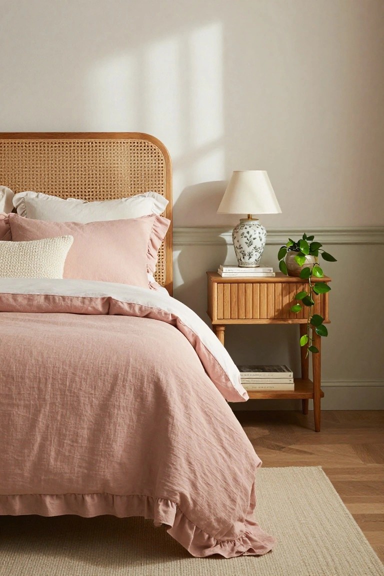
A ruffled duvet in soft blush pink linen makes this bedroom feel calm right away. The texture from the gathers adds a little movement without busyness, and it plays nice against the natural rattan headboard. That combo keeps things fresh, like a Danish take on cozy.
Put this in a main bedroom or guest space where you want quiet comfort. Layer plain white pillows on top, stick to wood tones nearby, and it works in most homes. Just skip heavy patterns elsewhere so the ruffles stay the focus.
Sage Green Kitchen Cabinets
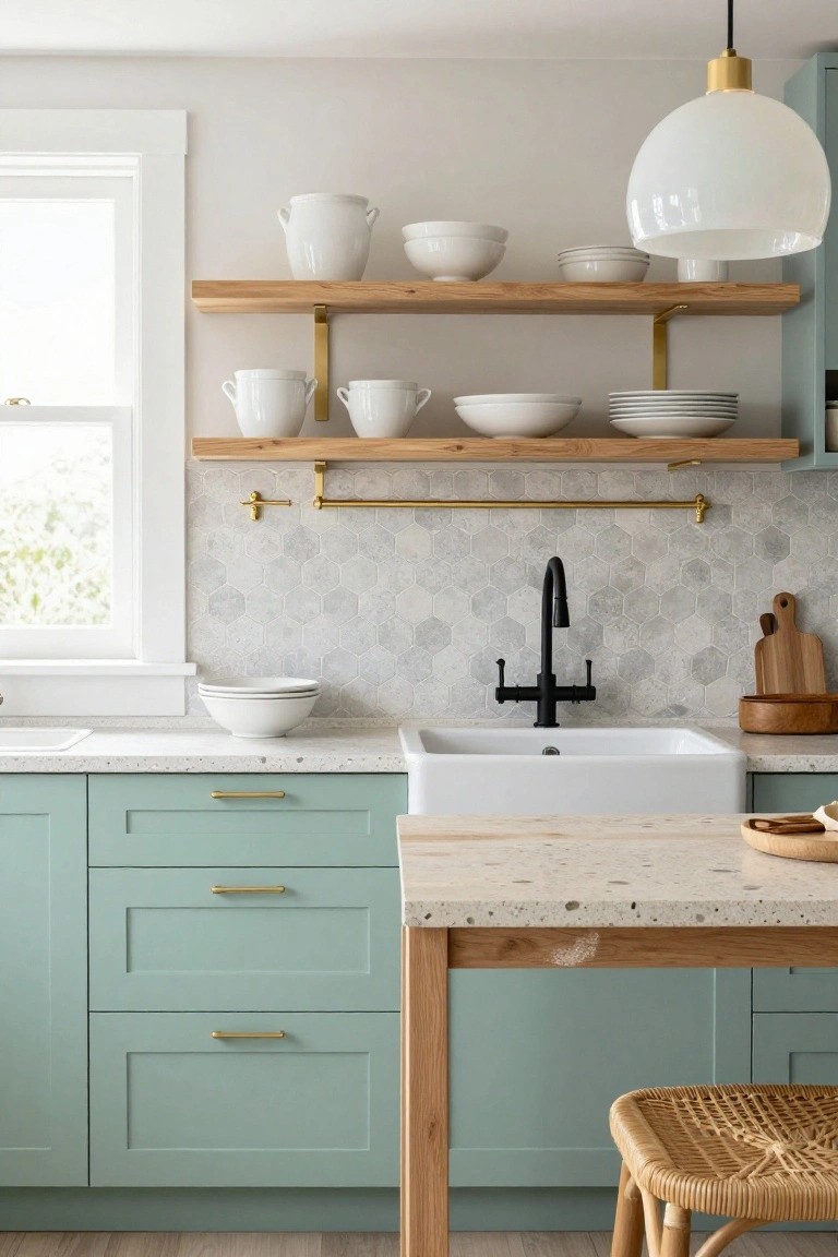
Soft sage green cabinets like these run along the base of the kitchen. They sit under a white sink and light counters without taking over the room. White bowls and jars stack simply on oak open shelves above. Gold pulls on the drawers tie it together quietly. This setup keeps everything calm and fresh. No bold colors to fight.
Try it in older homes with good natural light. The green works on both base and tall cabinets if you want. Pair with white uppers or open storage to stay open. Skip glossy paints. Matte keeps dust from showing too much.
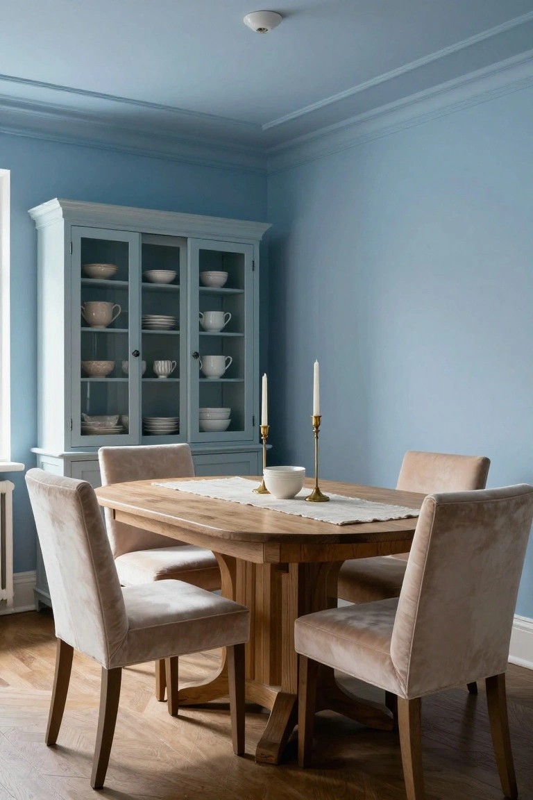
Soft Blue Shiplap Walls for Dining Rooms
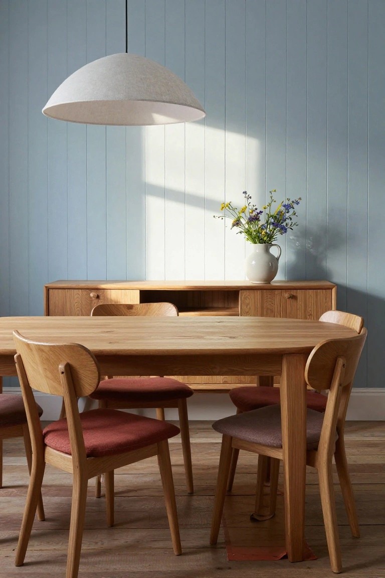
Pale blue shiplap walls like these bring a quiet calm to wooden dining setups. The soft color bounces light around without overwhelming the space, and it lets warm oak furniture stand out just right. That sunlight filtering through adds to the fresh feel, making meals here seem relaxed.
You can pull this off in most homes with a simple coat of paint on paneled walls. It suits compact dining nooks or open kitchens best, especially where you want wood tones to shine. Skip bold accents though. Keep vases or lamps simple to match the easy vibe.
Pastel Mint Crib in a Serene Nursery
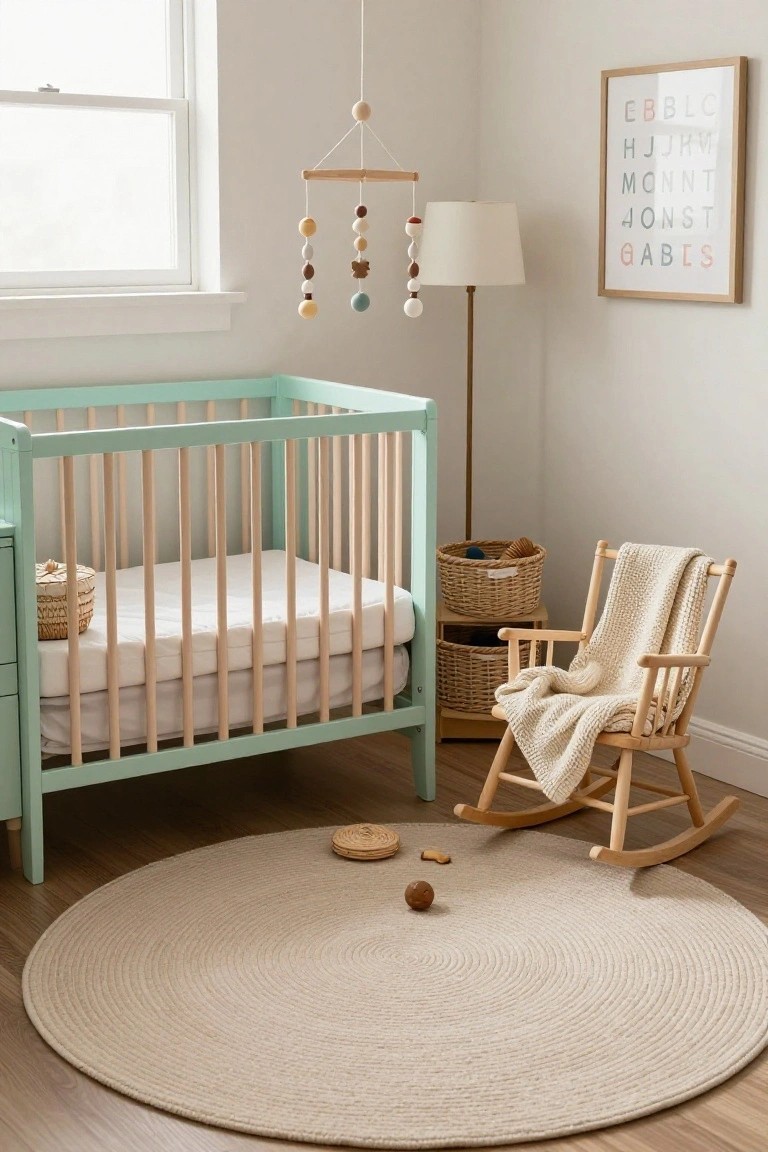
A mint green crib like this one brings a fresh, soft touch to a baby’s room. It stands out gently against white walls and light wood floors, with natural slats that feel sturdy yet light. The rocking chair nearby adds that quiet spot for feeding or reading, all without cluttering the space.
This works well in small corners or apartments where you want calm over busy patterns. Go for similar pastel wood furniture in homes with neutral bases. Keep toys minimal on the rug, and it stays practical for everyday use.
Sage Green Built-Ins for a Calm Desk Nook
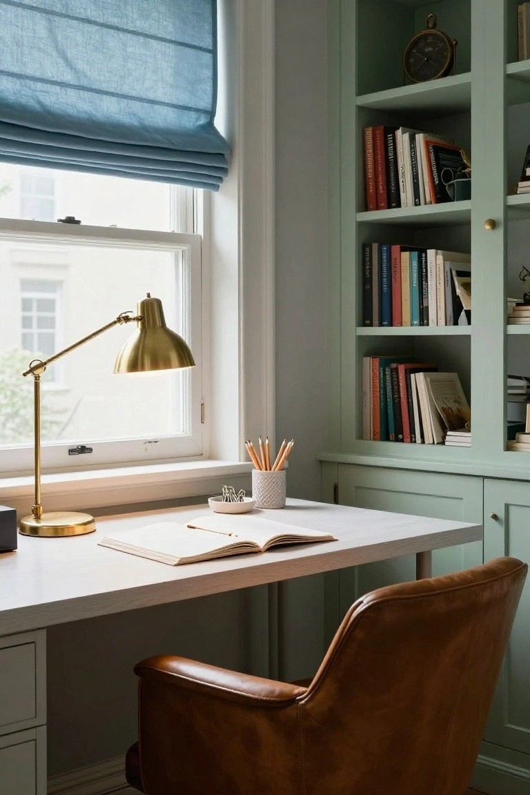
Soft sage green on built-in cabinets and shelves turns a simple desk into a peaceful spot. The color feels fresh and easy on the eyes. Books sit there without cluttering up the look. A white desk in front stays open and ready for work.
This works well in tight corners or alcoves. Pick a pale green finish that reads almost gray in low light. Pair it with basic wood furniture. It suits any home wanting a quiet reading or writing area… just don’t overload the shelves.
Soft Green Tiles for a Fresh Bathroom
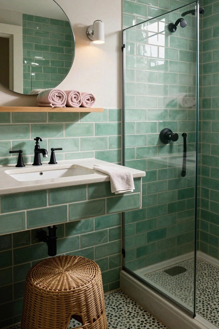
Soft green subway tiles cover the walls in this little bathroom. They make the space feel calm and clean. The pastel shade picks up light nicely. It turns a plain room into something spa-like but simple.
Use these tiles in a small bath or guest powder room. Go wall-to-wall like here. Add white sinks and black fixtures for contrast. Wood shelves keep it warm. Skip busy patterns elsewhere… this works best in tight spots.
Pastel Rattan Bench for Entry Storage
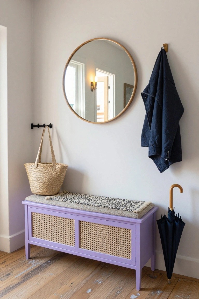
A rattan bench painted in soft purple makes a great spot to drop bags or shoes right when you walk in. The woven front panels and cushioned top keep things practical but light. Paired with pale walls, it brings a bit of color without taking over the space. That’s the Danish touch. Calm and useful.
Put one near your front door in a small hallway or mudroom. It works in older homes with wood floors, holding extra blankets inside or umbrellas nearby. Just keep the cushion simple, maybe with a neutral or patterned throw. Avoid anything too busy. It suits apartments too, where you need storage that doesn’t crowd.
Soft Pastel Cabinets in Laundry Rooms
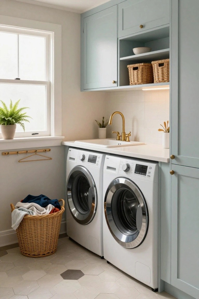
Laundry rooms don’t have to feel like chores when you go with soft pastel cabinets like this muted blue-green shade. It keeps things light and calm, especially against plain white washers and dryers. The color softens the whole utility vibe without making it look too precious.
Try this in a small mudroom or basement laundry where space feels tight. Add a few plants and wicker baskets for that lived-in touch. It suits homes chasing a Danish feel… fresh, not fussy. Just keep counters white to let the cabinets stand out.
Blush Pink Lower Walls in the Bathroom
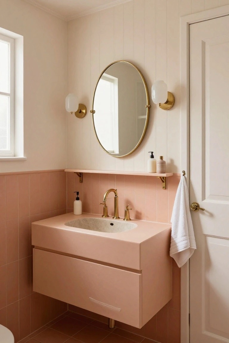
A soft blush pink on the lower half of the bathroom walls shows up nicely here with matching tiles and a floating vanity. It makes the small space feel open and calm without being too bold. That gentle color pulls from Danish pastel ideas and pairs easy with creamy upper walls.
Put this in a powder room or guest bath where you want quiet color. Use pale pink tiles up to chair height then keep the rest white. Gold faucets and sconces add a little shine. It suits apartments or cottages best. Stick to matte finishes so it stays fresh.
Soft Purple Walls in Attic Bedrooms
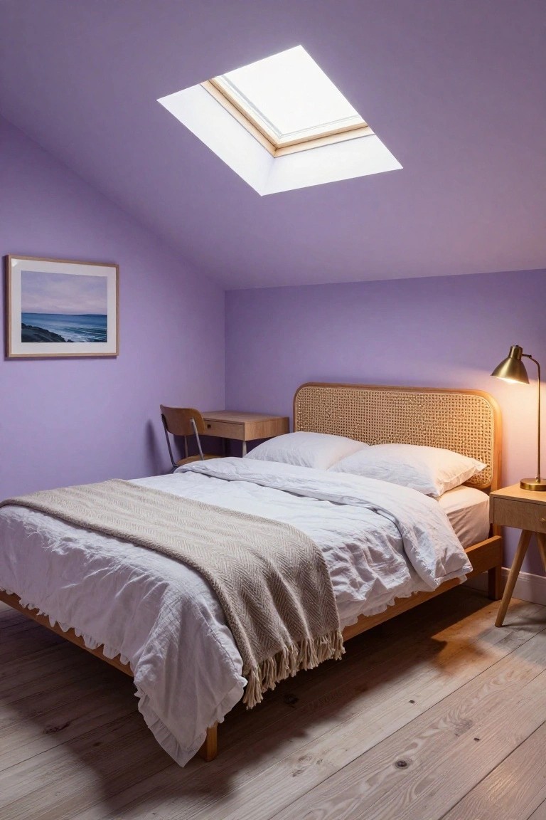
Soft purple walls turn a tucked-away attic bedroom into something fresh and restful. The gentle shade bounces light around from the skylight, making the sloped ceiling feel less confining. It pairs nicely with natural wood tones on the bed frame and floors, keeping things light without going too stark.
This works best in smaller upstairs rooms where you want calm without clutter. Stick to white linens and simple wood pieces to let the color shine. Avoid darker accents up there, or it might close in fast.
Built-In Window Seat by the Fireplace
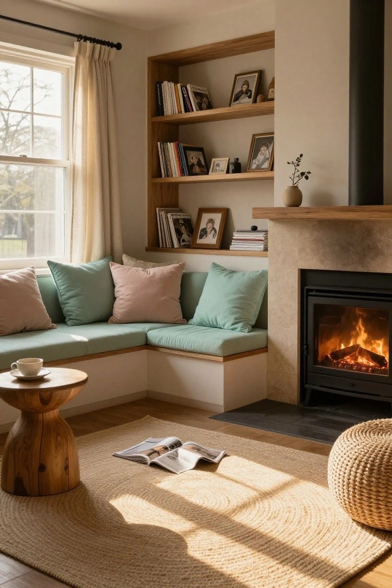
A built-in window seat like this one fits right into the corner next to the fireplace. Soft teal cushions with a couple of pink ones make it comfy for reading or just sitting quiet. The wood shelves nearby hold books and a few photos, keeping everything handy and relaxed.
This kind of seating works best in living rooms with good window light. It suits smaller homes where you want a calm spot without taking much floor space. Go for natural wood and pastel fabrics to keep that fresh, easy feel… just watch the cushions don’t slide off without a back lip.
Cozy Kitchen Banquette Nook
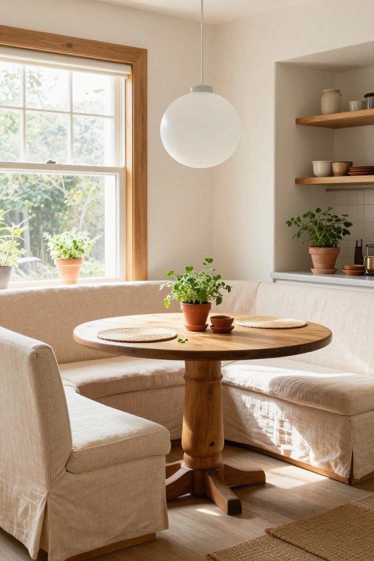
A banquette like this turns a corner into a real sitting spot. Soft beige linen covers the benches, wrapping around a plain round wood table on a sturdy pedestal base. Herb pots sit right on the table and sill, keeping things fresh and lived-in. It feels calm because the curves and cushions make everything softer, especially with light coming through the window.
This works best in a kitchen or breakfast area where space is tight. Build it into an unused corner, pick natural wood for the table, and layer on simple plants. Skip fussy chairs, they just crowd it. Any home can pull this off for casual meals that don’t feel rushed.
Mint Green Attic Bedroom
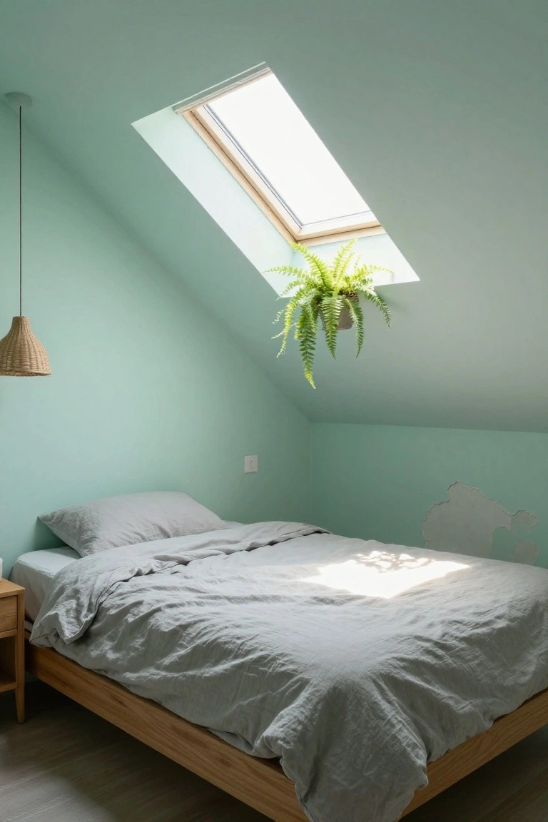
A soft mint green paint on sloped walls turns a tight attic space into something calm and airy. The color picks up the light from the skylight nicely, and that hanging fern up top keeps things fresh without crowding the room. It just feels restful.
Try this in older homes where you have those tricky ceiling angles. Stick to simple wood beds and linen bedding to let the green shine. Skip busy patterns. It suits small sleeping nooks best.
Soft Blue Walls and Sofa Setup
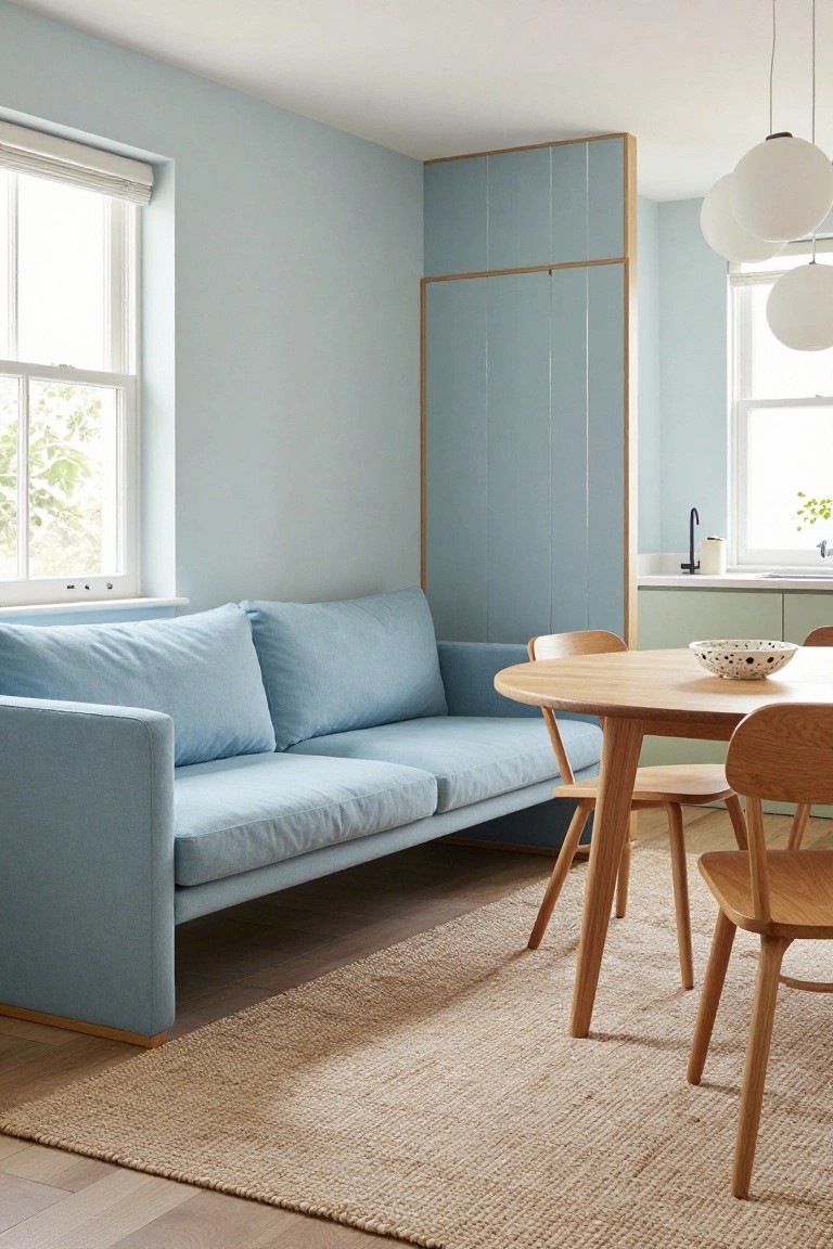
A light blue on the walls paired with a matching blue sofa makes a room feel restful right away. It’s simple but pulls the space together. The wood dining table nearby keeps it from going flat. That mix gives a fresh Danish calm without much effort.
Try this in a small living area or open kitchen corner. It suits apartments where you want everything light. Go for linen fabric on the sofa. It holds up and stays soft. Skip bold art here… let the blue do the talking.
Blush Pink Chair in a Quiet Library Corner
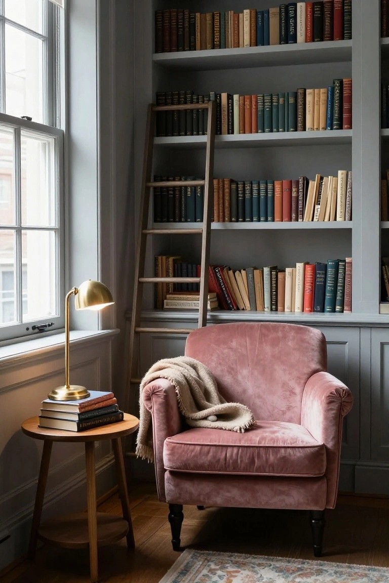
A blush pink velvet chair like this one turns a simple book-lined corner into a spot you actually want to linger in. It brings a soft, fresh feel to the darker wood shelves and stacks of books, without making things too bright or busy. That gentle pastel shade keeps the whole area calm, like a nod to Danish style that’s easy on the eyes.
Put something similar in a spare nook off your living room or hallway. Pair it with a small table, lamp, and a throw for those evening reads. It suits homes with traditional trim or lots of built-ins best… just keep the chair plush enough to sink into after a long day.
Blush Pink Fitted Wardrobes
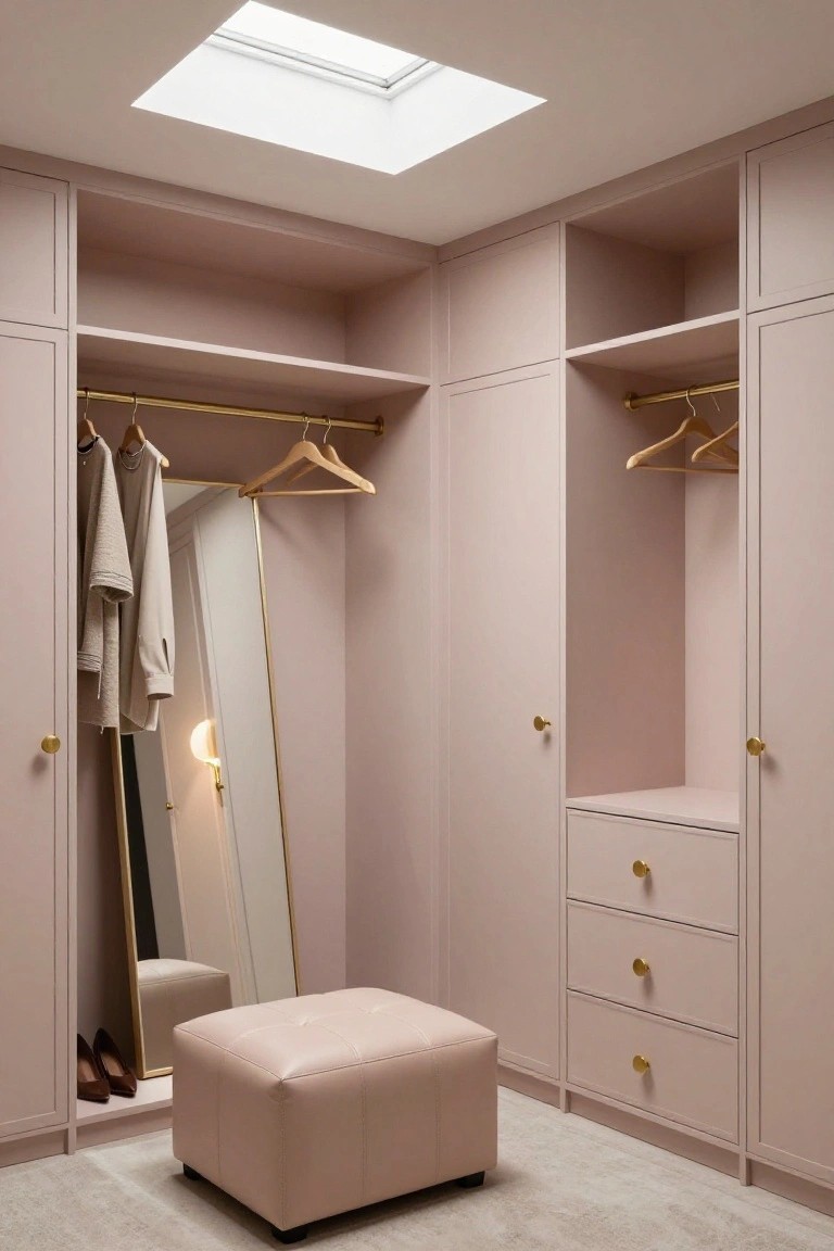
Fitted wardrobes in a soft blush pink turn a basic closet into something calm and fresh. The color keeps the space light, especially with a skylight overhead, and gold rails plus knobs give a quiet polish. It’s practical storage that doesn’t shout, just settles in nicely.
Try this in a bedroom corner or small dressing area. Paint simple flat-pack cabinets or built-ins in pale pink, add brass hardware, and tuck in a stool by the mirror. Suits compact homes best… avoids feeling cramped if you stick to matte finishes.
Low Wooden Cubby Storage for Play
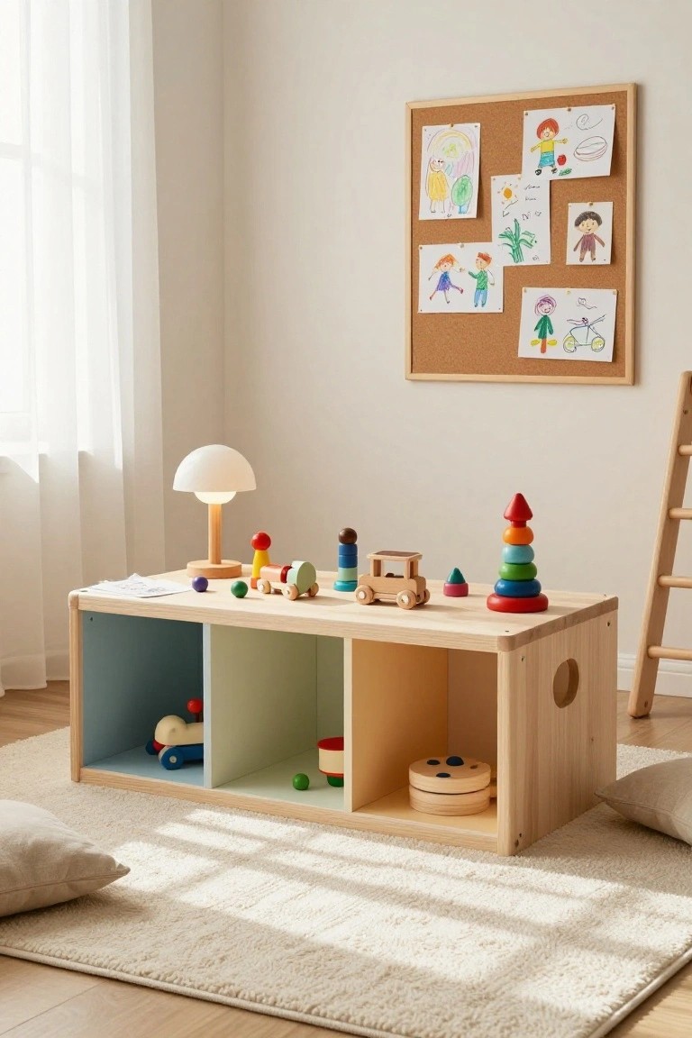
A low wooden unit like this makes toy storage part of playtime. Open cubbies in soft blue and green hold cars and blocks right at kid height. The flat top turns into a surface for stacking rings or trains. Natural wood keeps everything feeling light and calm, without sharp edges or clutter.
It fits best in small play corners or family rooms. Use it where you want easy access for little ones, but keep cubbies half empty so toys stay visible. Pairs well with simple wooden pieces for that fresh Danish look. Just wipe it down after messy sessions.
Floating Vanity with Open Basket Storage
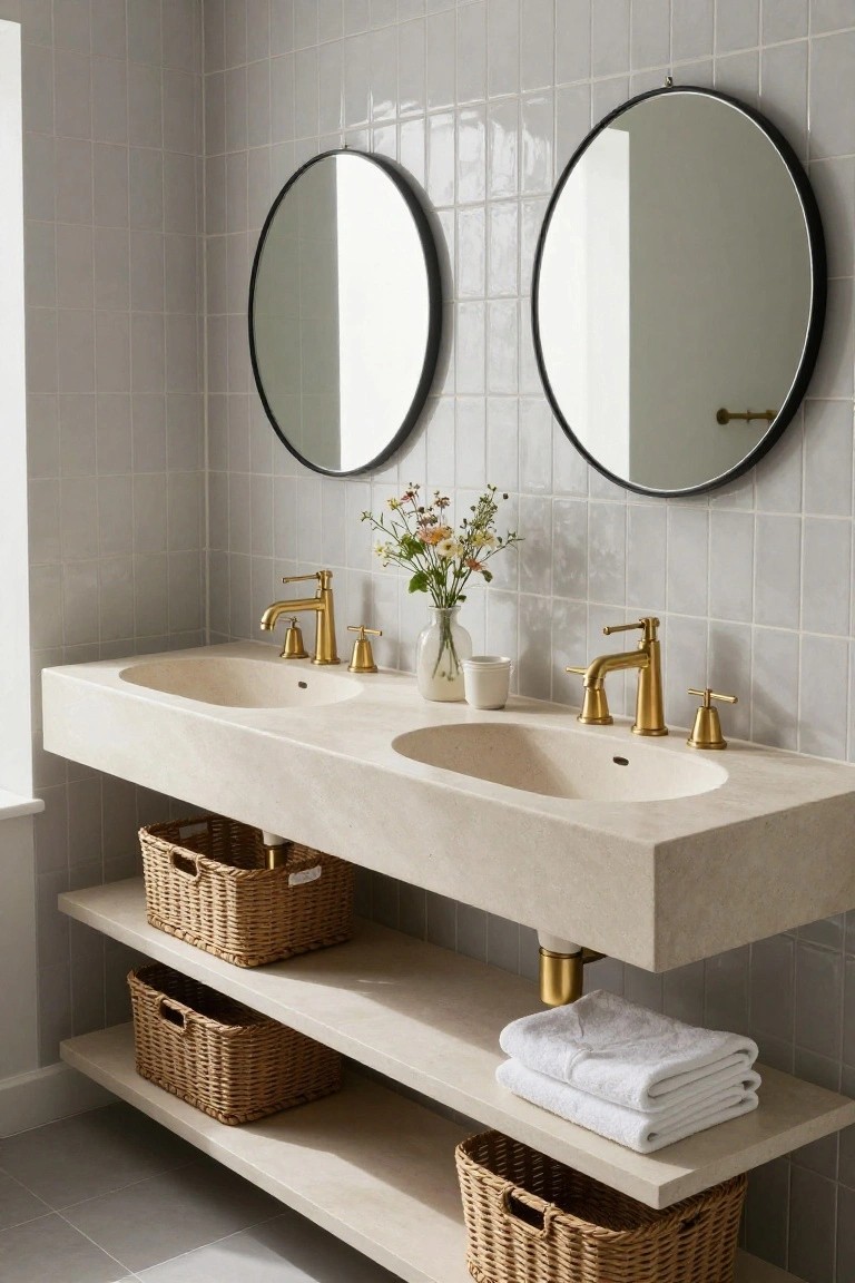
A floating vanity like this one in soft beige stone gives your bathroom a clean, open feel. The open shelves underneath hold woven baskets for towels and odds and ends. It mixes smooth surfaces with natural texture nicely, especially against pale gray tiles.
This works best in smaller bathrooms or ones with a light color scheme. Tuck in seagrass or rattan baskets to keep it practical… just avoid overstuffing so it stays calm. Fits right into a fresh, everyday setup.
Pastel Green Walls in Kitchen Corners
Soft pastel green walls like this mint shade make a small kitchen dining area feel bigger and calmer right away. They pair nicely with a simple oak table, letting the wood’s warmth stand out without clashing. It’s that easy Danish touch, fresh but not fussy.
Use it in tight spots, like apartments or galley kitchens. Stick to light cabinets nearby and natural wood pieces. Add one tall plant or lamp for balance. Just test the shade in your light first, it can shift a bit.
Soft Blue Walls in the Dining Room
Light blue walls like these bring a quiet freshness to a dining room. They keep things calm without feeling too stark, especially when you set them against a simple oak table and neutral chairs. The color lets the wood tones warm up the space naturally.
Try this in a room that gets decent light. It suits everyday family spots or cozier apartments. Stick to natural furniture to balance the cool blue. Skip busy patterns on the walls.
Warm Wood Console in a Plain Hallway
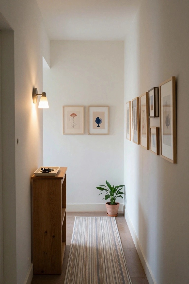
A simple wooden console table like this one brings a bit of natural warmth to an otherwise all-white hallway. It holds keys in a shallow tray right where you need them, without taking up much space in a narrow spot. The light wood tone picks up on Danish style nicely, keeping things calm and fresh instead of stark.
Put one near your front door or along a passageway where you drop things coming in. It works best in smaller homes or apartments with minimal trim. Pair it with a small plant nearby, but skip anything fussy on top. Just watch the height so it doesn’t crowd your path.
Wicker Chair in the Bathroom Corner
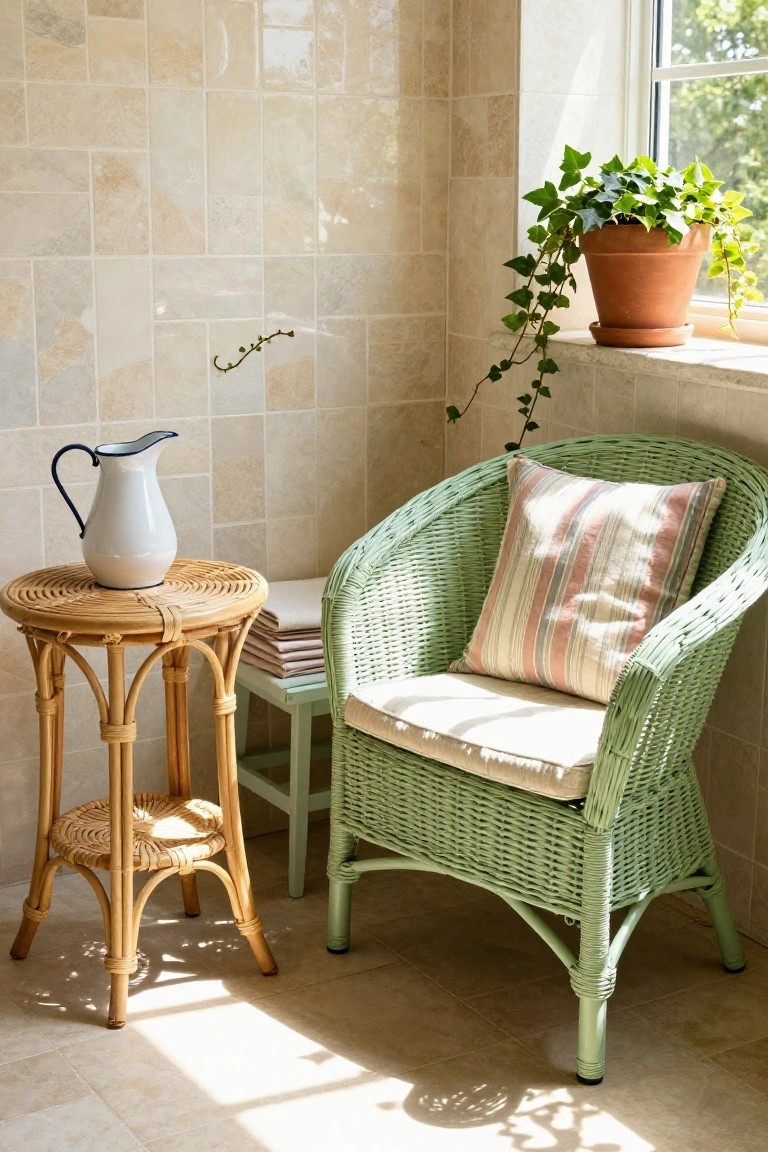
A wicker armchair like this one adds an easy spot to sit in the bathroom. The soft green weave and striped cushion make it feel relaxed, not stiff. Paired with a simple rattan table holding a white pitcher, it turns an empty corner into something useful. Natural light from the window helps everything stay calm and airy.
Try this in a bathroom with room near a window. It suits older homes or spaces wanting a spa touch without big changes. Watch the scale, though… too big a chair crowds things. Add towels or a plant nearby to keep it practical.
Sage Green Pantry Cabinet
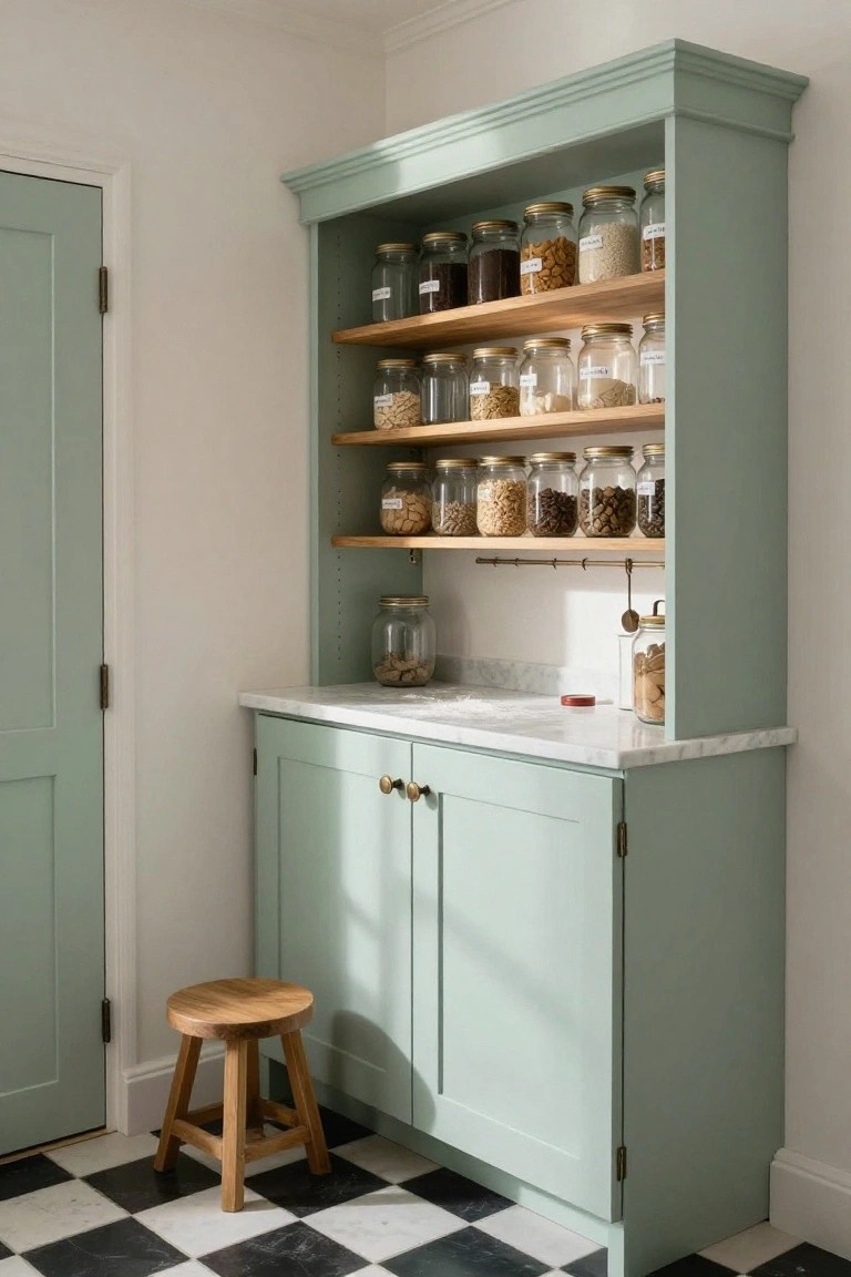
A corner pantry like this one in soft sage green makes kitchen storage feel calm and put-together. Open wooden shelves hold rows of glass jars filled with grains, nuts, and spices. Labeled lids keep it all tidy at a glance. The color softens the space without hiding what’s inside.
Put one in an underused corner near your main prep area. It suits compact kitchens where you want practical access to dry goods. Top it with a slim marble counter for quick weighing or pouring. Just stick to clear jars so dust doesn’t build up on shelves.
Frequently Asked Questions
Q: How do I add pastels to a room full of dark furniture without clashing?
A:
Paint one accent wall or swap out a few cushions first.
That softens everything gradually.
Wood pieces take on a cozy glow next to pale blues or mints.
Q: Will Danish pastels work in a low-light room?
A:
They brighten spaces that get dim.
Bounce light with glossy finishes on trim.
Sheer whites nearby make it all feel airy…
Q: How do I keep pastels from looking childish?
A:
Mix in matte blacks or raw woods for edge.
Rough textures like jute rugs pull it together.
And skip cartoons, obviously.
Q: What’s a quick way to refresh old pastel walls?
A:
Wipe down with mild soap to lift dust.
Tuck in new greenery for life.
It perks up the calm instantly.