

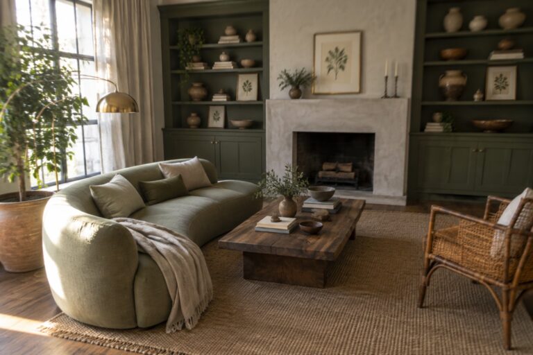
I have found that botanical greens settle into a room only when they echo the wood tones and textiles already there instead of fighting against them.
Light shifts across walls and upholstery throughout the day, so a green that looks calm at noon can turn heavy by evening if the balance is off.
Some shades simply need more space to breathe.
I always paint a few test patches and live with them for a week because that shows how the color actually works once furniture and daily clutter return.
Keeping the green to one or two dominant surfaces leaves room for the rest of the palette to keep the space from feeling flat.
Built-Ins Painted in Soft Green
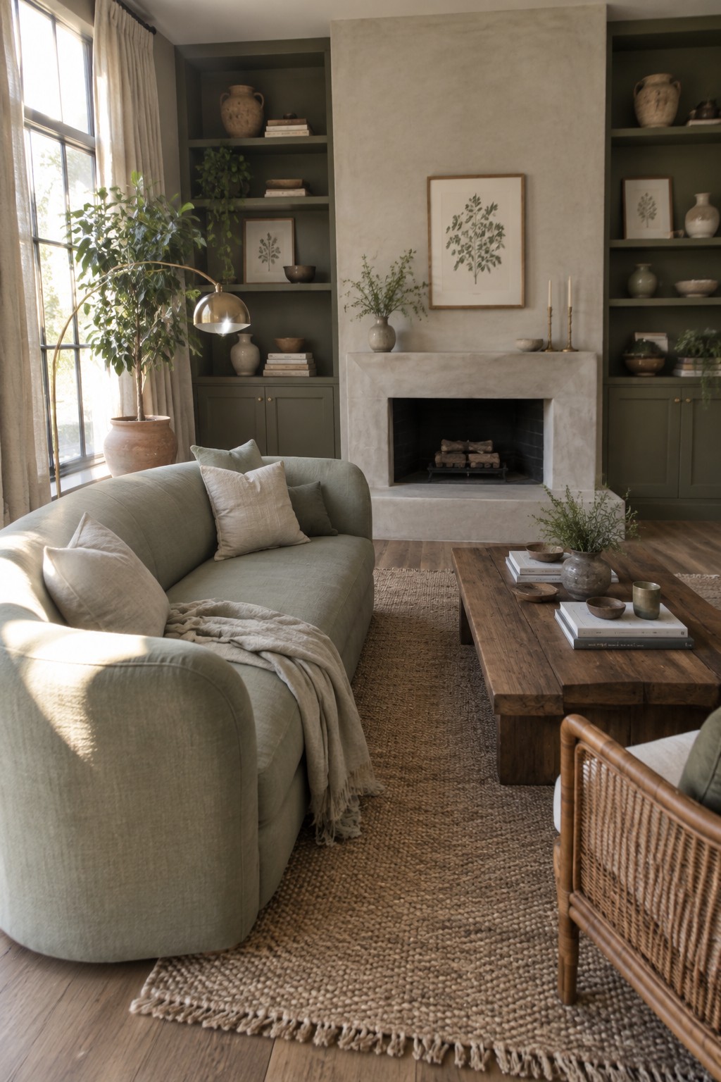
Painting built-ins the same green family as your main seating pulls a room together without much effort. The shelves and sofa here share a similar muted tone, so the eye moves easily across the space instead of stopping at sharp contrasts. It feels calm and a bit like the outdoors has been invited in.
This works best in living rooms where you already have a fireplace or a large wall that needs softening. Keep the green on the muted side so it does not fight with wood tones or natural light. Add a few plants and linen or wool textiles, and the whole room settles into a quiet, botanical feel without looking decorated.
A Soft Green Wall Color For The Bedroom
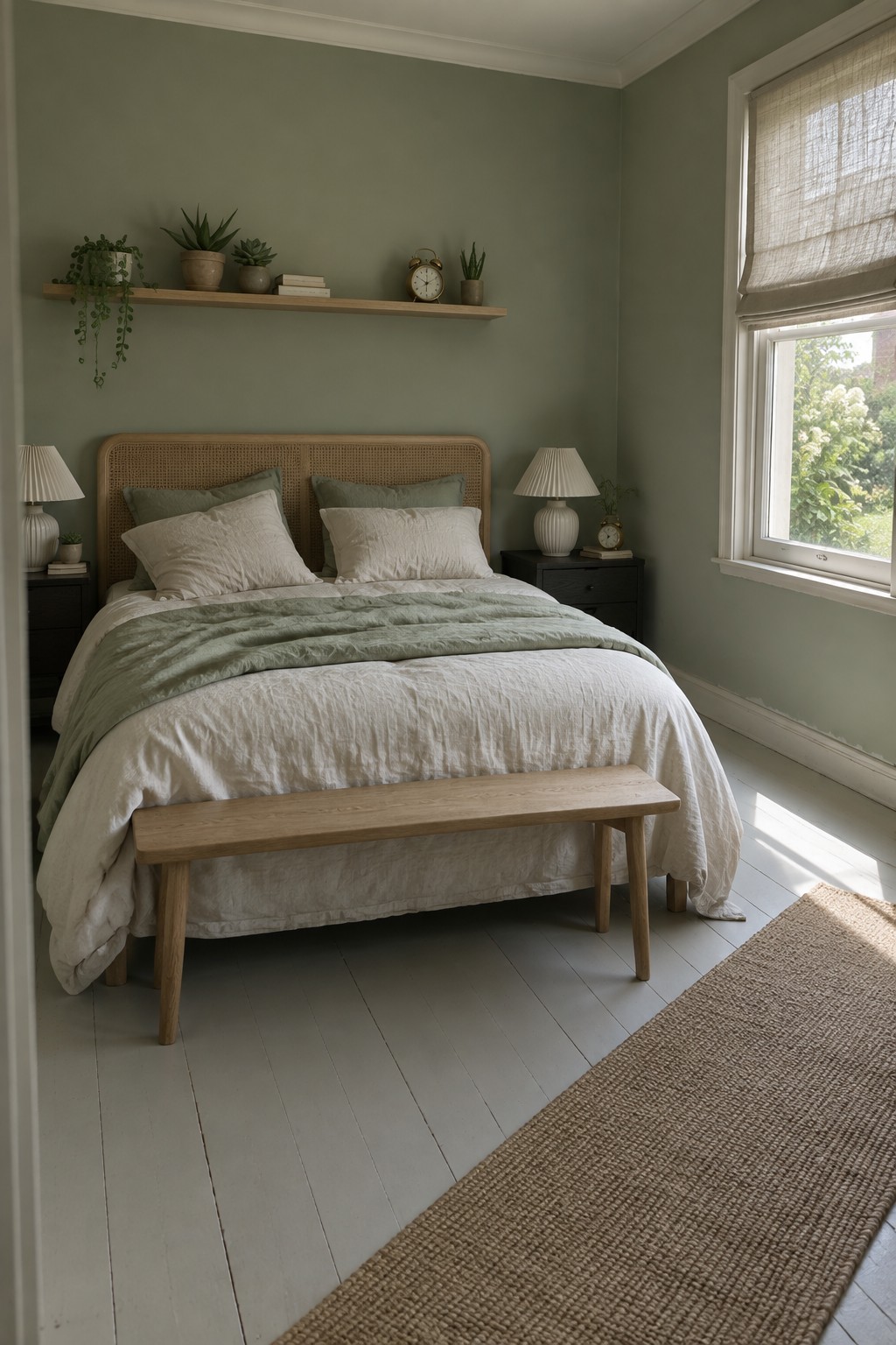
A soft green wall color gives a bedroom that calm, slightly botanical feel without making the space feel busy. It works because the tone stays quiet enough to let the rest of the room breathe while still adding a gentle connection to nature.
This approach suits smaller bedrooms or homes that already lean toward natural materials. Keep the furniture simple in wood tones and layer in light linens so the green stays the main note rather than competing with too many other colors.
Deep Green Cabinetry In The Kitchen
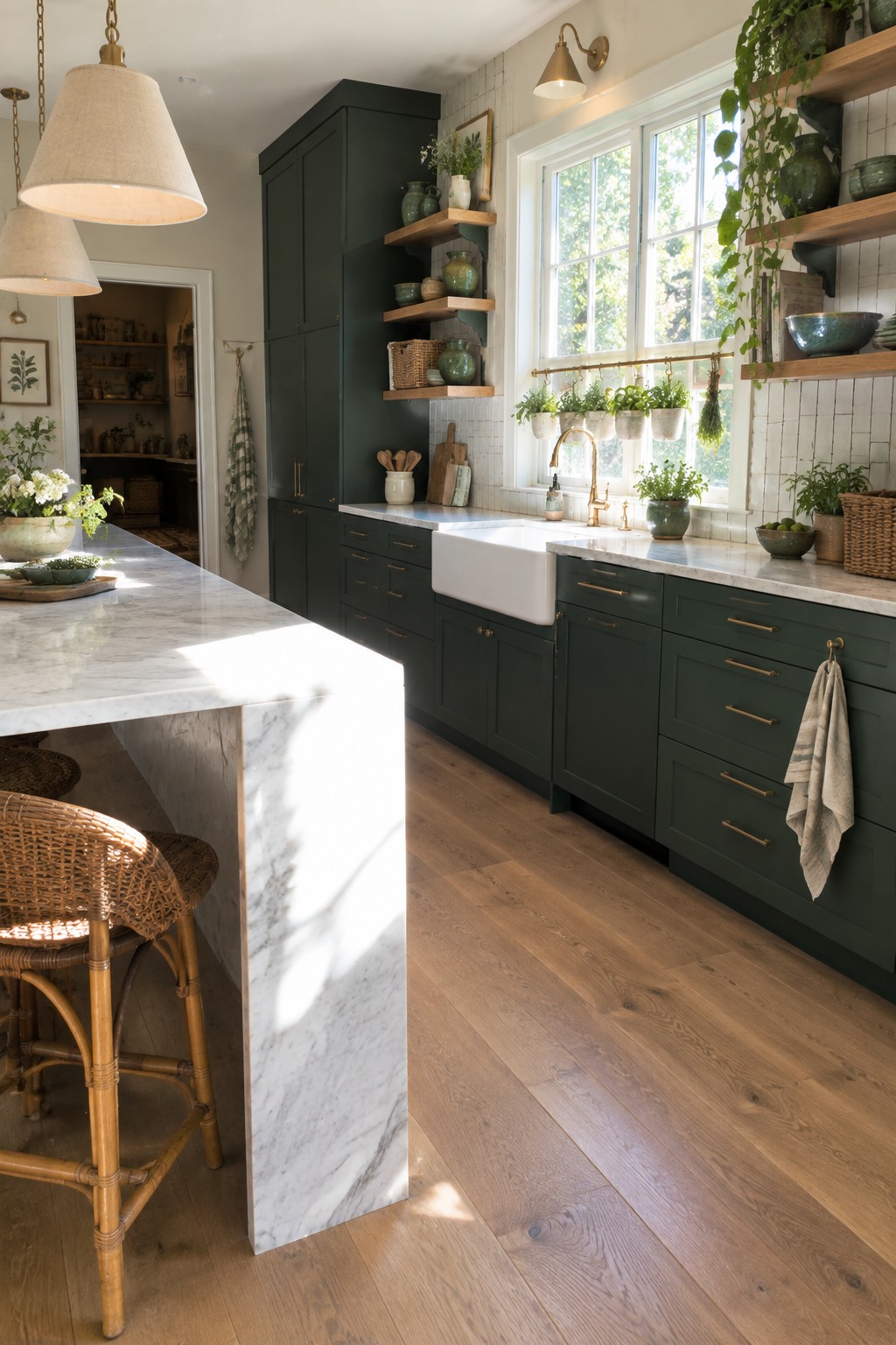
A deep green on kitchen cabinets gives the room a steady, plant-like presence that feels more permanent than a trend. It works because it sits comfortably with natural materials like wood and stone, so the space feels connected to the outdoors without extra effort.
This color choice suits older homes and newer builds alike, especially where the kitchen gets steady daylight. Keep the surrounding tones simple and let the green carry the weight.
Green Hexagon Tiles In The Bathroom
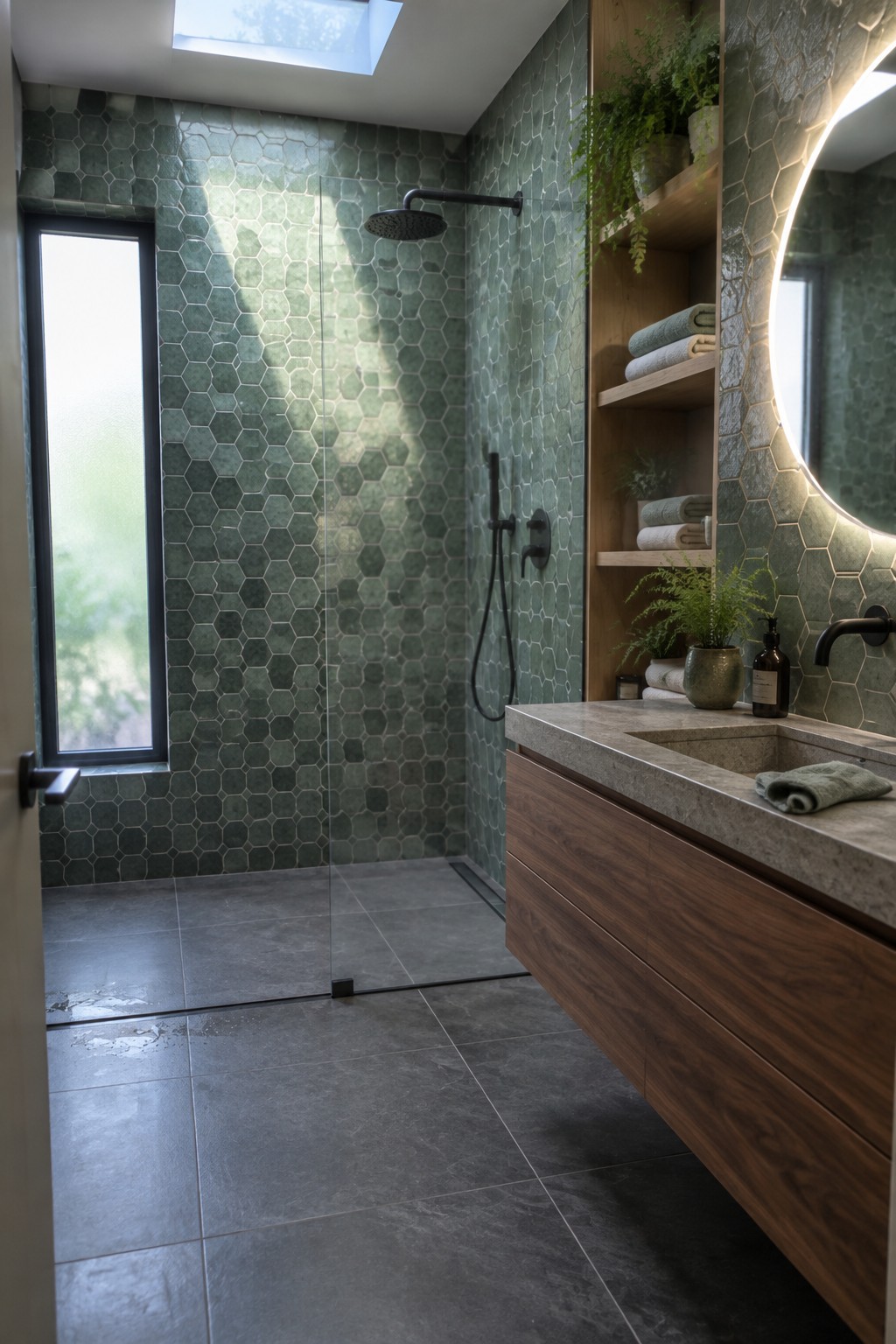
Green hexagon tiles give a bathroom a botanical color without needing a lot of extra decoration. The shape keeps the look interesting while the color brings in that fresh plant-like tone people respond to in smaller spaces.
This works best in bathrooms that get good natural light, since the green can shift from soft to deeper depending on the time of day. Keep the rest of the room simple with wood tones and plain fixtures so the tiles stay the main feature rather than competing with too many other colors or patterns.
Wrap the Dining Room in Botanical Green Wallpaper
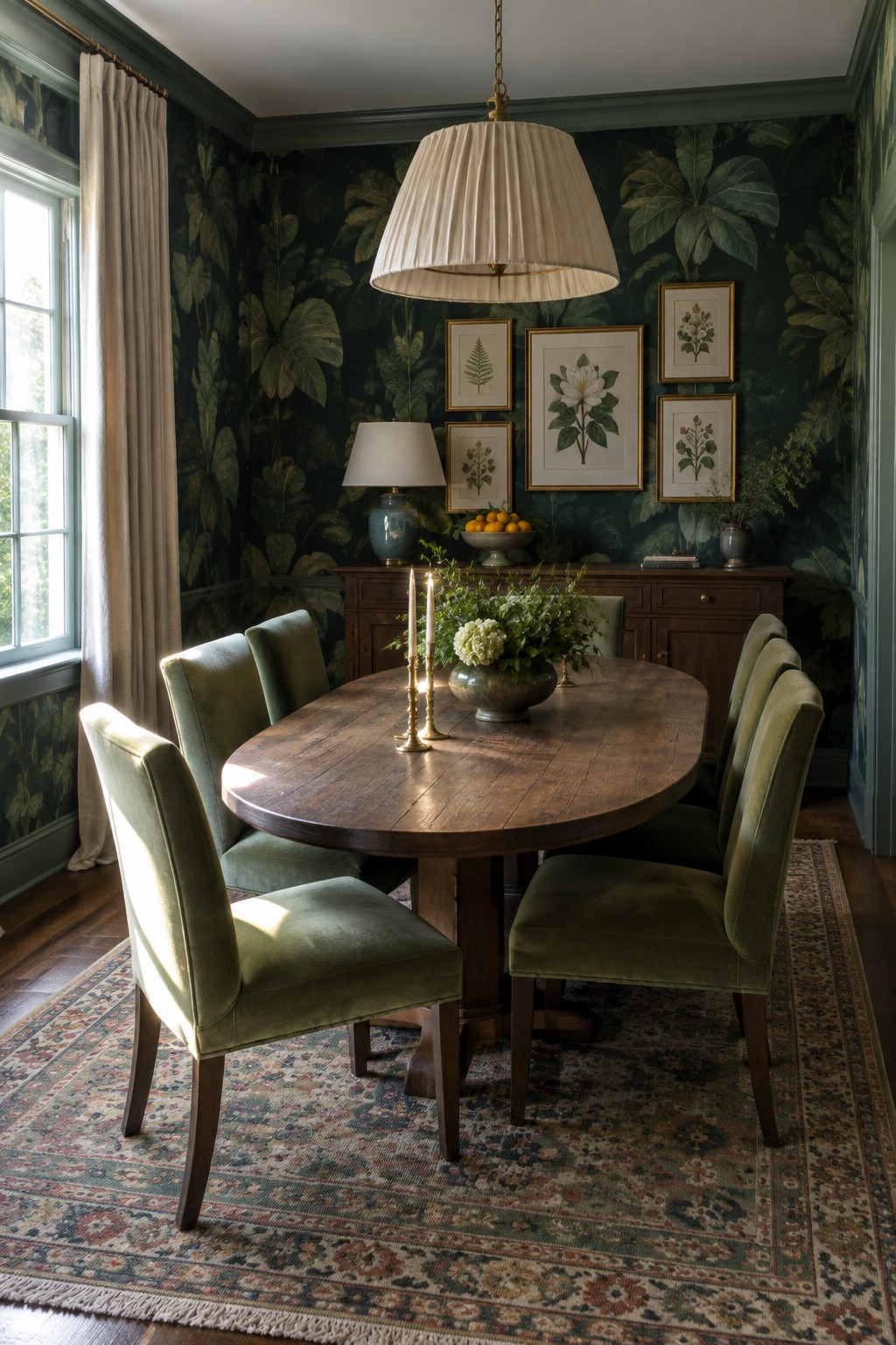
A deep green botanical wallpaper can pull an entire room together without much extra effort. It gives the walls real presence while leaving room for other green pieces like chairs or small accents to feel like they belong. The pattern keeps things interesting even when the color stays consistent from wall to chair.
This approach works best in dining rooms or other spaces where people sit for a while. The dark green creates a cozy feeling that still feels fresh because of the leaf pattern. Stick to one strong green on both walls and seating so the room reads as intentional rather than busy.
Soft Green Walls for Entryways
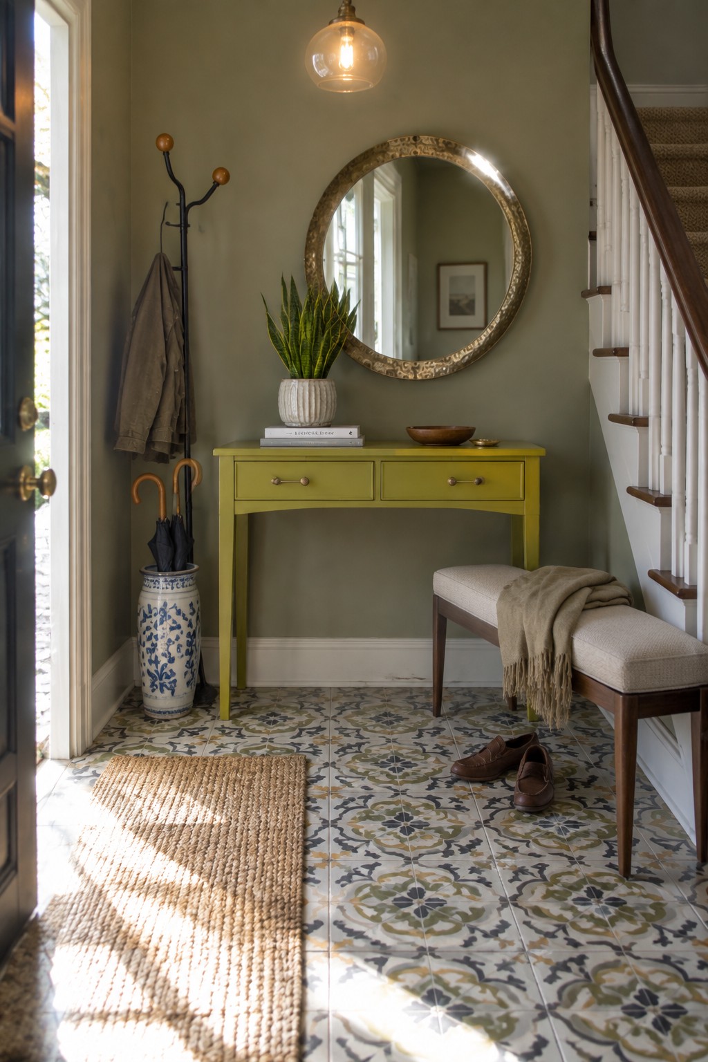
A soft botanical green on the walls gives an entry a calm, lived-in feel that still feels fresh. It works especially well in smaller or transitional spaces where you want color without making the area feel heavy or closed off.
This shade pairs nicely with lighter wood tones and simple furniture shapes. It suits older homes or any space that gets steady daylight, though it can look flat in very dark hallways without some added lighting.
Botanical Wallpaper in a Soft Green Nursery
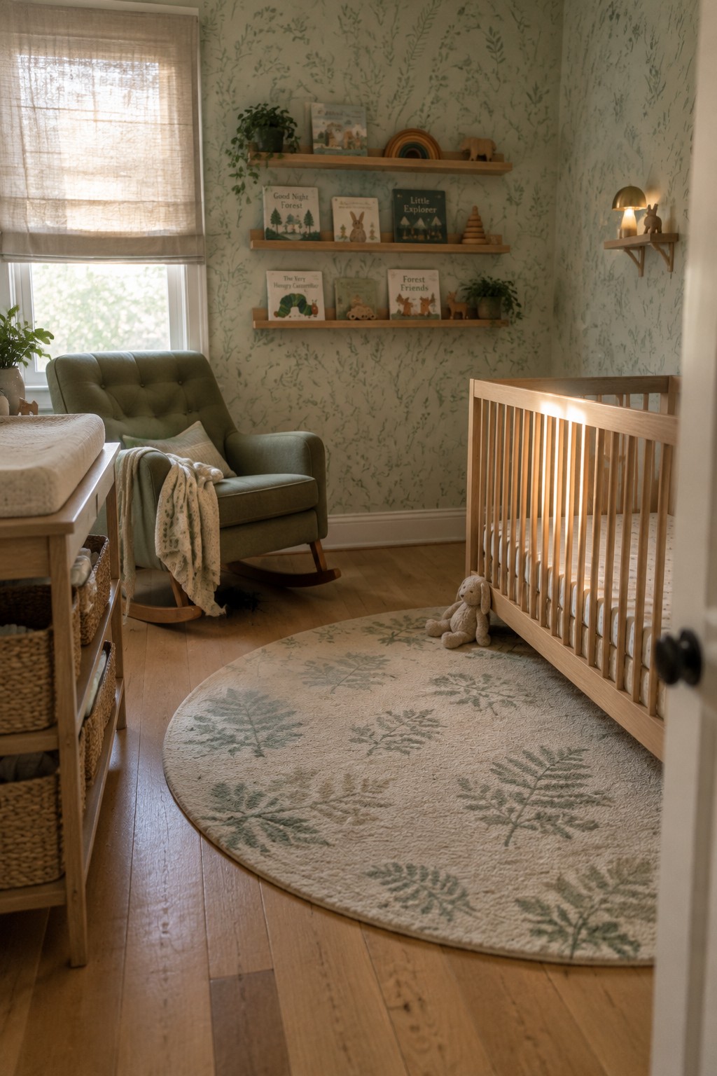
Botanical wallpaper with a quiet leaf pattern brings a gentle outdoor feel into a nursery without making the room feel busy. The muted green tone keeps the space calm and works nicely with natural wood furniture and simple textiles.
This choice suits smaller rooms where you want some visual interest on the walls but still need things to feel restful. Keep the rest of the palette light and avoid layering on too many extra patterns or bold colors.
Deep Green Walls for a Home Office
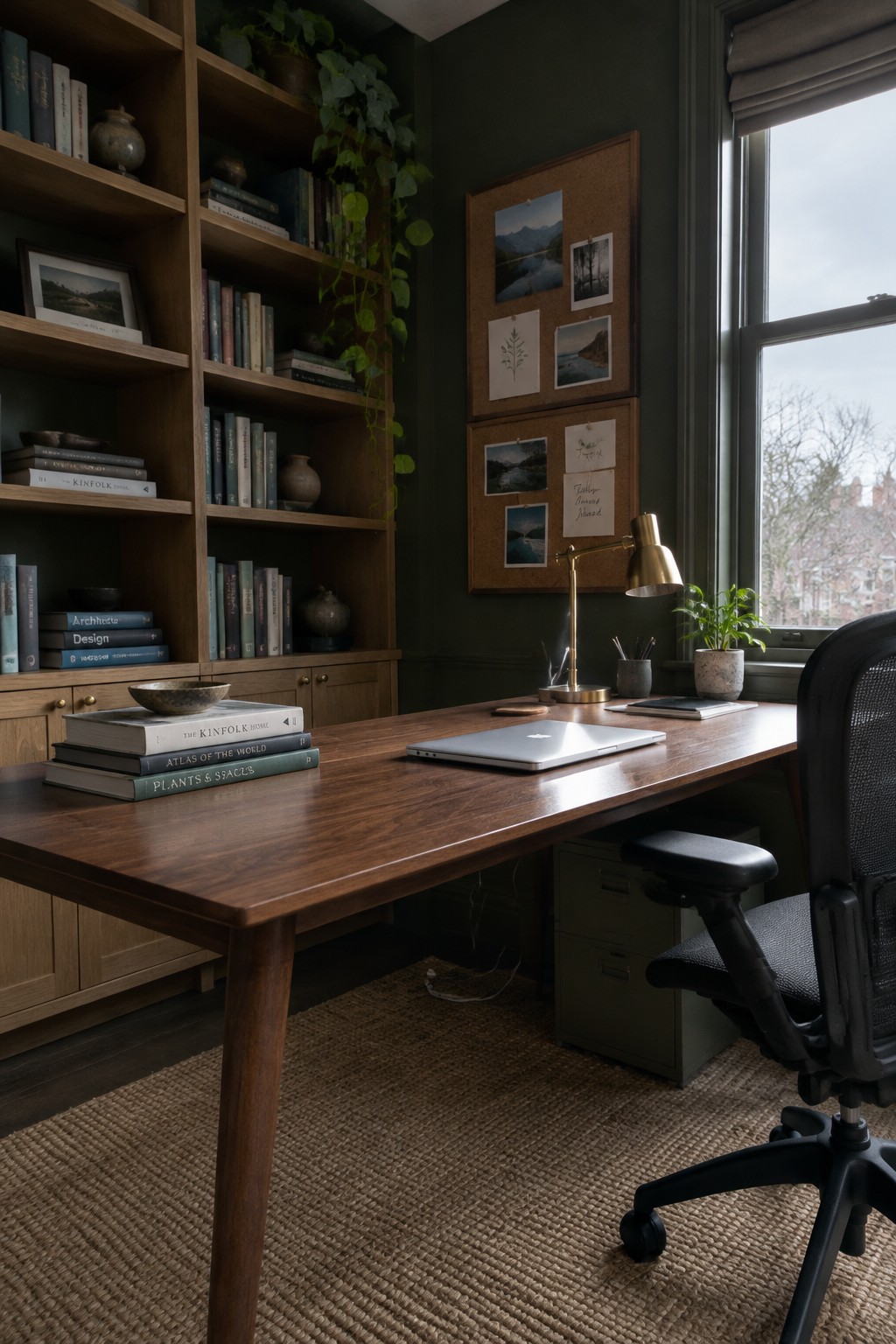
A deep botanical green on the walls gives a workspace a grounded, steady feel that helps the room stay calm during long hours. It pairs naturally with wood tones and keeps the focus on the books and plants rather than competing with them.
This color works best in smaller rooms that already have some natural light, since it can feel heavy if the space gets too little sun. Use it where you want the office to feel separate from the rest of the house without needing extra trim or pattern.
Painting Cabinets the Same Color as the Walls
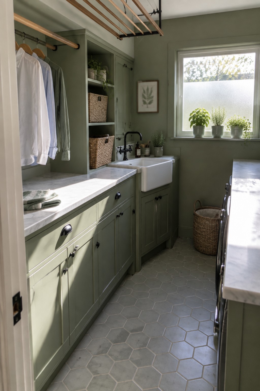
One simple way to make a botanical green palette feel calm rather than busy is to paint the cabinets the same shade as the walls. This removes the usual contrast between upper and lower surfaces, so the eye moves easily through the space without stopping at every edge.
The approach works best in utility rooms or laundry spaces that already have sinks, counters, and open storage competing for attention. Stick with a soft green that reads as a background color, then let light countertops and dark hardware do the rest of the work.
Botanical Wallpaper For Bathrooms
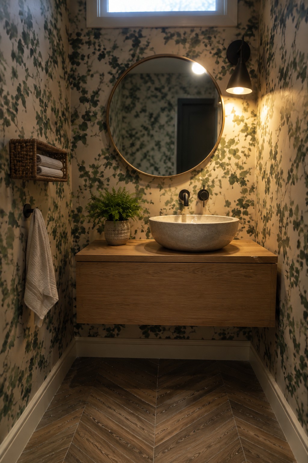
A botanical print on the walls gives a bathroom an easy green layer without needing lots of extra decor. The soft leaf pattern keeps the space feeling fresh and connected to nature while the light background prevents the room from closing in.
This approach works especially well in powder rooms or small baths where you want color but still need the space to feel open. Keep the rest of the finishes simple so the wallpaper stays the main feature.
Botanical Wallpaper In The Bedroom
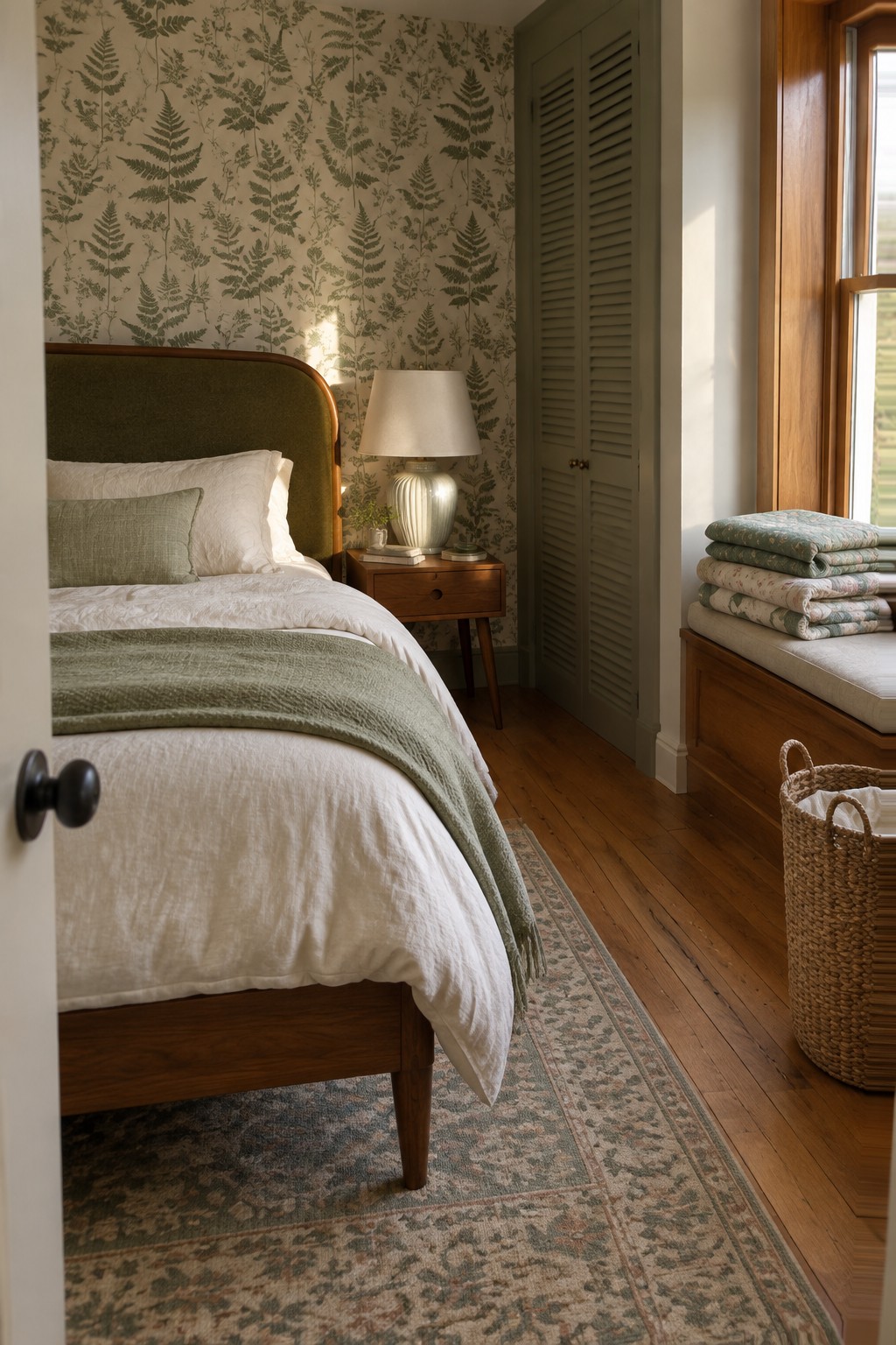
A botanical print on the walls gives a bedroom an easy starting point for a green palette. The pattern brings in enough detail to carry the room while the soft green tones keep everything calm and connected. It works especially well when the rest of the textiles stay simple so the wallpaper can do the main job.
This approach suits older homes or rooms that already have wood trim and floors. Keep the bedding and curtains in the same color family but vary the textures so nothing feels too matched. Avoid adding too many extra patterns or the whole space can start to feel busy.
Layering Multiple Greens in One Room
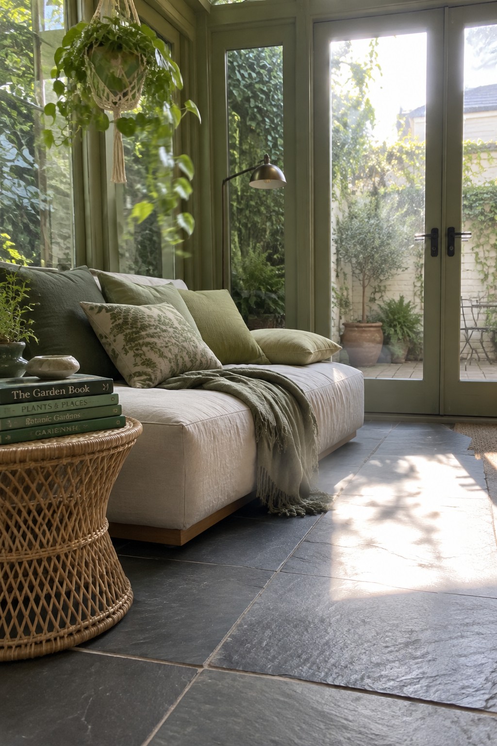
One simple way to build a botanical color palette is to use several shades of green together in the same space. A soft green on the walls gives a calm base, while pillows, throws, and other textiles in deeper or lighter greens add depth without feeling busy. The mix keeps the room feeling connected to the plants outside.
This approach works best in rooms with good natural light, where the different greens can shift throughout the day. Start with the biggest surfaces in one main green, then bring in two or three more tones through fabric. It suits homes that already have garden views or want to feel more connected to the outdoors.
Deep Green on the Fireplace Wall
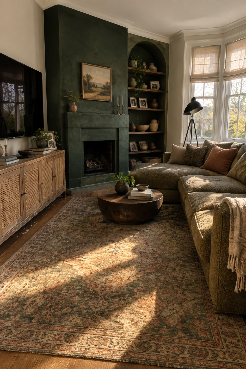
A deep green painted wall around the fireplace gives a living room an easy way to bring in botanical color without making the whole space feel busy. The color grounds the room and works especially well when the rest of the space stays soft with wood tones and neutral fabrics.
This approach suits older homes or rooms that already have some built-in character around the fireplace. Keep the surrounding walls lighter so the green stays the main focus, and let the natural light do the rest.
Soft Green Cabinetry in Dining Spaces
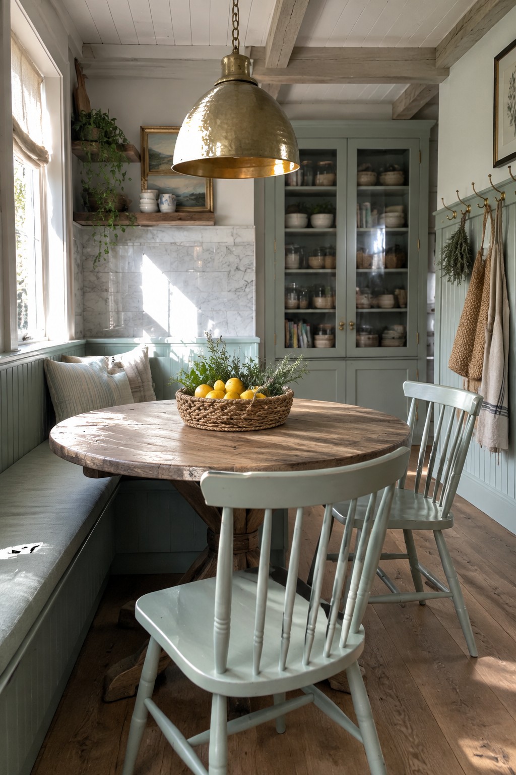
Soft green cabinetry has a way of making a room feel calm and connected to the outdoors. The color sits nicely between gray and green, so it works without demanding too much attention or feeling trendy.
This approach suits homes that already have wood tones and simple trim details. Start with the larger pieces like a hutch or built-in bench, then carry the same shade onto the walls if the first coat feels right.
Keeping One Green Palette Across the Bathroom
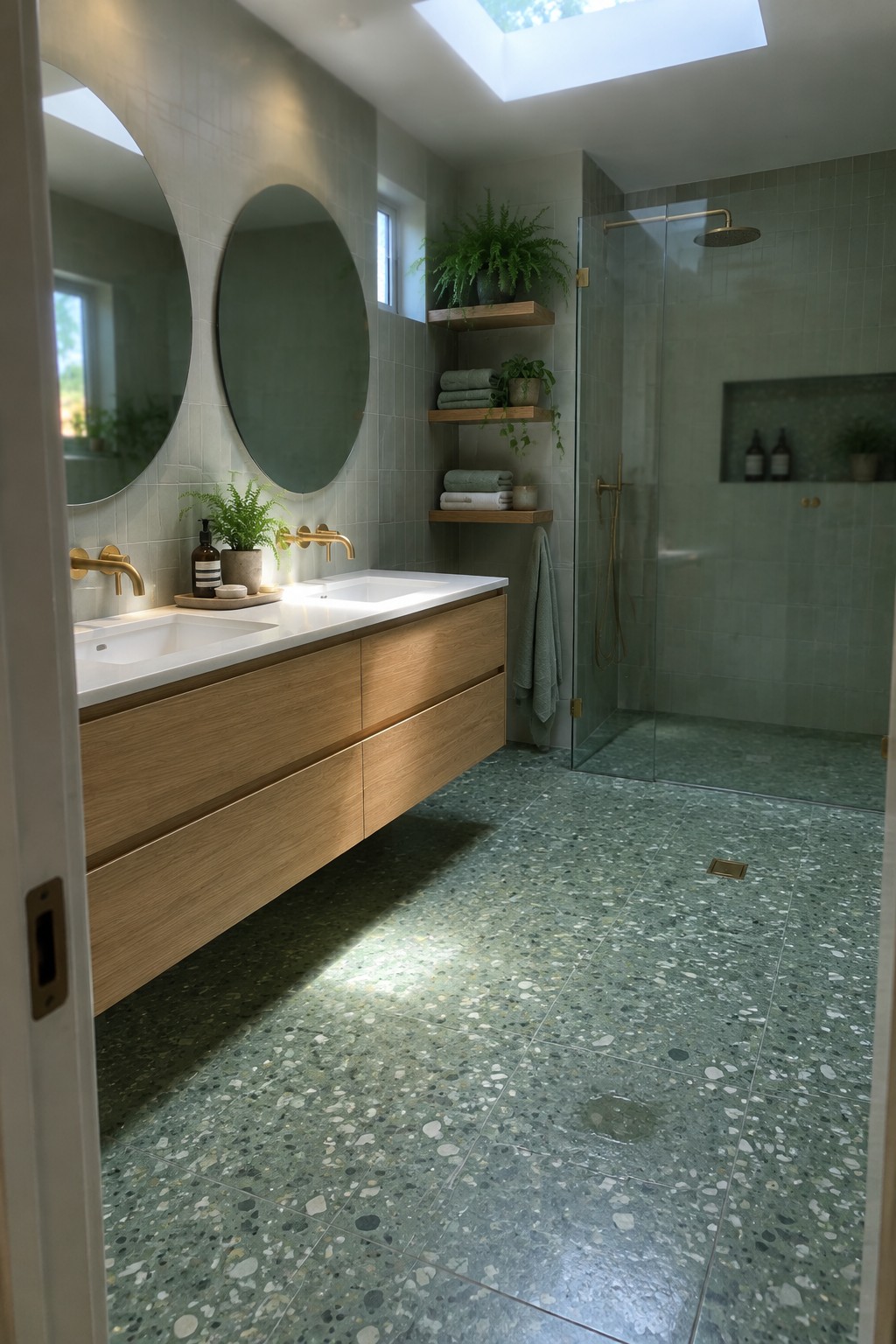
Many bathrooms end up feeling scattered when they mix too many colors. Using one green tone across the main surfaces helps the room feel calmer and more connected.
This works well in smaller baths or spaces that get good natural light. Pick a soft green tile for the walls and floor, then bring in wood tones for the vanity and a few plants to add life. It suits homes that want a quiet, natural look without extra pattern or contrast.
Green Walls As The Starting Point
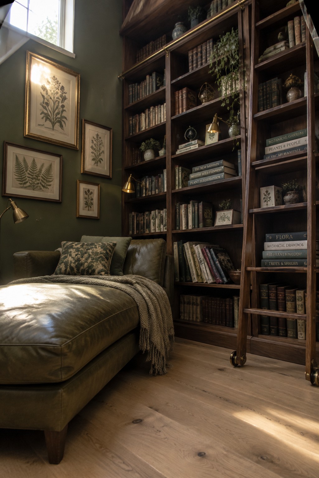
A deep green wall color gives a room an immediate botanical feel without needing too many extra layers. It works especially well in smaller spaces like a reading corner or library nook, where the color can wrap around the seating and bookshelves to create a calm, enclosed atmosphere. The leather seating and framed prints in this room show how the green holds everything together without feeling busy.
This approach suits older homes or rooms with existing woodwork, since the green pairs naturally with warm wood tones and brass accents. Keep the rest of the palette simple, using mostly natural textures and a few plant themed accessories so the wall color stays the focus. Avoid adding too many competing patterns if the goal is a restful space.
Green Cabinetry In Walk-In Closets
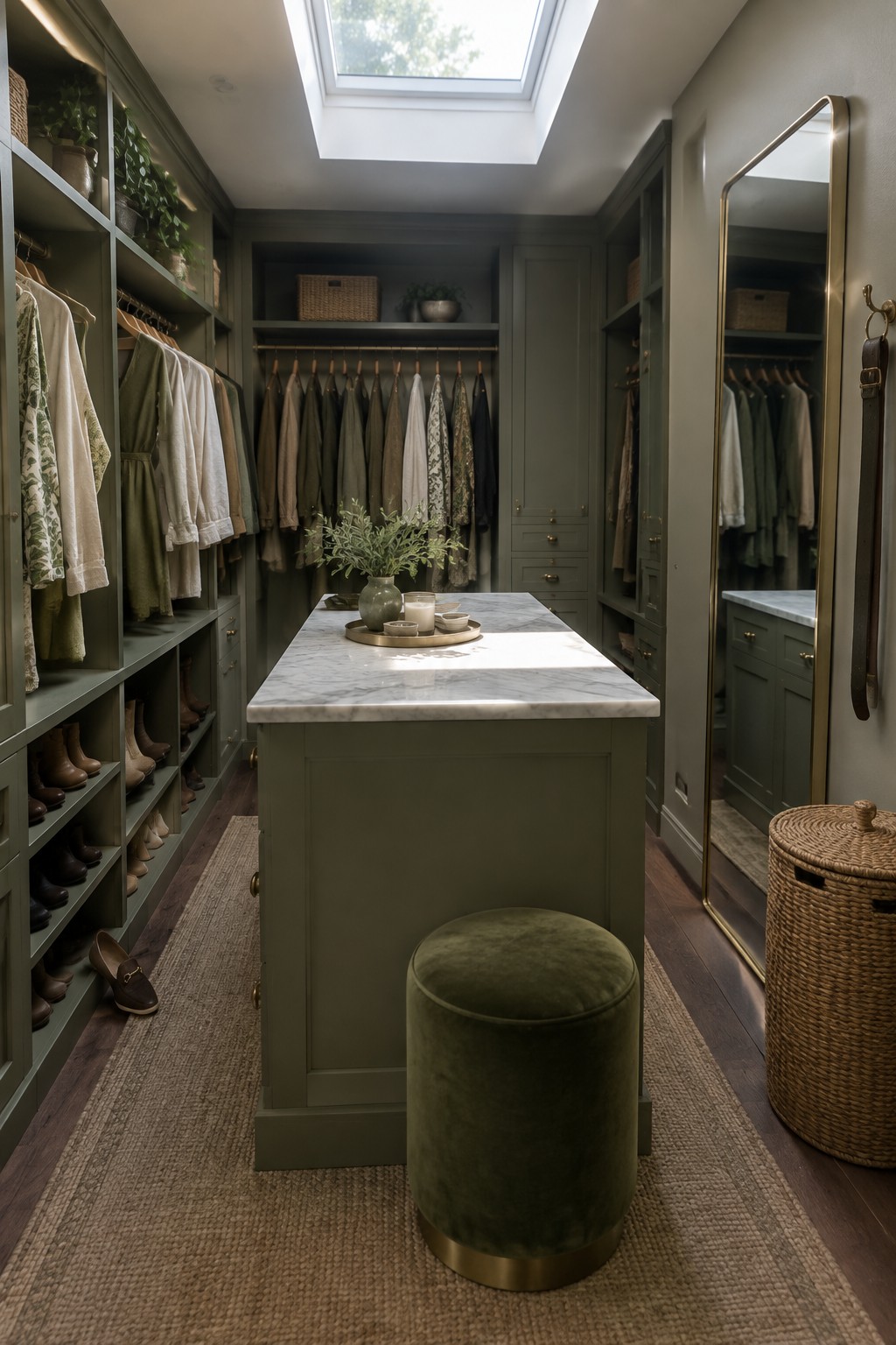
Painting closet cabinetry a soft green gives the whole space a calm, finished look that feels more like a room than just storage. The color wraps around the shelves, drawers, and island so nothing stands out as an afterthought.
This approach works best in closets that already have built-ins or an island, since the green can cover everything at once. It suits homes that want a natural palette to carry through from bedrooms into smaller spaces without adding pattern or extra trim.
Matching Green On Walls And Sofa
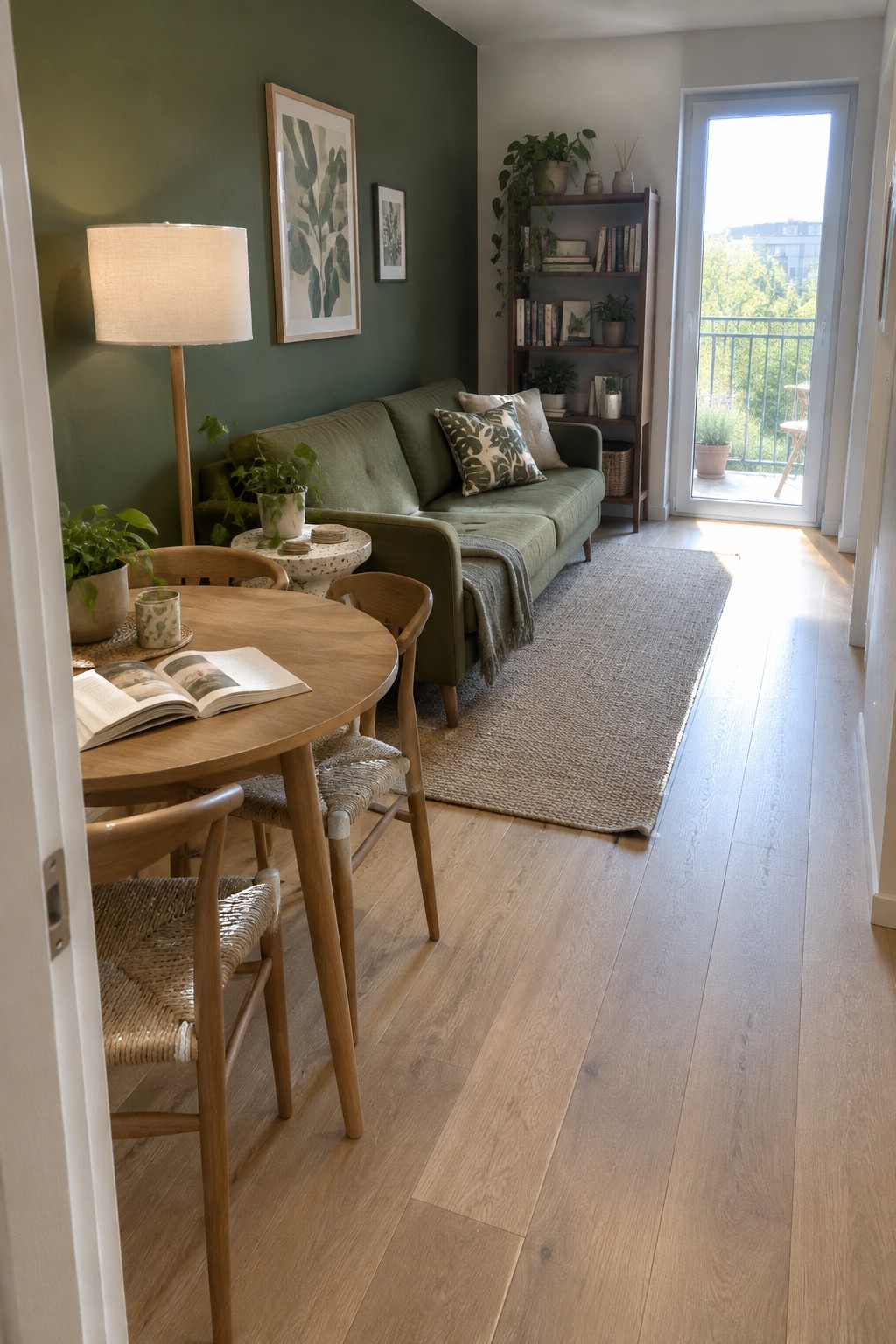
Painting an accent wall the same green as the sofa gives a room an easy sense of calm. The color feels grounded and quiet, and the space reads as one complete idea instead of separate pieces.
This works best in living rooms that get steady daylight, where the green can shift gently through the day. Keep other colors simple, mostly wood and soft neutrals, so the green stays the focus without competing.
Frequently Asked Questions
Q: What greens should I start with if my walls are already painted white? A: Start with soft sage or moss tones on pillows and rugs. These shades bring in the botanical feel without overpowering the space. Layer in a few darker accents like olive on a chair to add depth.
Q: Will these green ideas work in a tiny apartment? A: Yes, choose lighter greens like mint or pale olive to keep the space open. Add them through smaller items such as throws and vases. A single large plant can anchor the room without crowding it.
Q: How do I make sure the greens don’t clash with my wood floors? A: Pick greens with warm undertones like forest or sage to complement the wood. Test samples in the actual light before committing. This simple step prevents most color surprises.
