
I’ve noticed that Danish interiors really come alive when bold colors work with a room’s natural light and layout, creating spaces that feel both playful and grounded.
They turn ordinary homes into places full of character, especially where plain walls once made everything blend together.
In my kitchen remodel last year, adding a few turquoise accents made meals feel more cheerful without disrupting the workflow.
Color draws your eye first, often deciding if a room welcomes you or pushes you away.
Several of these ideas adapt easily to real homes, worth sketching out for your next project.
Built-In Wooden Shelves

Full wall wooden shelves like these turn empty space into something useful right away. They run along the pink paneled wall behind the sofa, holding all kinds of pottery, vases, books, and baskets. What makes it work is how the natural oak keeps things grounded against that soft pink background. It feels collected, not staged.
Put these in a living room or den where you need spots for books and decor without adding more furniture. They suit smaller homes especially, since they use vertical space well. Just keep the shelves from getting too crowded, or it starts to feel busy. A low sofa underneath keeps the seating area open.
Green Walls with Pink Chairs
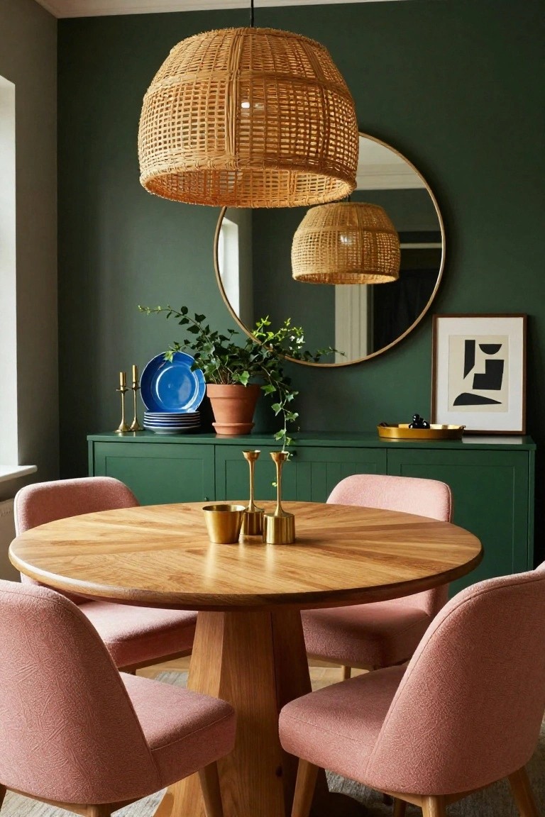
Deep green walls turn a simple dining room into something cozy and bold. They wrap the space like a hug, making it feel intimate even if it’s not huge. Here, the pink chairs pop against that green backdrop, adding playfulness without going overboard. The round wooden table and rattan light keep things natural and easy.
This setup works great in apartments or older homes with smaller rooms. Pick a matte green paint for the walls, then softer pink fabric for chairs that won’t show stains too fast. Brass candleholders and pots on a matching green cabinet bring warmth. Skip busy patterns… just let the colors do their thing.
Bold Kitchen Cabinet Colors
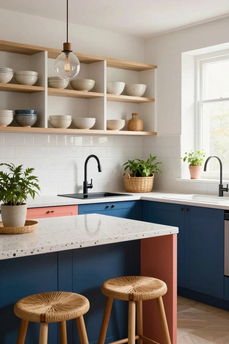
Kitchens don’t have to be all white or wood. This one goes bold with navy blue cabinets wrapping the base units and a pink edge on the island. It adds real personality right where you spend time cooking and gathering. The mix feels fresh and Danish without trying too hard.
You can pull this off in most homes by keeping uppers light or open shelving. Navy grounds things, pink adds play. Stick to white counters so it stays clean. Good for apartments or family spots… just test samples in your light first.
Mustard Velvet Headboard in a Sage Bedroom
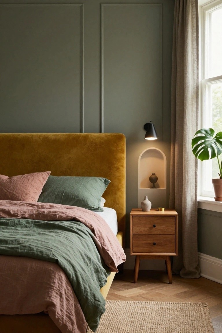
One way to add real personality to a Danish-style bedroom is with a mustard velvet headboard set against sage green walls. That rich yellow pops nicely without taking over the room. It brings in warmth and a bit of boldness, especially when you layer on rumpled linen bedding in soft greens and pinks. The walls stay calm with their simple paneling, letting the bed do the talking.
This setup works best in smaller bedrooms where you want coziness without clutter. Go for velvet if you like texture that feels good to touch. Pair it with wooden nightstands and a few plants to keep things grounded. Just make sure the green on the walls isn’t too bright, or it might fight the headboard.
Pale Blue Walls for Bedroom Calm
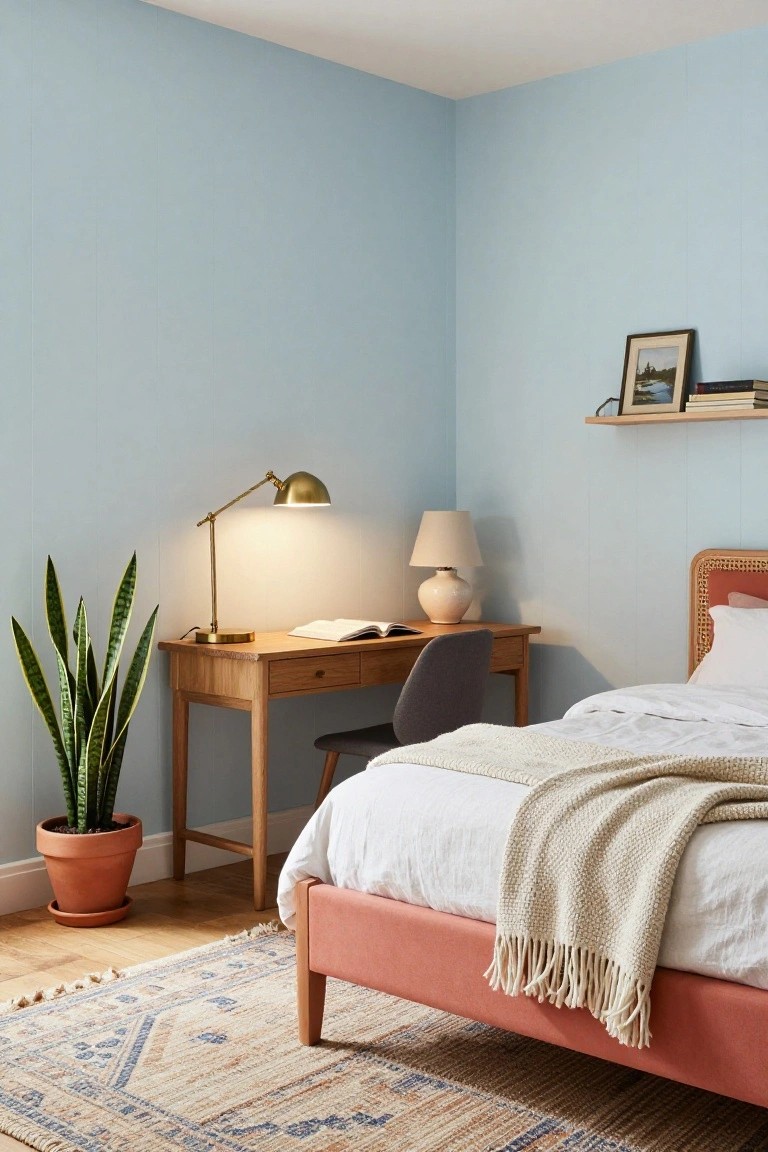
Pale blue walls like these give a bedroom that easy, restful feel right away. They keep things light without being stark white. In Danish style, this color works because it plays nice with natural wood on the desk and rattan bed frame. A tall snake plant next to the desk brings in some green life too.
You can pull this off in most any bedroom, especially smaller ones where you want space to breathe. Stick to wood furniture and simple plants to keep it grounded. It adds personality without much fuss… just paint and a few pieces that fit.
Bold Orange Walls in a Nursery
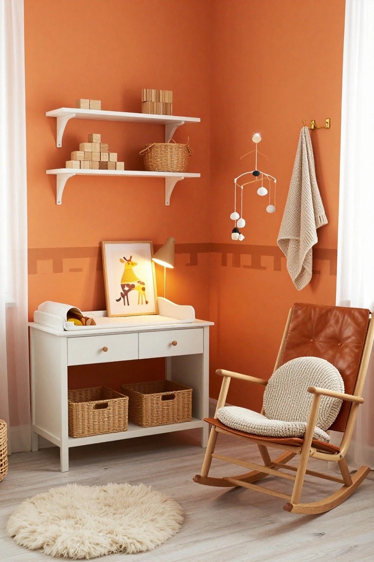
A deep orange paint on the walls turns this nursery into a warm, playful spot that feels just right for a child’s room. The color picks up on the giraffe art and lamp, while natural wood pieces like the dresser and rocking chair keep things grounded and cozy in that Danish style.
This works best in compact corners or small rooms, where the bold hue wraps around without overwhelming. Pair it with light woods, wicker baskets, and soft rugs to stay practical for daily use. Skip it in bigger spaces unless you want to zone off a kid area.
Yellow Chair Pops Against Green Walls
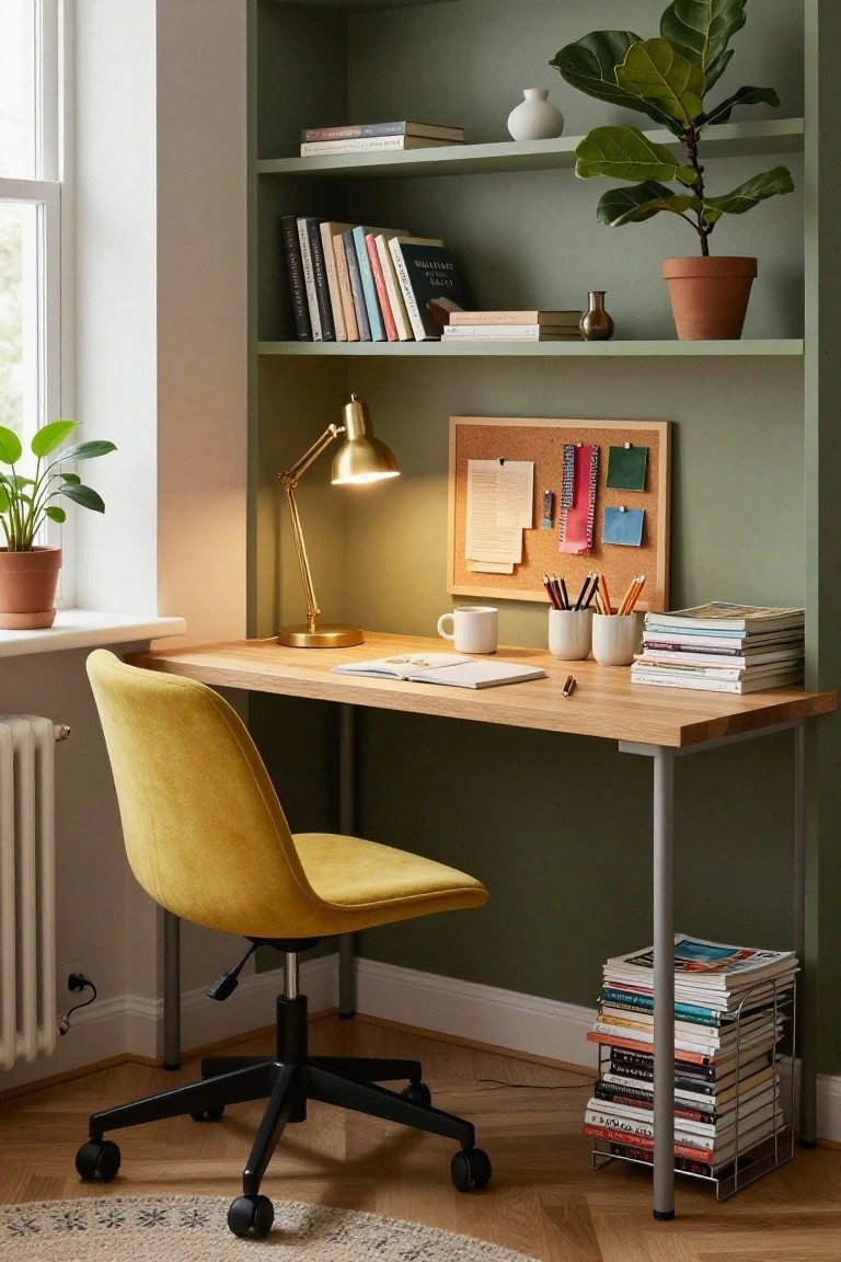
A mustard yellow swivel chair grabs the eye right away in this home office. Set against soft sage green walls and a simple oak desk, it adds a shot of cheer without overwhelming the space. Bookshelves stuffed with novels and a few green plants keep things lived-in and calm around it.
This kind of bold chair works best in a work nook or small study where you want some personality. Stick to natural wood furniture and muted walls so the color shines. It suits apartments or cozy homes… just avoid pairing it with too many patterns.
Sunny Entryway Bench
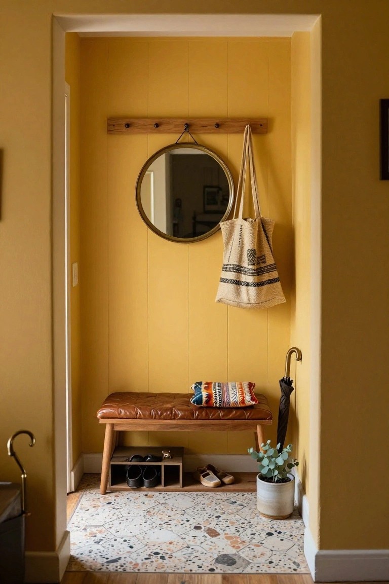
A bench right in the entryway makes coming home easier. You sit to take off muddy shoes or boots without tracking dirt through the house. In this spot the warm yellow walls keep it from feeling too plain. The leather cushion and wood legs add some comfort without taking up much room.
Put cubbies under the bench for shoes and keep hooks up top for coats or bags. It fits tight hallways in older homes best. Go for natural materials alongside the bold color so it stays cozy not overwhelming.
Blush Pink Tiles with Sage Green Vanity
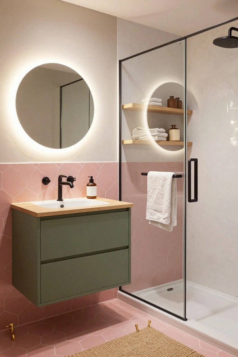
This setup takes a simple bathroom and gives it real personality through a mix of blush pink hexagonal tiles and a floating sage green vanity. The pink covers the lower walls and floor for a cohesive look, while the green cabinet floats nicely and keeps things fresh. A wood-topped sink and open shelves with towels add that everyday warmth without cluttering up the space.
It works best in smaller bathrooms where you want color but not overwhelm. Try it in a guest bath or powder room, sticking to matte black taps and a glass shower to let the hues shine. Just balance the pink so it doesn’t feel too sweet… pair it with neutrals on upper walls.
Blush Pink Walls and Navy Cabinets
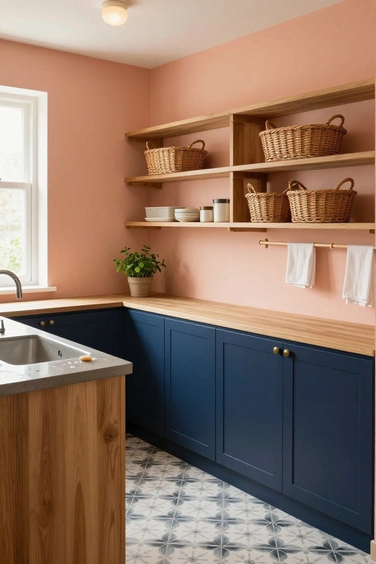
This setup takes a small corner kitchen and makes it feel fresh and lively. The soft blush pink on the walls keeps things light and cheerful without going overboard. Then navy cabinets below ground it all, adding some weight and depth to the space. Wooden shelves with wicker baskets up top bring in that natural touch, and it just works together nicely.
You can pull this off in a utility room or galley kitchen where you want color but not chaos. Stick to matte navy on the lowers so it doesn’t glare, and keep walls in a pale pink to bounce light around. It’s great for older homes needing a pick-me-up… pairs well with oak counters too. Just watch the lighting, since pink can look dingy in dim spots.
Teal Walls in a Closet
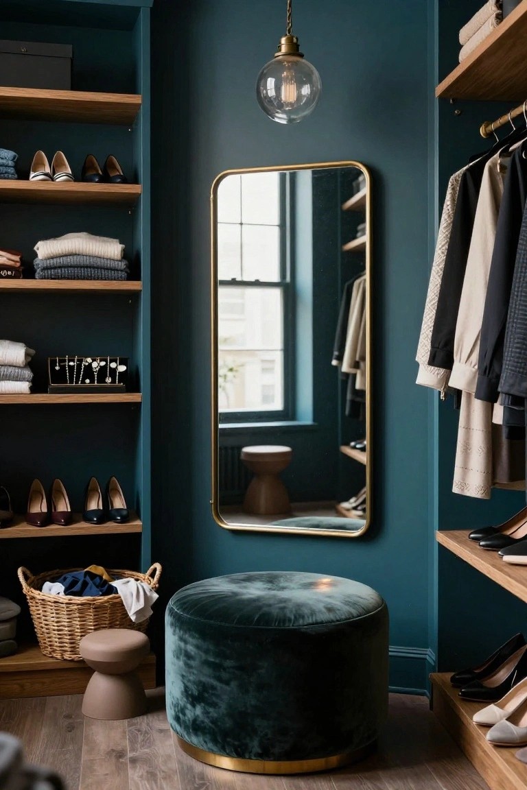
A deep teal paint on the walls turns this closet into something special. It wraps the space in color without feeling too much, especially with the light oak shelves holding sweaters, shoes, and bags. That gold mirror and a few brass touches pick up the richness just right.
Paint a closet or dressing nook like this if you want personality in a smaller spot. It suits homes with neutral bedrooms nearby, so the color stays contained. Keep shelves simple in wood to let the walls do the talking, and add one velvet stool for sitting.
Blush Pink Kitchen Cabinets
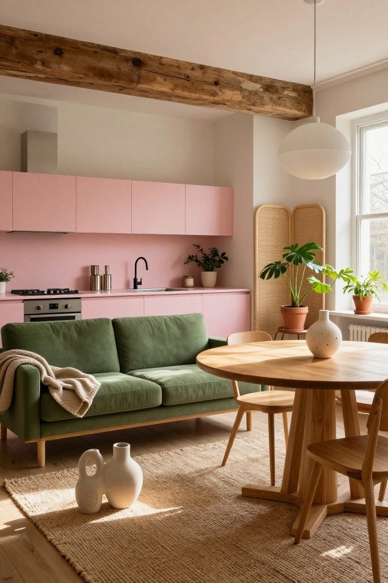
Blush pink kitchen cabinets like these catch the eye right away in an open living space. They work well here because the soft pink tone feels fresh and playful, especially next to the exposed wood beams and white walls. That green sofa across from the sink pulls it all together without clashing. It’s a simple way to add color that feels Danish, calm but with personality.
Try this in smaller apartments or lofts where kitchen and living blend. Go for matte pink cabinets to keep it understated, then layer in wood furniture and a few plants. It suits homes with lots of natural light. Just avoid glossy finishes, they can feel too bold sometimes.
Playful Painted Wall Shapes
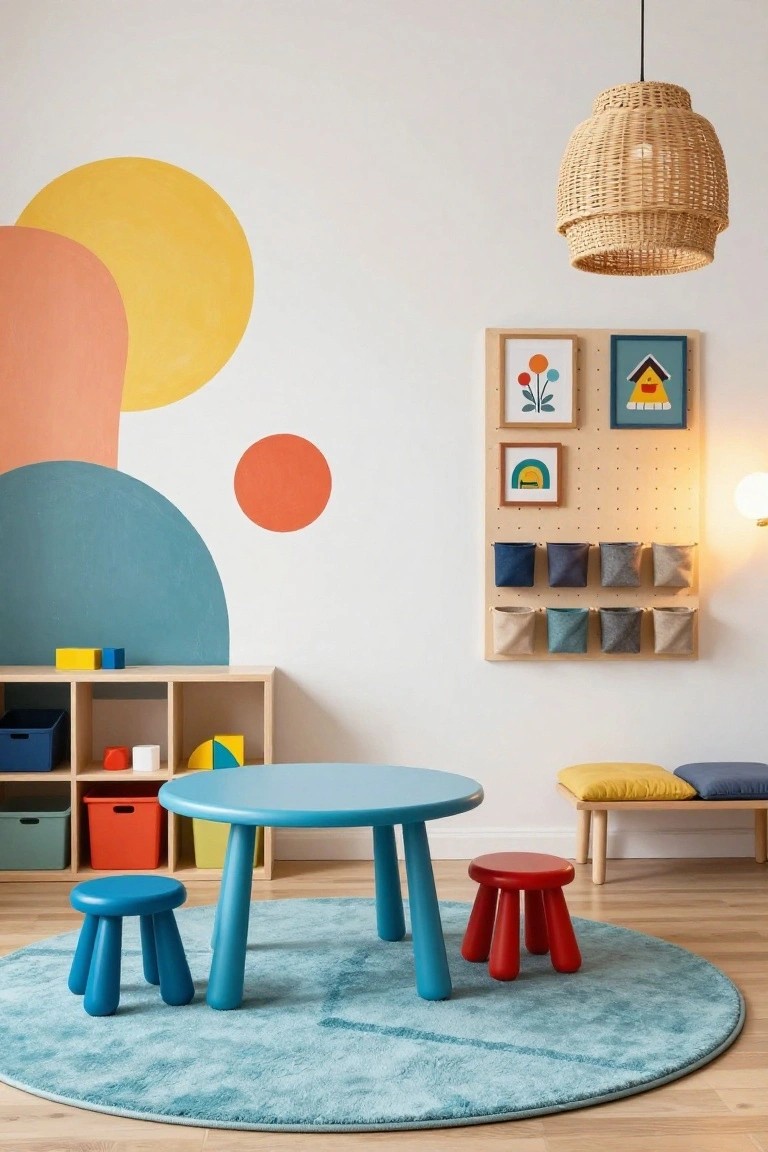
Big organic shapes painted right on the walls give this kids’ playroom a burst of color and fun. Think oversized semi-circles in sunny yellow, soft orange, and teal blue against a mostly white backdrop. They add personality without cluttering the space. Paired with a simple blue table and wooden stools, the look stays clean and Danish-inspired.
Try this in a playroom or nursery where you want energy but not chaos. Use matte paints in just two or three shades, keeping shapes loose and curved. It works best in smaller rooms… makes them feel bigger and happier. Skip busy patterns nearby to let the walls shine.
Navy Bookshelves with Terracotta Bench
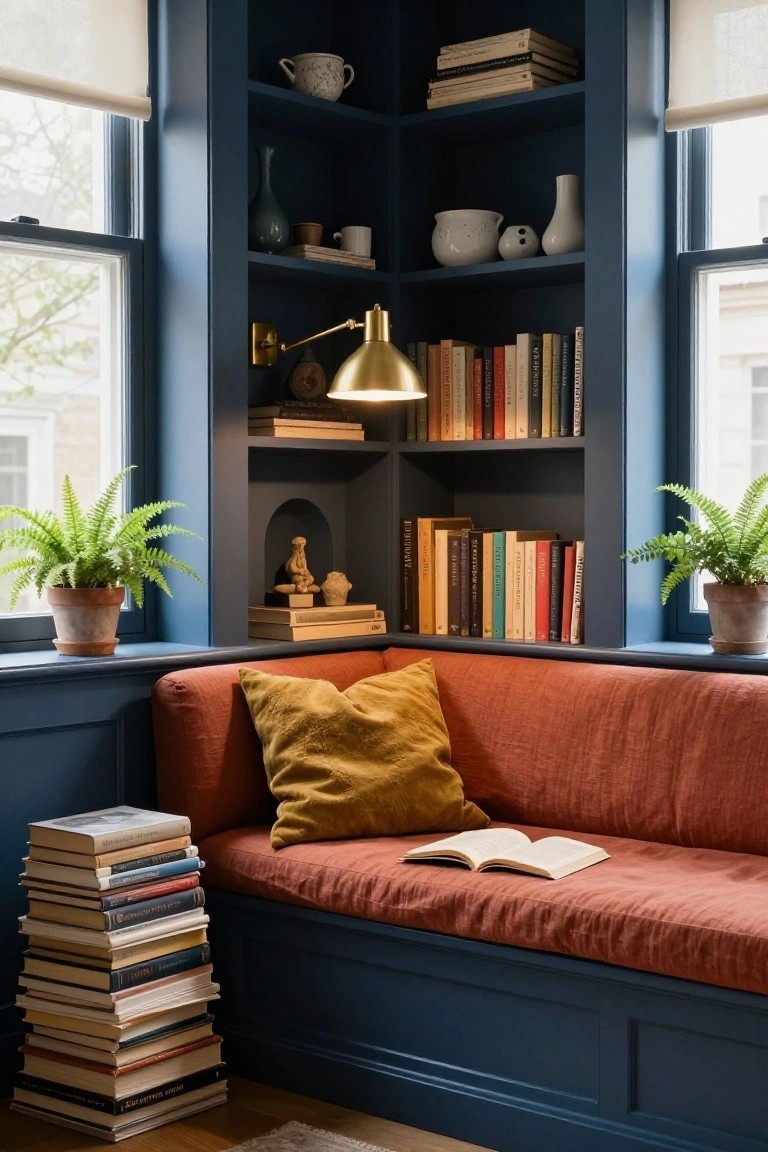
A deep navy finish on built-in corner shelves pairs nicely with a terracotta-upholstered bench right in the window. The colors contrast in a way that feels warm and bold at once. Full shelves of books and a few plants keep it practical too.
This works well in a living room or quiet study spot. It suits homes with good natural light from big windows. Watch the scale though… too big a bench might crowd a tight space.
Cozy Green Leather Banquette
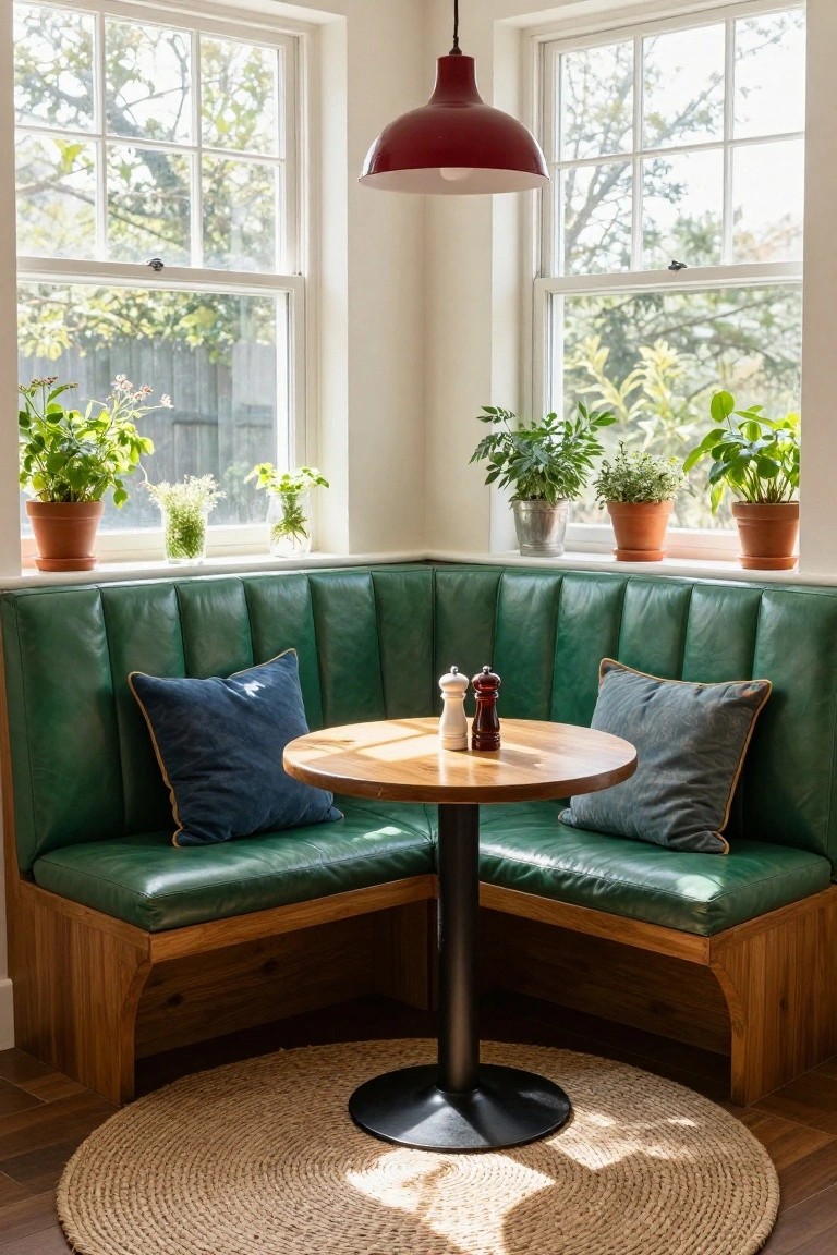
A built-in banquette like this one in deep green leather turns a simple corner into a real spot to linger. The tufted cushions and button details give it some character without overdoing it, and that bold color brings personality right into a kitchen or eating area. Natural light from the windows keeps it from feeling too heavy.
You can pull this off in most homes with a little nook by the window. Go for leather that’s easy to wipe down, and keep the table plain wood to let the green stand out. It suits casual family spaces best… just measure your corner first to make sure it fits.
Bold Striped Wallpaper in the Powder Room
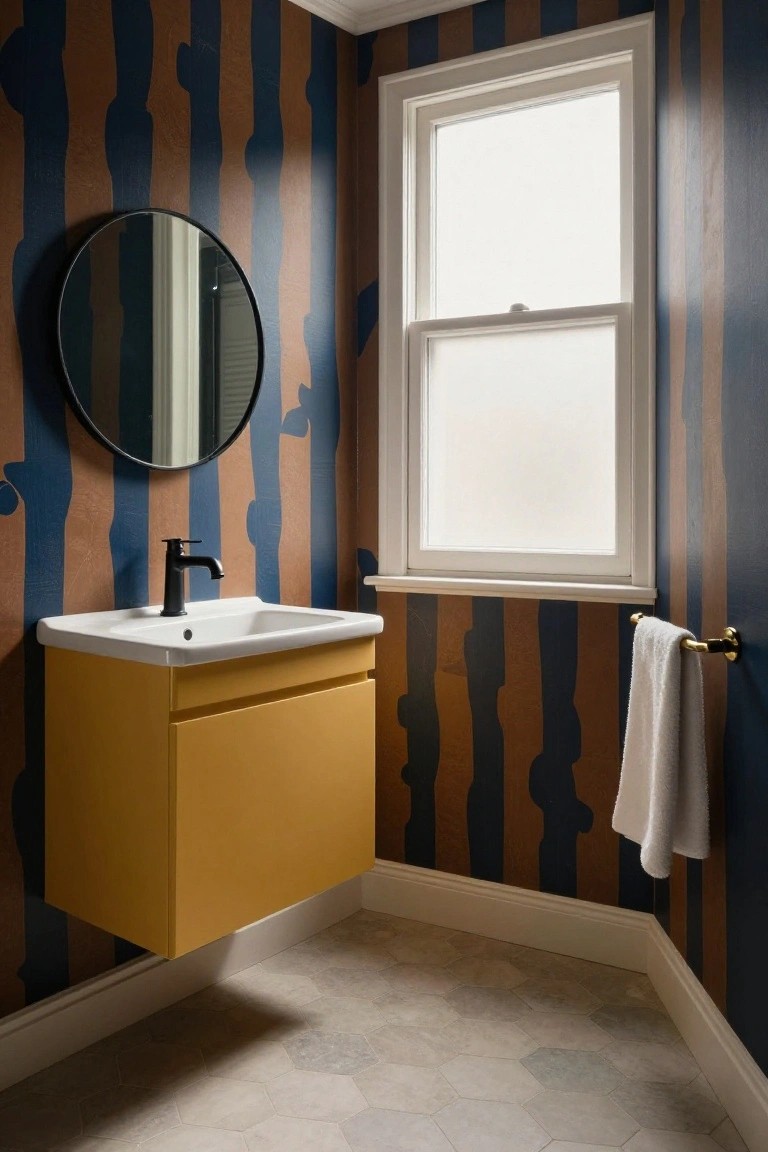
This powder room pulls off a strong look with wallpaper covered in thick, irregular stripes of navy blue and rusty brown. The pattern has an organic feel, like abstract brushstrokes or tree shapes climbing the walls. It gives the small space plenty of personality right away, especially against the plain white sink and floor.
Try this in a guest bath or hallway toilet where you want color without much furniture. Hang a bright yellow vanity underneath to echo the warmer tones, and stick to simple black hardware and a round mirror. It keeps things practical… just measure twice before wallpapering around that window.
Deep Purple Brick Walls
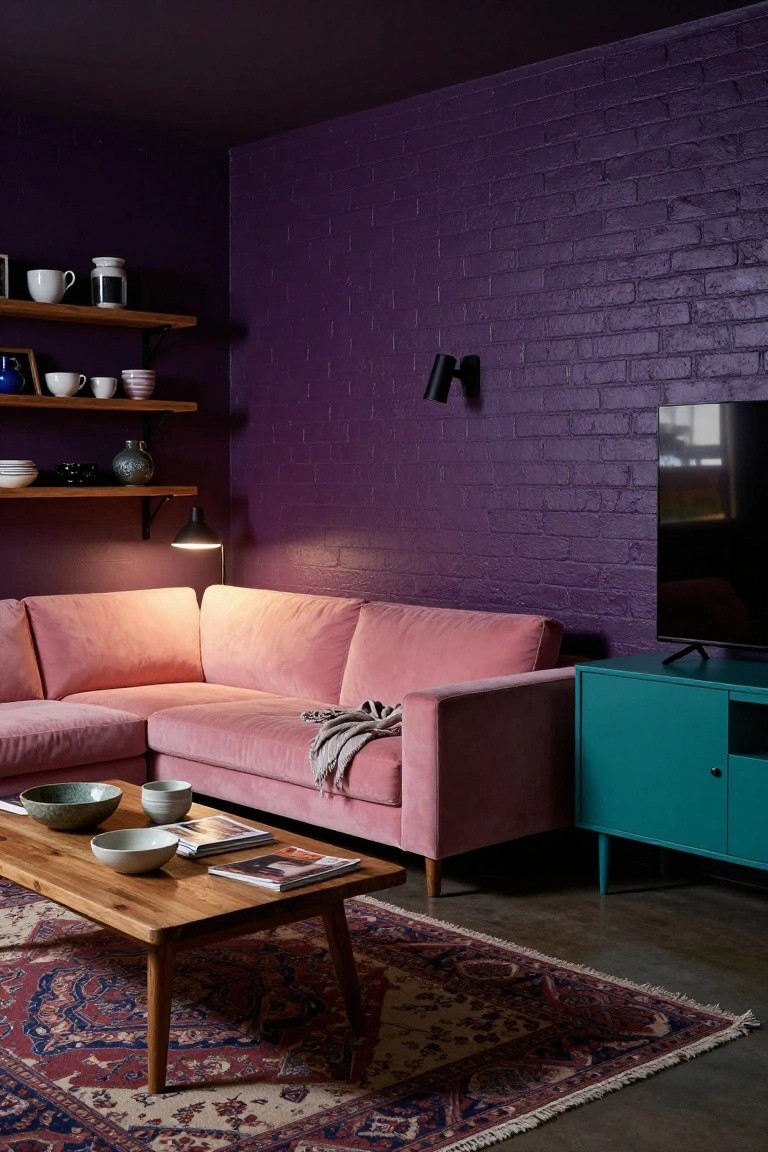
One way to add real personality to a living room is painting exposed brick a deep purple. It gives the space a moody vibe right away. Here the purple wall works behind a pink velvet sofa and teal cabinet. Those colors pop without clashing. The brick texture keeps it from feeling too flat.
This idea fits best in city apartments or smaller homes where you want coziness with some edge. Use good lamps to brighten it up. Skip if your room gets little natural light… it could feel heavy. Just add plants or ceramics on open shelves for balance.
Frequently Asked Questions
Q: How do I dip my toe into bold colors without messing up my Danish simplicity?
A: Pick one hero piece, like a sunny yellow sofa or cobalt vase. Let it shine against your crisp whites and woods. Build around it slowly, and your space gains personality fast.
Q: Will bold colors work in my cramped apartment?
A: They sure do – smartly chosen ones make tiny spots feel alive. Paint a single wall in a zingy orange to pull eyes upward. Keep the rest light, and it breathes.
Q: I’m renting, so what’s a no-drill way to add these colors?
A: Grab vibrant textiles first: throw pillows, rugs, curtains. Layer them over your basics for instant pop. Swap out artwork too – it transforms everything.
Q: And how do I mix patterns with all this color?
A: Stick to two bold prints max per room. Echo one color from each to tie them together. Step back, tweak, and enjoy the playful vibe.