
In homes I’ve known, wall colors shape how light moves through a space and sets the mood for everything from quick breakfasts to quiet evenings.
Scandinavian interiors get this right by leaning on soft, lively hues that brighten rooms without clashing against wood floors or simple furnishings.
I tried a muted sage in my hallway once, and it suddenly made the narrow spot feel wider and easier to navigate daily.
These choices help rooms function as real gathering places, where the walls fade back just enough to let personal touches stand out.
Save the ones that echo your home’s light patterns.
Pale Yellow Walls Brighten a Living Room

A soft pale yellow on the walls does a nice job of opening up this living room without feeling too bold. It picks up the natural light coming through the tall window and plays well with simple white sofas and wooden furniture. That gentle color keeps the Scandinavian look calm and easy.
You can pull this off in most any living space, especially ones that get decent daylight. North-facing rooms benefit a lot since the yellow adds warmth on duller days. Just stick to neutral pieces around it… no need for busy patterns.
Blush Pink Walls for Bedroom Calm

A soft blush pink on the bedroom walls brings a quiet brightness that feels fresh yet restful. It lifts the space just enough, especially against the natural rattan headboard and white linens. Those green leaf prints above the bed tie in nicely without cluttering things up.
This color works best in bedrooms facing north or ones that stay dim most days. Pair it with wood furniture and neutral bedding to keep the Scandinavian look going. Go for a muted shade… anything too vibrant might close in the room.
Pale Green Walls Brighten Kitchens
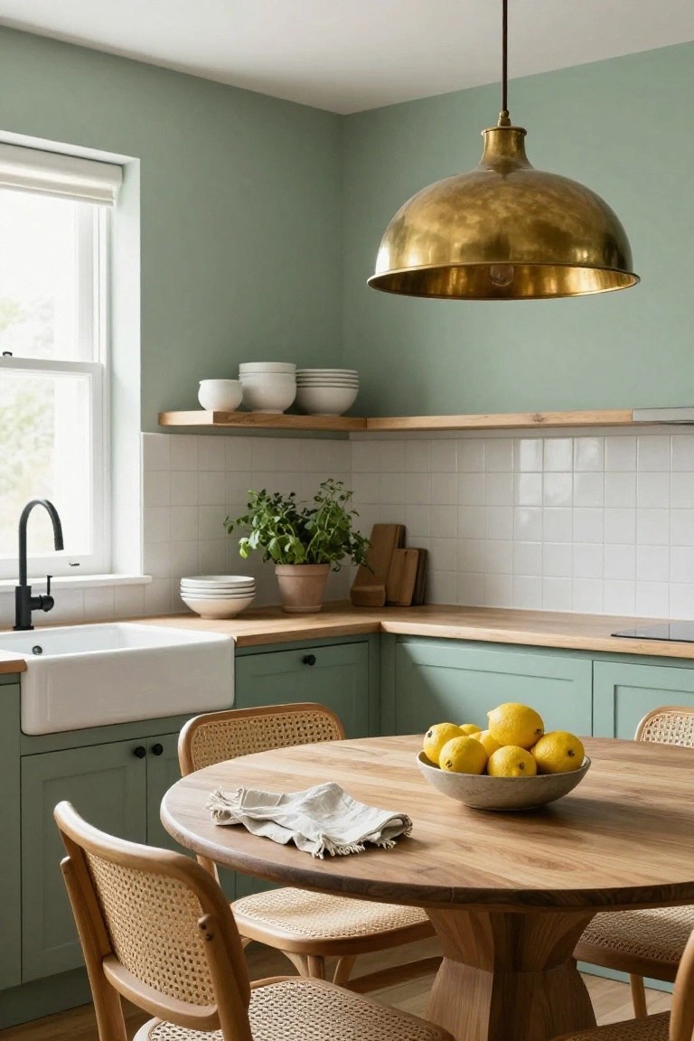
A soft pale green on the walls gives this kitchen a fresh, easy feel. It works because the color reflects light well, making even a compact space look bigger and calmer. Paired with simple white tiles and wood counters, it nods to Scandinavian simplicity without going too plain.
This shade suits kitchens with good window light or ones that need warming up. Use it on walls and cabinets for a pulled-together look. Older homes take to it nicely, especially if you add brass accents like that hanging light. Just test samples first, since greens can shift in different lights.
Pale Mint Walls Brighten Home Offices

Soft mint green walls like these bring a gentle lift to a workspace. They keep things calm and fresh without the chill of cooler tones. In this setup, the color plays off warm oak on the desk and shelves, making the room feel open and easy on the eyes during long work hours.
Use pale mint in studies or home offices where you want light without glare. It suits north-facing rooms that need a boost. Pair it with natural wood furniture and a few plants to stay grounded. Avoid going too dark elsewhere, or the space might feel closed in.
Soft Beige Walls Brighten Nurseries

A soft beige on the walls gives this nursery a gentle glow that feels fresh all day. It works because the color pulls in light from the window and bounces it around, making the space look bigger and more open. With simple wood pieces like the crib and dresser, plus those black animal prints, the walls keep everything calm and easy on the eyes.
Try this shade in any kid’s room or small bedroom where you want quiet comfort. It pairs well with oak tones and white linens, but pick a version without too much yellow so it stays neutral. In north-facing rooms… it really helps chase away any gloom.
Blush Pink Walls Brighten Dining Rooms
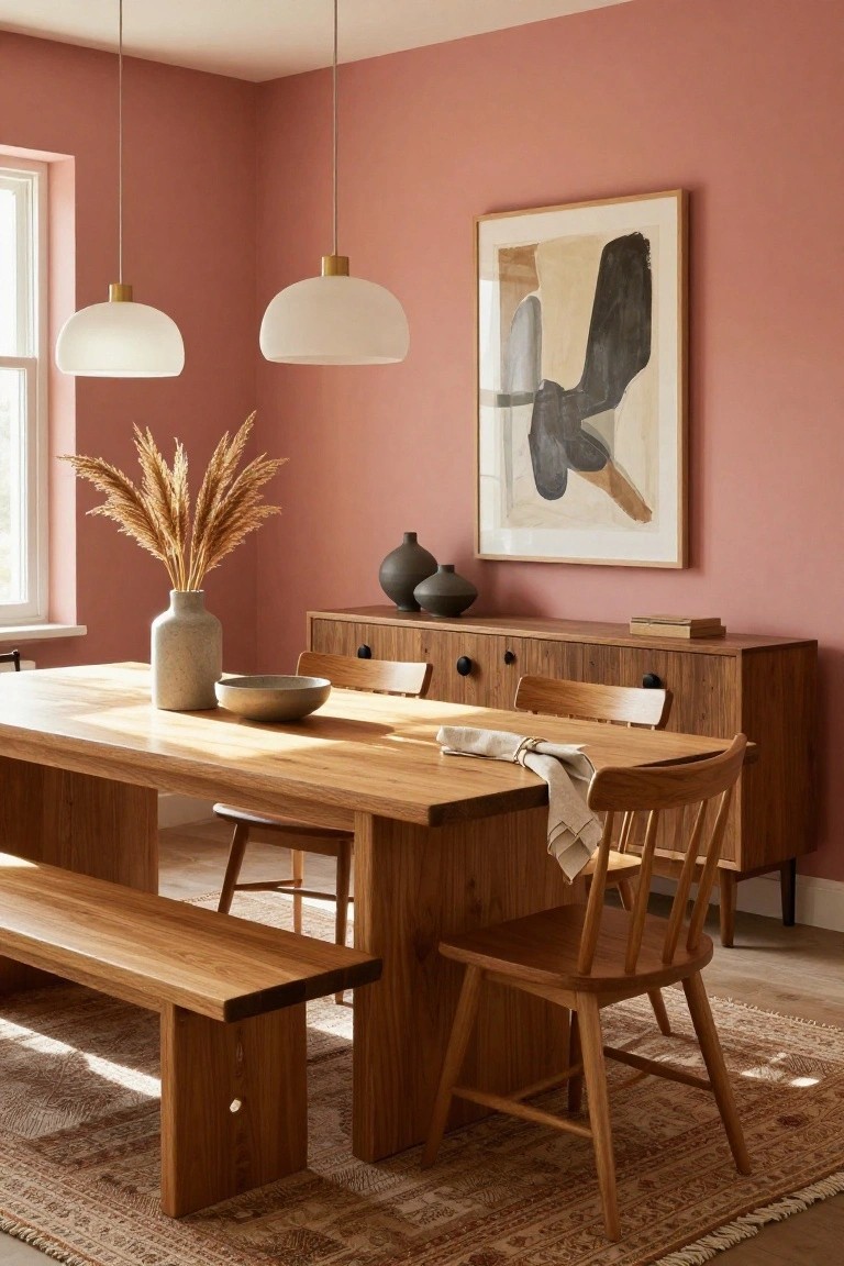
A soft blush pink on the walls does a nice job lightening up this dining space. It catches the natural light coming through the window and keeps things from feeling too dark or flat. With the oak table and pampas grass vase right there, the color ties everything together without overpowering.
This shade works best in rooms that get decent daylight, like eat-in kitchens or casual dining areas. It fits right into homes with wooden floors and furniture… just test a sample first to see how it looks in your light. North-facing spots especially benefit from that gentle lift.
Soft Blue Walls Brighten Bathrooms

A soft blue wall like this one adds a gentle pop of color to a bathroom without making it feel heavy. It works nicely against the warm wood of a floating vanity and crisp white sink, keeping things light and airy. That calm vibe is straight out of Scandinavian style. Folks like it because it brightens up the room on its own.
Put this color on just one wall in smaller bathrooms. It suits modern homes or apartments where you want subtle interest. Pair it with natural wood pieces and white towels for balance. Skip it if your space already has a lot going on. Easy to live with year-round.
Pale Blue Walls for Cozy Reading Nooks
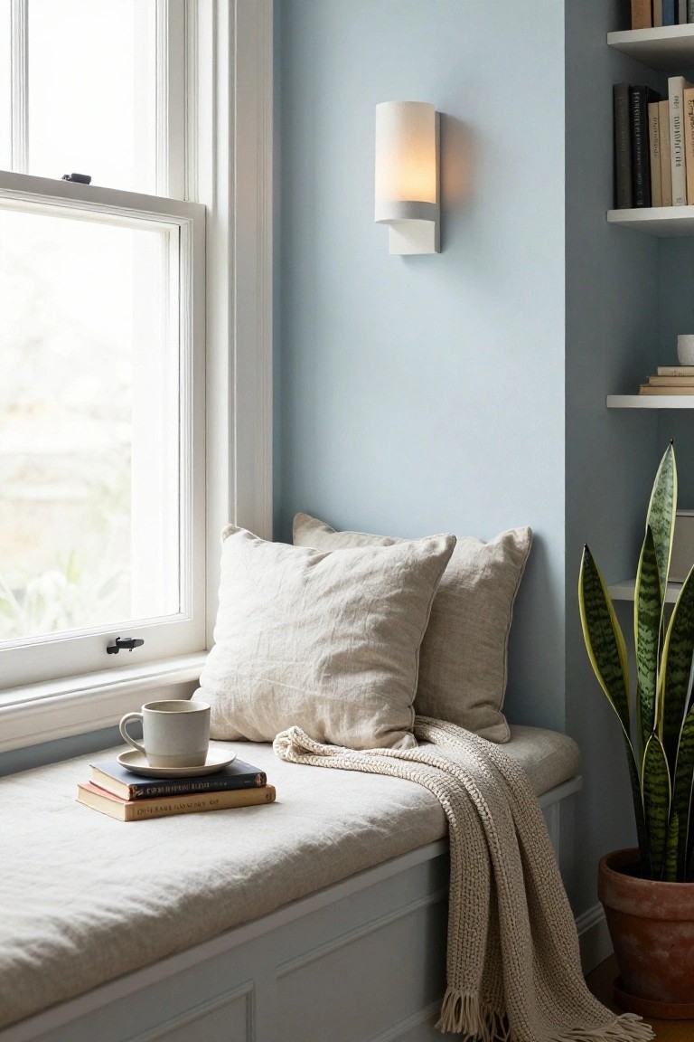
Pale blue walls like this one work so well in a quiet corner. They pick up the light from the window and keep the space feeling open and restful. It’s a classic Scandinavian move that makes even a small nook look bigger without trying too hard. Paired with simple linen pillows and a few books, it turns a basic window seat into a spot you actually want to use.
You can pull this off in older homes with lots of natural light, or any room that needs a gentle lift. Just stick to a soft shade and neutral fabrics around it. Avoid going too dark, or it might feel closed in. Works great near bookshelves too… adds that easy calm.
Sage Green Walls Warm Up Entries

Sage green walls give this entry a soft, welcoming feel that’s pure Scandinavian. The pale shade keeps things bright even in a smaller space, working nicely with the wood console table and white vases for that natural balance.
Put it in foyers or hallways where you need color without busyness. It suits homes with light floors and simple furnishings… just go pale enough to bounce light around.
Soft White Walls Brighten Laundry Rooms

Soft white walls like the ones in this utility space make even a workhorse room feel open and fresh. They reflect light from the window and under-cabinet glow, keeping the off-white cabinets and wood shelves from looking stark. It’s a simple way to nod to Scandinavian style without going all minimal.
These walls suit smaller laundry nooks or kitchens that get decent daylight. Pair them with matte black fixtures for contrast and a few natural touches like baskets. Avoid super glossy paints, though. They can feel cold up close.
Sage Green Walls for Bedroom Calm

Sage green walls bring a gentle lift to bedrooms like this one. The soft shade picks up light from the window and pairs easy with oak bed frames and white sheets. It keeps things feeling open and restful. No harsh edges here.
Use this color in any size bedroom, especially if it faces north. Add a big plant nearby and keep furniture light. Watch the undertone though. Too yellow and it warms up fast. Stick to cooler sages for that bright Scandinavian feel.
Soft Blue Walls Brighten a Living Room

A soft blue on the walls gives this living room a calm, open feel. It’s not too bold, just enough color to lift the space without overwhelming it. Paired with natural wood furniture and a light sofa, the blue keeps things fresh and airy, like a Scandinavian touch that lets in the light from big windows.
This works best in rooms with good natural light, maybe a north-facing living area that needs perking up. Paint one or two walls blue and keep the rest white or neutral. Watch for too much blue though… it can cool down a space if you overdo it. Stick to pale shades for that bright, easy look.
Soft Pink Walls Brighten a Kitchen

Soft pink walls give this kitchen a fresh, airy feel that fits right into Scandinavian style. The pale shade picks up light from the window and bounces it around, making the room seem bigger and more welcoming. White cabinets and wood accents keep things simple and grounded.
You can pull this off in kitchens with plenty of natural light, especially north-facing ones that need a lift. Pair the pink with oak counters or brass fixtures for balance. It suits family homes or apartments where you want color without going bold. Just test samples at different times of day.
Sage Green Walls Brighten Bathrooms
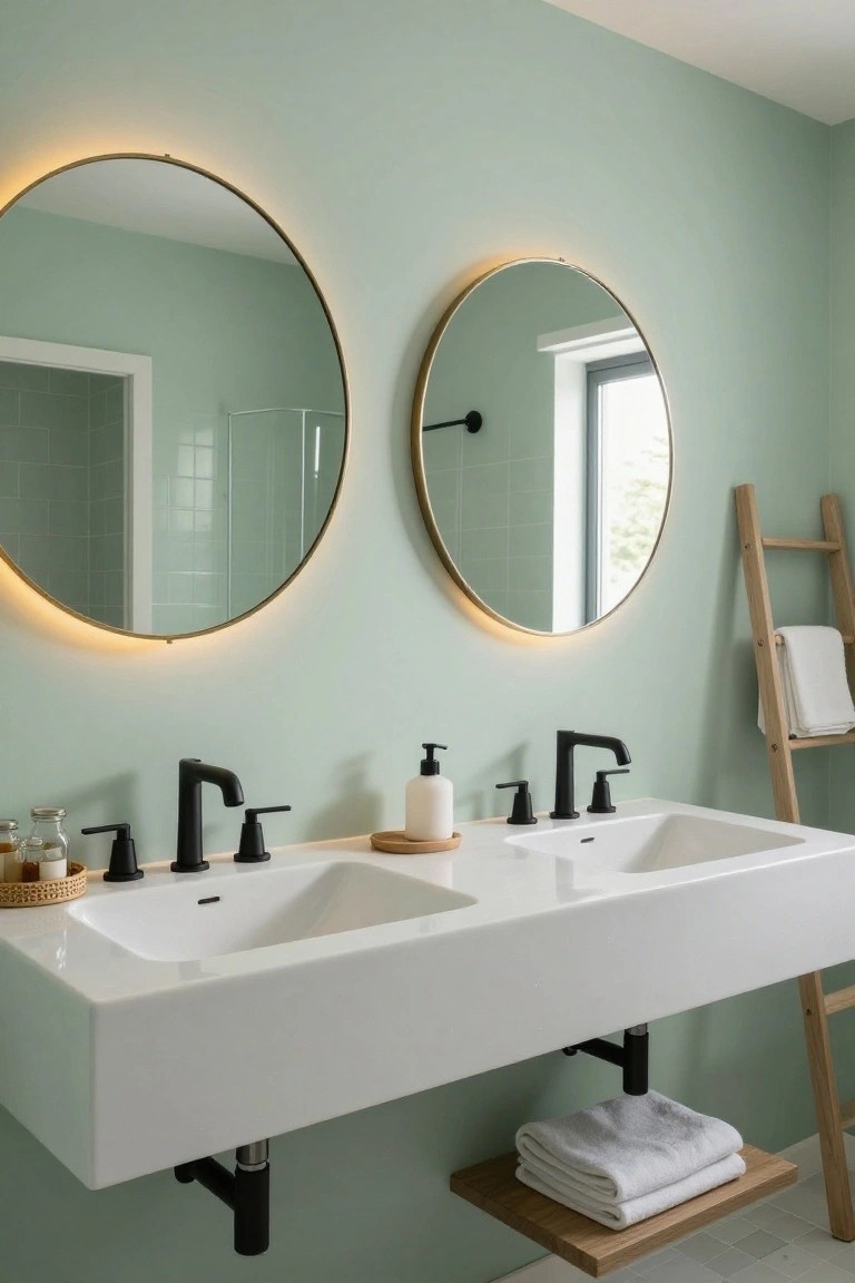
A soft sage green on the walls gives this bathroom a fresh, airy feel that fits right into Scandinavian style. It lightens up the space without overpowering it, letting natural light from the window and those backlit mirrors do their thing. The color feels calm and easy on the eyes, especially next to white sinks.
You can pull this off in most any bathroom, big or small, as long as you keep fixtures simple like these matte black faucets. It works best in rooms with some daylight. Watch the sheen though… matte paint keeps it from looking too slick.
Sage Green Walls in Cozy Corners

Sage green walls give this little dining nook a fresh, calm feel that fits right into Scandinavian style. The soft color brightens the space without overpowering it, and it looks great next to the wooden table and chairs. It keeps everything light and easy on the eyes.
Use sage green in tight spots like breakfast areas or window seats. It suits homes with wood floors or simple furniture, adding just enough color to feel lived-in. Skip it if your room gets too little light, though. Might turn a bit moody.
Mustard Yellow Walls Brighten Bathrooms
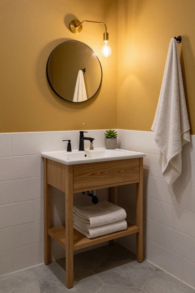
A soft mustard yellow on the walls turns this small bathroom corner into something cheerful. It plays nice with the white tile backsplash and oak vanity, making the space feel open even in a tight spot. That warm tone catches the light from the simple brass sconce just right.
You can pull this off in powder rooms or guest baths where you want a pop without overwhelming. Stick to natural wood cabinets and black metal fixtures to keep the Scandinavian feel. Just test the shade in your light first… it shifts a bit depending on the bulb.
Soft Gray Walls in Book Nooks

A pale gray wall color like this one opens up a cozy corner packed with books. It reflects light around the room without washing out the warm tones from oak shelves or a tan leather chair. That soft backdrop makes the space feel bigger and calmer. Even with a ladder leaning there for reaching high spots, nothing feels crowded.
You can pull this off in any small alcove or study. Pair the gray with natural wood and simple ceramics to keep it Scandinavian. It suits homes with lots of books… just avoid going too dark on the trim. Works best where you want quiet focus.
Pale Blue Walls Brighten Entryways

A soft pale blue on the walls gives this entryway a fresh, open feel without overwhelming the space. It plays nicely with the natural wood bench and simple touches like a potted fir tree, making everything look calm and put-together. That color lifts the tiled floor and keeps things light, even on duller days.
You can pull this off in your own mudroom or front hall, especially if it’s a tight spot. Go for a shade like this in older homes or rentals. Just balance it with wood elements and practical storage, and skip anything too fussy… it stays easy to live with.
Soft Mint Green Walls in Playrooms

A soft mint green like this keeps a kids’ room feeling light and fresh. It brightens the space on its own, without needing much else. Here, plain wooden shelves with books and a few toys sit right against it, and simple wall hangings like a kite add play without clutter. The color stays calm even with drawings pinned up nearby.
Use this shade in play corners or nurseries where you want cheer that grows with the child. It suits north-facing rooms that need a lift, or any spot with blonde wood furniture. Pair it with rugs and pillows in neutrals so the green doesn’t overwhelm… just enough white or cream keeps it easygoing.
Soft Pale Walls Brighten Wood Rooms

In rooms heavy on natural wood like this one, soft pale walls keep things from feeling too dark or closed in. The light beige here picks up the warmth from the oak wardrobe and desk without competing. It lets the wood tones shine while making the space feel bigger and more open, especially with a skylight overhead.
You can pull this off in bedrooms or small offices where built-in storage eats up wall space. Pick a greige or creamy off-white that leans warm to match oak or pine furniture. It works best in north-facing rooms needing more light, but skip it if your wood is super dark… go a shade brighter then.
Turquoise Tiles Brighten a Bathroom

Turquoise tiles like these make a small bathroom feel fresh and open. They add just enough color against pale walls without crowding the space. The glossy finish bounces light around. Keeps everything simple and clean, much like Scandinavian rooms do best.
This works great in powder rooms or guest baths. Go for subway-style tiles around the sink area. Stick to white sinks and wood accents nearby. Avoid going all the way up if the ceiling’s low…it might feel heavy.
Sage Green Walls for a Relaxed Living Room

A soft sage green on the walls sets a gentle tone here. It’s not bold but adds just enough color to keep things from feeling stark. With the light from the window and warm walnut pieces like the sideboard, it makes the room feel brighter and more inviting on gray days.
This color works best in spaces with some natural light, like living rooms or dens. It suits apartments or older homes where you want calm without fuss. Pair it with beiges and woods… avoid going too dark elsewhere or it might close in.
Frequently Asked Questions
Q: My north-facing living room feels gloomy. Which colors from the list perk it up best?
A: Warm off-whites or pale sandy beiges reflect light beautifully in low-sun spots. They keep the Scandinavian vibe without going stark. Paint a test patch and watch it through the day.
Q: How do I try these colors out before committing to a full room?
A: Snag sample pots and brush large squares right on your walls. Move around the room at different times to catch the light shifts. This saves you from regrets.
Q: Do these soft shades hide everyday dirt on busy walls?
A: Flat matte finishes on light neutrals mask fingerprints and scuffs way better than gloss. Wipe with a damp cloth weekly to keep them fresh.
Q: And what if I want to mix in some color pops with these walls?
A: Layer pillows or art in muted blues and greens against pale walls. The neutrals ground everything so pops shine without overwhelming.